set.seed(35003)

mu_C    <- 22   # E[C], the expectation (a fixed parameter)
sigma_C <- 5    # sd of C (Normal convention: mean & standard deviation)

# one independent commute time, in minutes
rcommute <- function(n) rnorm(n, mean = mu_C, sd = sigma_C)Week 13 — Sums, simulation & limit behavior
Seeing the law of large numbers and the central limit theorem by simulation
Concept note
For twelve weeks you have computed with single random quantities — one quiz score, one shuttle wait, one commute. This week the random quantity is an average, and two of the most useful facts in all of probability are about what happens to an average as you let the sample size grow. Both facts are easiest to believe once you have watched them happen on a screen, so this is a software week: we state each law in words and symbols, then let base-R simulation make it visible.
Keep one distinction at the front of your mind the whole week, because everything turns on it. The sample mean is a statistic — a number you compute from data you actually drew, and it changes every time you draw a fresh sample. The expectation \(E[X]\) is a parameter — a fixed feature of the underlying model, the same no matter how many times you sample. We will write the sample mean of \(n\) draws as \(\bar{X}_n\) and the expectation as \(\mu = E[X]\). The two laws below are statements about how the random \(\bar{X}_n\) relates to the fixed \(\mu\).
Take Maya’s morning commute as the running quantity. From Week 11, her commute time in minutes is modeled as
\[ C \sim \text{Normal}(\mu = 22,\ \sigma = 5), \]
with \(\mu\) and \(\sigma\) read as mean and standard deviation (the course’s Normal convention; R’s rnorm uses the same one). Imagine recording her commute on \(n\) independent days and averaging the times. That average \(\bar{C}_n\) is itself random — a different \(n\) days would give a different average — but the two limit laws pin down its behavior tightly.
The law of large numbers, in words
The law of large numbers (LLN) says that as you average more and more independent draws, the sample mean settles down onto the expectation. For independent, identically distributed draws \(C_1, C_2, \dots, C_n\) each with mean \(\mu = E[C]\),
\[ \bar{C}_n = \frac{1}{n} \sum_{i=1}^{n} C_i \;\longrightarrow\; \mu \quad \text{as } n \to \infty. \]
For Maya’s commute, \(\mu = 22\), so the average of her commute times converges to \(22\) minutes. The word “converges” is doing real work: it does not say the average equals \(22\) at any finite \(n\), and it does not say the average marches toward \(22\) without ever stepping back. It says the wobble around \(22\) keeps shrinking, so that for large \(n\) the average is reliably close to \(22\). The LLN is the precise version of the everyday intuition that “more data gives a more trustworthy average.”
The central limit theorem, in words
The LLN tells you where the average lands. The central limit theorem (CLT) tells you the shape of its leftover wobble — and the answer is the same shape almost regardless of where the data came from. For \(n\) independent, identically distributed draws with mean \(\mu\) and standard deviation \(\sigma\), the sample mean is, for large \(n\), approximately Normal:
\[ \bar{C}_n \;\approx\; \text{Normal}\!\left(\mu,\ \frac{\sigma}{\sqrt{n}}\right). \]
Two things to read off this. First, the average is centered at \(\mu\) — that is the LLN again. Second, the standard deviation of the average is \(\sigma/\sqrt{n}\), which shrinks as \(n\) grows. For Maya’s commute, \(\bar{C}_n \approx \text{Normal}(22,\ 5/\sqrt{n})\): centered at \(22\), with spread \(5/\sqrt{n}\) that narrows as you average more days. At \(n = 25\) the spread is \(5/5 = 1\) minute; at \(n = 100\) it is \(5/10 = 0.5\) minutes. The factor \(\sqrt{n}\) in the denominator is why halving the spread of an average costs you four times the data, not twice.
The striking part is the word approximately Normal. Maya’s commute was already Normal, so an average of Normals being Normal is no surprise. The CLT’s real power is that the average turns bell-shaped even when the individual draws are not — dice rolls, coin flips, waiting times. We will see exactly that with the dice transfer example below.
Why the sample-mean / expectation distinction matters here
Because the sample mean is random and the expectation is fixed, it is a category error to say “the sample mean is \(22\).” A particular sample mean is a draw; \(22\) is the target it is drawn around. The LLN says the draws cluster ever more tightly on the target as \(n\) grows; the CLT says that, at any large \(n\), those draws are scattered around the target in a Normal pattern with a known, shrinking width. Holding the two ideas apart — statistic versus parameter — is what keeps the simulations below interpretable rather than magical.
Setup and practice sequence
The plan is to make both laws visible with two pictures, all in base R. All data here are synthetic; seed 35003 is set so every run is reproducible. The R chunks are shown for study and are not executed on this site (#| eval: false) — you run them yourself in your own R session. See the R · Quarto setup page to get an environment going.
Work the sequence in order:
- Set the world. Fix the seed and the commute model so every reader gets the same numbers.
- See the LLN: a running-mean curve. Draw one long stream of commute times, compute the average of the first \(1, 2, 3, \dots, n\) of them, and plot that running average against \(n\). Watch the curve flatten onto \(22\).
- See the CLT: a histogram of many sample means. Draw many separate samples of size \(n\), compute each sample’s mean, and histogram those means. Watch the histogram look Normal and watch it narrow as \(n\) grows.
- Transfer to dice. Repeat both pictures with rolls of a fair six-sided die — a decidedly non-Normal, flat-topped distribution — and watch the average flatten onto \(3.5\) and the histogram of means go bell-shaped anyway.
Step 1 — set the commute world
Note the naming on purpose: mu_C is the parameter \(\mu = 22\) we are trying to recover, never the data. The data come only from rcommute().
Step 2 — the LLN as a running-mean curve
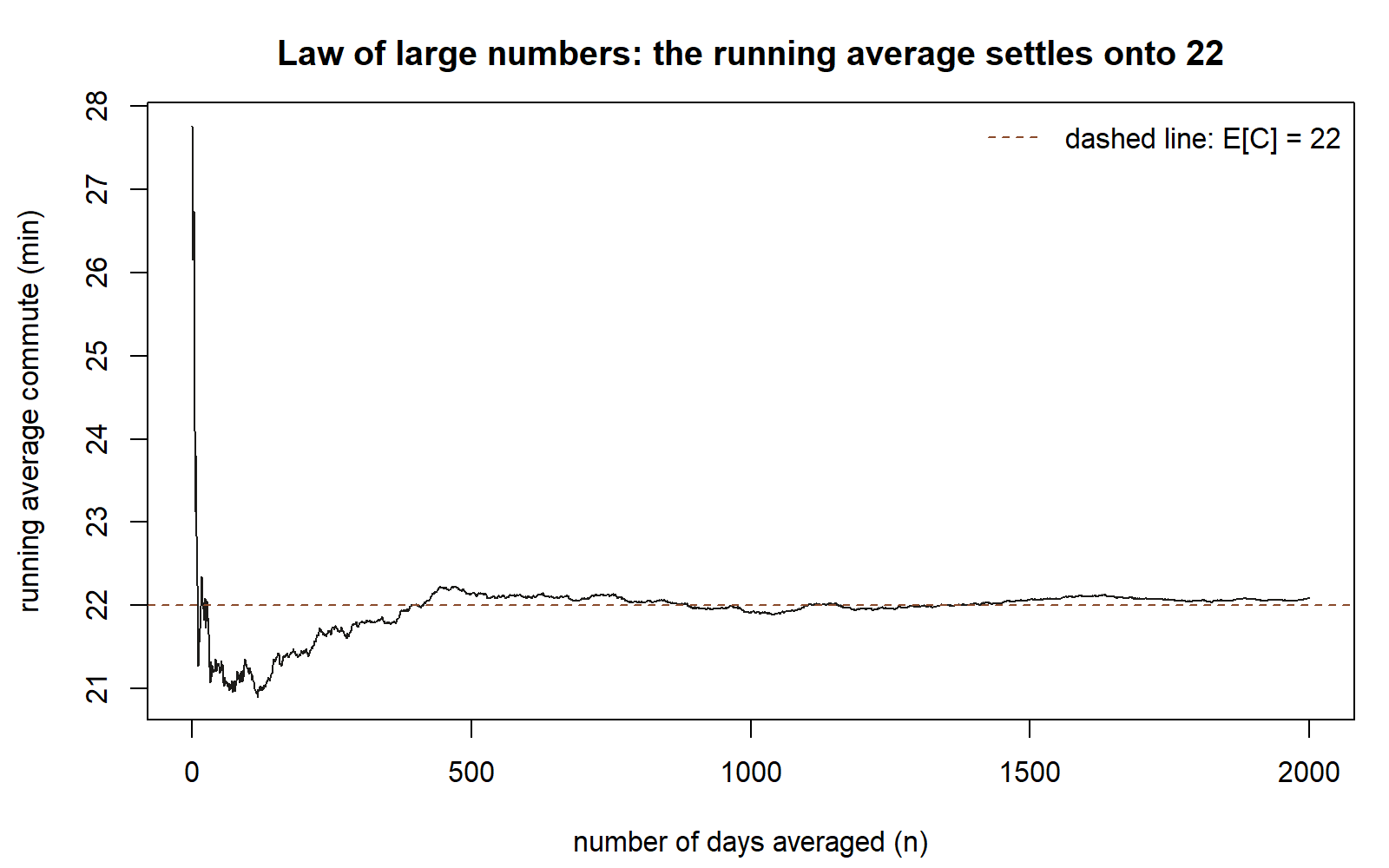
Draw one stream of \(n = 2000\) commute times. For each prefix length \(k\), average the first \(k\) draws. The function cumsum(x) / seq_along(x) gives that whole running average in one vectorized step.
set.seed(35003)

n      <- 2000
draws  <- rcommute(n)                 # 2000 independent commute times
runavg <- cumsum(draws) / seq_along(draws)   # running mean after 1, 2, ..., n draws

plot(seq_len(n), runavg, type = "l",
     xlab = "number of days averaged (n)",
     ylab = "running average commute (min)",
     main = "Law of large numbers: the average settles onto 22")
abline(h = mu_C, lty = 2)             # the target E[C] = 22

runavg[c(10, 100, 1000, 2000)]        # average is jumpy early, steady late
Read the picture. Early on (small \(n\)) the curve swings widely — a few unlucky long commutes can drag a \(5\)-day average well off \(22\). As \(n\) climbs into the hundreds and thousands, the curve hugs the dashed line at \(22\) and the swings shrink toward nothing. That flattening is the LLN: \(\bar{C}_n \to \mu = 22\). The printed values at \(n = 10, 100, 1000, 2000\) make the same point numerically — each is closer to \(22\) than the last, on average, though no single value need be.
Step 3 — the CLT as a histogram of sample means
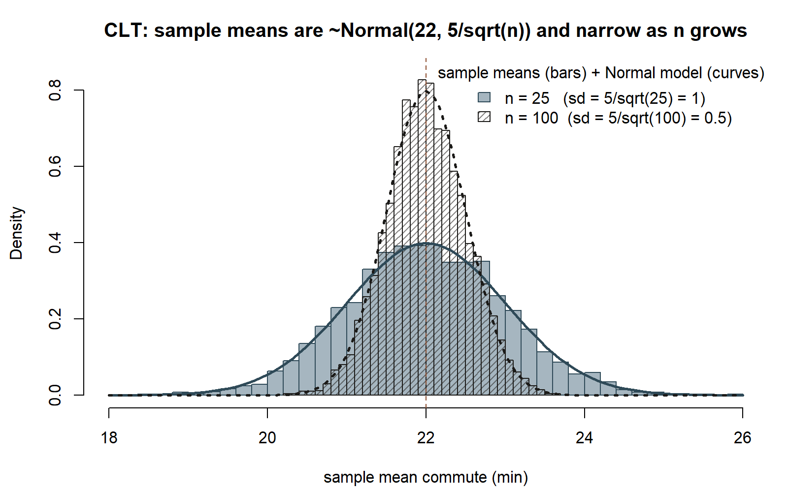
Now change what we collect. Instead of one growing average, draw many independent samples, each of a fixed size \(n\), and keep just each sample’s mean. The collection of those means is what the CLT describes.
set.seed(35003)

reps <- 5000        # number of independent samples (number of sample means we collect)

sample_means <- function(n, reps) {
  replicate(reps, mean(rcommute(n)))   # one mean per sample, reps of them
}

means_n25  <- sample_means(25,  reps)
means_n100 <- sample_means(100, reps)

# the CLT predicts each set of means is approx Normal(22, 5/sqrt(n))
c(pred_sd_25  = sigma_C / sqrt(25),    obs_sd_25  = sd(means_n25))
c(pred_sd_100 = sigma_C / sqrt(100),   obs_sd_100 = sd(means_n100))

hist(means_n25, breaks = 40, freq = FALSE,
     xlab = "sample mean commute (min)", xlim = c(18, 26),
     main = "CLT: sample means are ~Normal(22, 5/sqrt(n)) and narrow as n grows")
hist(means_n100, breaks = 40, freq = FALSE, add = TRUE,
     col = rgb(0, 0, 0, 0.25))
abline(v = mu_C, lty = 2)             # both histograms center on 22
Two things to watch. Center: both histograms pile up on \(22\) — that is the LLN once more, since \(\bar{C}_n\) is centered at \(\mu\). Spread: the \(n = 100\) histogram is visibly narrower than the \(n = 25\) one, by a factor of two, because \(5/\sqrt{100} = 0.5\) is half of \(5/\sqrt{25} = 1\). The printed pred_sd versus obs_sd lines confirm the \(\sigma/\sqrt{n}\) formula: the standard deviation of the simulated means lands right on \(1\) and \(0.5\). And the bell shape is exactly the Normal the CLT promises.
Step 4 — transfer: averages of dice rolls
Maya’s commute was already Normal, so its average being Normal is unsurprising. The CLT’s real claim is that the average goes bell-shaped even when the individual draws are not. A fair die roll is the perfect stress test: its values \(1, 2, 3, 4, 5, 6\) are equally likely, so a single roll has a flat distribution, not a bell. Its mean is
\[ E[\text{roll}] = \frac{1 + 2 + 3 + 4 + 5 + 6}{6} = 3.5. \]
set.seed(35003)

roll_die <- function(n) sample(1:6, size = n, replace = TRUE)

# --- LLN: running average of single rolls flattens onto 3.5 ---
rolls  <- roll_die(2000)
runavg <- cumsum(rolls) / seq_along(rolls)
plot(seq_along(rolls), runavg, type = "l",
     xlab = "number of rolls averaged (n)", ylab = "running average roll",
     main = "Dice LLN: the average of rolls settles onto 3.5")
abline(h = 3.5, lty = 2)

# --- CLT: histogram of the mean of n=30 rolls goes bell-shaped ---
reps         <- 5000
mean_of_30   <- replicate(reps, mean(roll_die(30)))
hist(mean_of_30, breaks = 40, freq = FALSE,
     xlab = "mean of 30 dice rolls",
     main = "Dice CLT: averages of a FLAT distribution become bell-shaped")
abline(v = 3.5, lty = 2)
mean(mean_of_30)   # close to 3.5
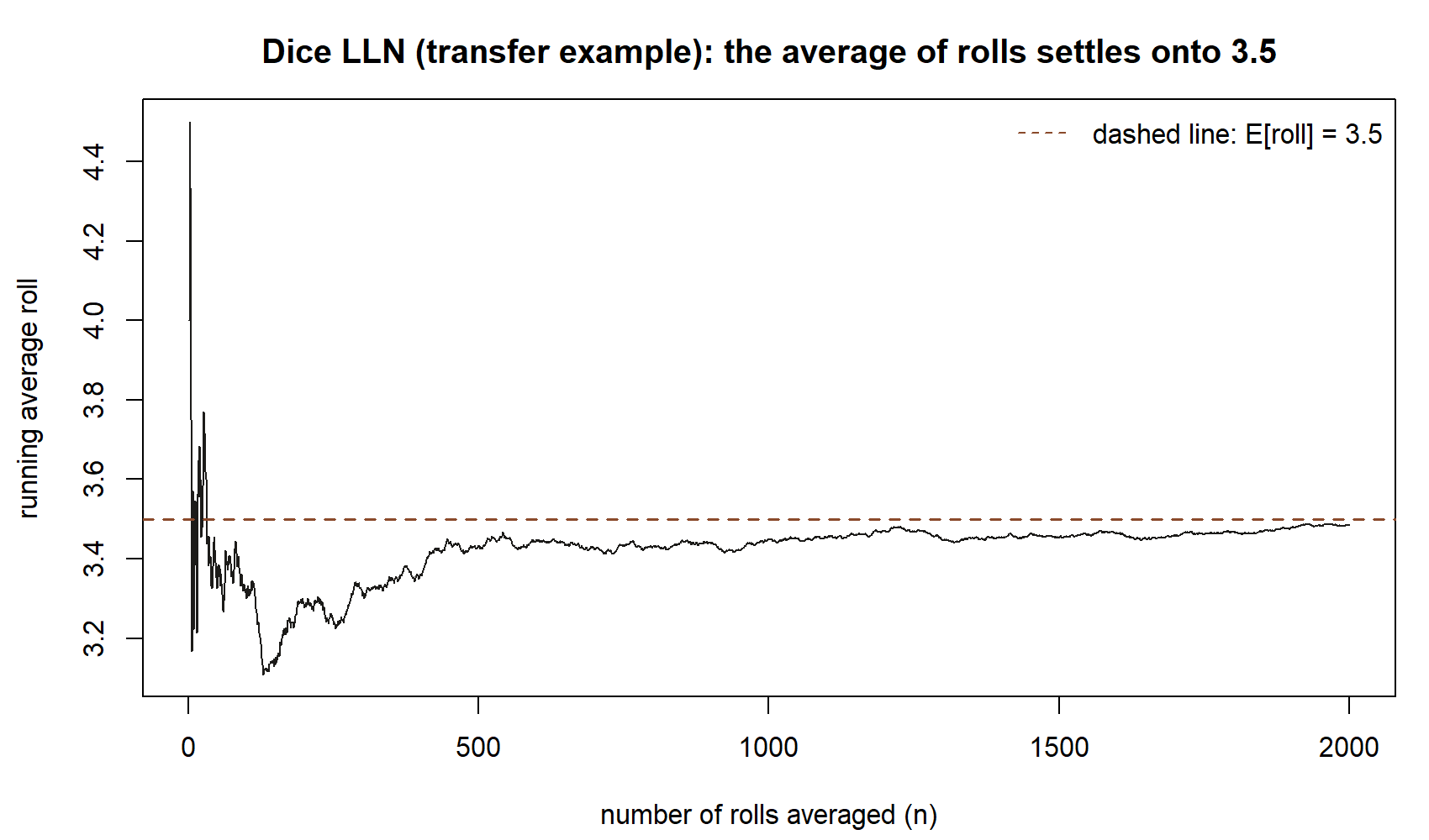
The first plot is the dice LLN: a single roll is flat, but its running average flattens onto \(3.5\) exactly as the commute average flattened onto \(22\).
The second plot is the dice CLT: even though one roll is flat, the average of \(30\) rolls is a clean bell centered at \(3.5\).
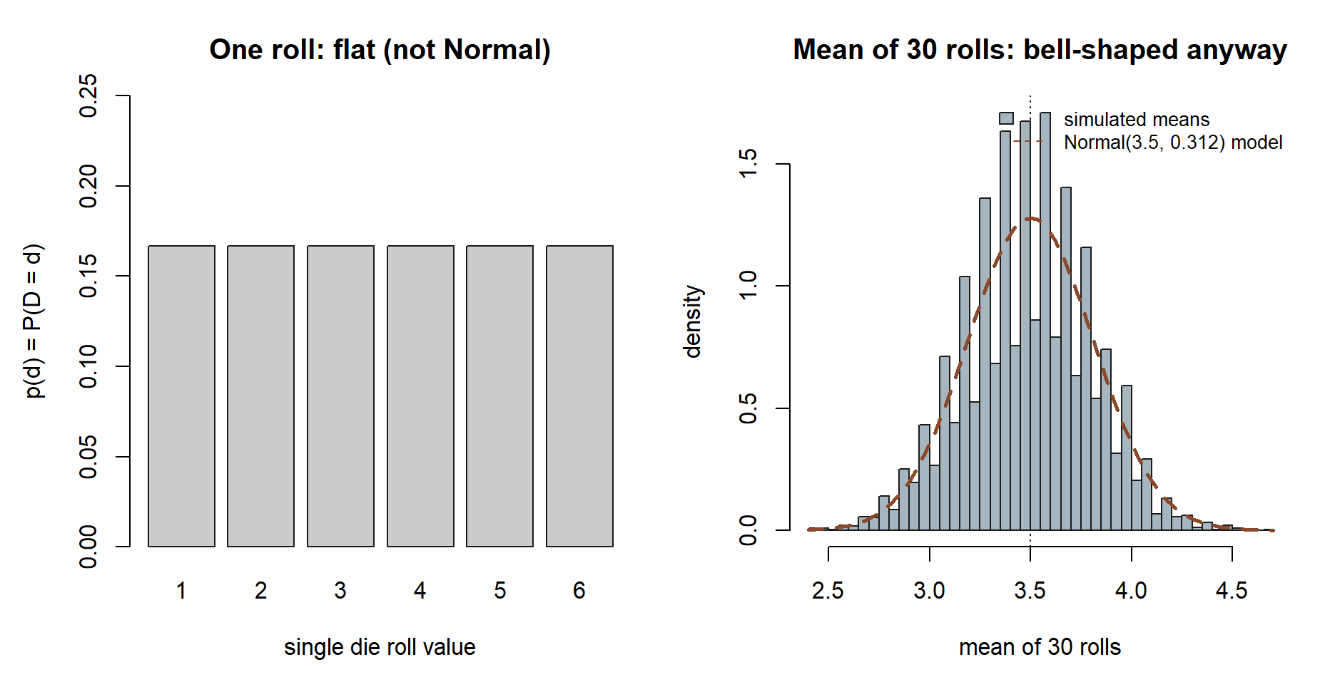
Nothing about the underlying distribution being non-Normal stopped the average from becoming Normal — that universality is the whole point of the CLT, and it is why the Normal model shows up so often once averages or sums are involved.
Reproducible-file convention
Keep this week’s work in one .qmd file — say week13-limits.qmd — so the prose, the code, and the plots travel together and anyone (including you, next month) can re-run it from top to bottom and get the same figures. A few conventions make that reliability real:
- Seed once, near the top, and re-seed each independent simulation. Every chunk above calls
set.seed(35003)before it draws. That is deliberate: it makes each chunk reproducible on its own, so a reader who runs only the CLT chunk still gets the documented numbers. (The course seed is35003throughout; the data are synthetic.) - Name the parameter and the statistic differently in code, too.
mu_Cis the fixed \(\mu = 22\);runavg,sample_means, andmean_of_30are the random statistics. Mirroring the statistic-versus-parameter distinction in your variable names keeps the simulation honest. - Render with Quarto, then record your session. After the document knits, paste the output of the chunk below into the file so the exact R and package versions that produced your figures are on the record.
sessionInfo() # R version, platform, and loaded packages — paste the output into your fileIn this build the chunks are shown for teaching and carry #| eval: false, so the site renders the code without running it; in your own copy you would set them to evaluate so the plots appear.
Debugging
The most common simulation snag this week is a result that looks “wrong” but is really a reproducibility or sample-size issue rather than a coding error. Three to watch for:
- Your numbers differ from a classmate’s. Almost always a seed problem: either
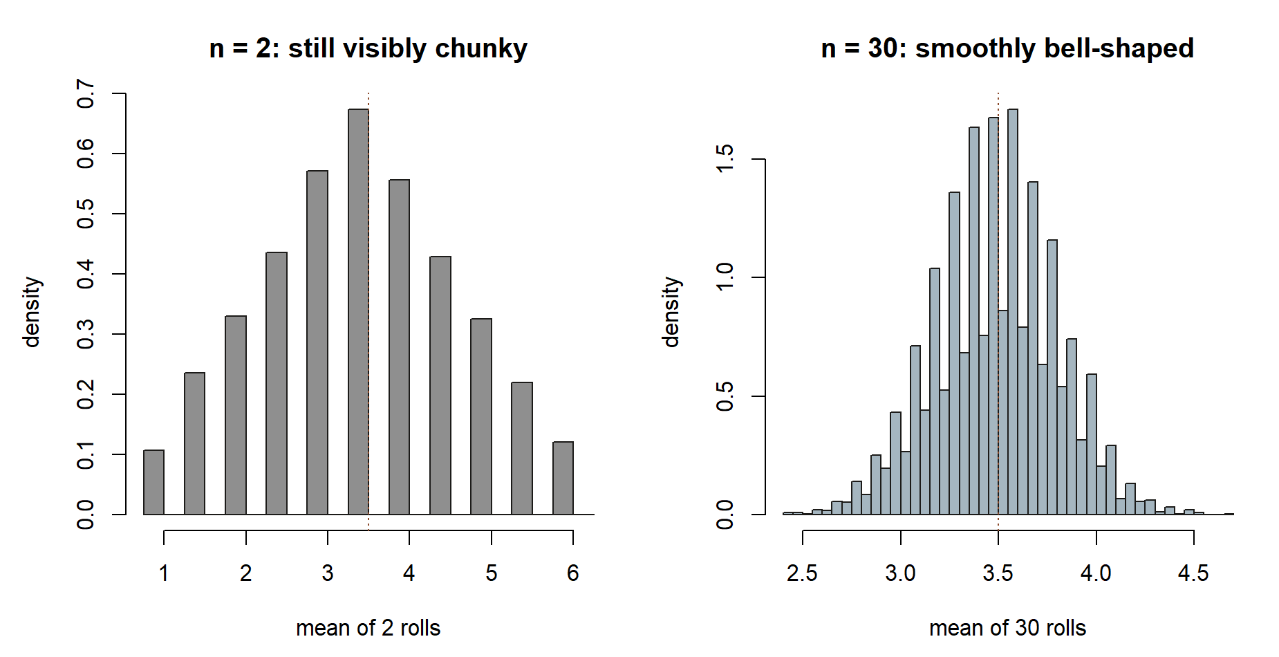
set.seed(35003)was not called immediately before the draw, or a chunk was run out of order so the random-number stream had already advanced. Fix: put the seed at the top of the chunk that does the drawing, and run the file from a clean session top to bottom. Re-seeding is not cheating — it is what makes the figures reproducible. - The histogram of means does not look Normal. Usually \(n\) is too small. The CLT is a large-\(n\) statement; at \(n = 2\) or \(n = 5\) the average of dice rolls is still visibly chunky. Increase the per-sample size \(n\) (try \(30\) and up) — note this is the sample size inside each
mean(), not the number of repetitionsreps. Those two knobs do different jobs and are easy to swap by accident. - The running-mean curve never settles. Check that you divided by the running count, not by the fixed
n. The patterncumsum(draws) / seq_along(draws)divides each partial sum by how many terms went into it; writingcumsum(draws) / ninstead divides everything by the final count and gives a curve that drifts rather than converges. A quick guard: the last value of a correct running mean equalsmean(draws)exactly.
The second bullet above is easiest to see: here is the CLT histogram at a sample size the CLT has not yet “kicked in” for, next to one where it clearly has.
The third bullet is also easiest to see: the “bug” version below is not a subtly-wrong line, it visibly fails to converge at all until the very last point.
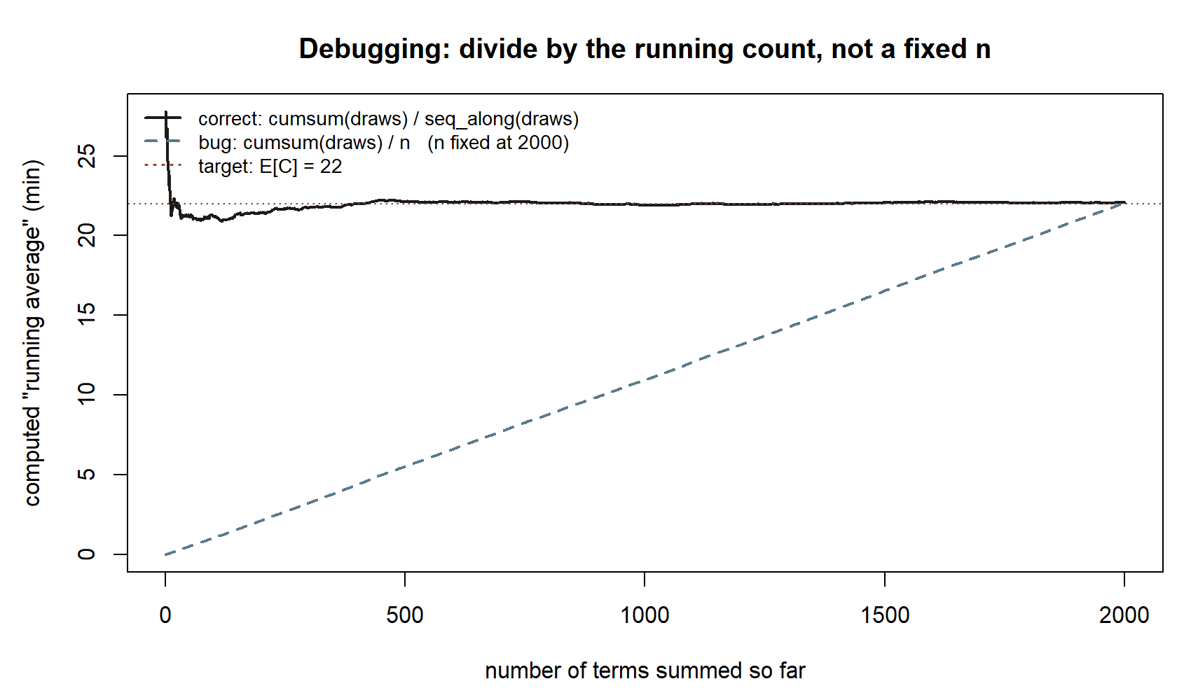
cumsum(draws) / n with n fixed at 2,000, ramps up almost linearly and only reaches the dotted target at the very last point, \(n = 2{,}000\).
A good habit when a simulation surprises you: print a couple of summary numbers (mean(), sd(), length()) before trusting the plot. The plot can mislead; a printed standard deviation compared against the predicted \(\sigma/\sqrt{n}\) rarely does.
AI Use Note
Generative AI can speed up the mechanical parts of a simulation, but you are responsible for whether the output is correct. If you use an AI tool while working this week, keep a short record like the one below — the Verification column is the load-bearing one, because it is where you confirm the result against the theory rather than against the tool’s confidence.
| Tool | Purpose | Verification |
|---|---|---|
| AI chat assistant | Explain why cumsum(x) / seq_along(x) gives a running mean |
Re-derived by hand on a 3-element vector; confirmed the last value equals mean(x) |
| AI coding helper | Draft the replicate() loop that collects 5000 sample means |
Checked sd(sample_means) against the predicted \(\sigma/\sqrt{n} = 5/\sqrt{n}\); matched at both \(n=25\) and \(n=100\) |
| AI chat assistant | Reword the LLN-vs-CLT distinction in plain language | Compared against the statements in the reading (G&S Ch 8–9); kept the statistic-vs-parameter wording exact |
The rule of thumb: an AI can propose code or phrasing, but a claim is only trustworthy once you have checked it against a hand calculation, the simulated numbers, or the named source. Record what you checked, not just what you asked.
Reading and source pointer
For the law of large numbers, read Grinstead & Snell, Chapter 8 — Law of Large Numbers, which makes precise the sense in which a sample mean converges to the expectation. For the central limit theorem, read Grinstead & Snell, Chapter 9 — Central Limit Theorem, which develops the Normal approximation to the distribution of a sum or average: https://www.dartmouth.edu/~chance/teaching_aids/books_articles/probability_book/book.html.
This is also a simulation week, so it draws on the secondary course text. See MIT OpenCourseWare 18.05 for its treatment of the central limit theorem and its R/simulation resources — a good second pass on watching averages turn Normal and on setting up the kind of repeated-sampling experiment used above: https://ocw.mit.edu/courses/18-05-introduction-to-probability-and-statistics-spring-2022/.
These notes are the course’s own synthesis, grounded in but not copied from the sources.
Public vs. graded
These notes, the examples, and the practice here are public and ungraded — study material only. No graded prompts, answer keys, rubrics, point values, or due dates appear on this site. Graded checkpoints, quizzes, homework, labs, the midterm, the project, and the final live in Blackboard (the LMS), which is authoritative for due dates, submissions, and grades. If this page and Blackboard ever disagree, follow Blackboard.
Looking ahead
The two laws this week are the bridge from probability to statistics, and the rest of the course leans on them. The LLN is the reason a simulated probability — counting how often something happens in a long run — is trustworthy at all; the CLT is the reason the Normal curve shows up everywhere an average or total is involved. Next week’s probability modeling project puts both to work: you will build a model for a question like “how likely is it that Maya has two or more late days in a five-day week?”, and when the model is too tangled to solve by hand, you will simulate it — drawing many synthetic weeks and counting — trusting the LLN that the simulated proportion converges to the true probability. Week 15 then ties the whole commuter’s-morning thread together for the final review.
See also
- Companion lab — Lab 13: Law of large numbers and CLT — build the running-mean curve and the histogram of sample means yourself, for both the commute and the dice, and verify the \(\sigma/\sqrt{n}\) shrinkage by simulation.
- Notation glossary — the binding symbols, including \(\bar{X}_n\) for the sample mean versus \(\mu = E[X]\) for the expectation (statistic versus parameter).
- Distribution reference — the Normal model \(\text{Normal}(\mu, \sigma)\) in mean–standard-deviation form and the R
rnorm/samplefunctions used above. - Week 11 — Common continuous models — where the commute model \(C \sim \text{Normal}(22, 5)\) was introduced.
- Week 14 — Probability modeling project — the next step, where simulation becomes the tool for answering a modeling question end to end.
- Course syllabus — overall structure, schedule, and where graded work lives.