set.seed(35003)

# Population size and the THREE allowed inputs (the Week-5 givens).
N           <- 100000
prevalence  <- 0.02   # pi  = P(D)        -- the prior
sensitivity <- 0.95   #       P(+ | D)    -- likelihood if diseased
specificity <- 0.90   #       P(- | not D)
fpr         <- 1 - specificity   # P(+ | not D) = 0.10, the false-positive likelihood

# We deliberately do NOT define the posterior or the denominator here.
# Both must FALL OUT of the counting below, or the check proves nothing.Lab 5 — Bayes by simulation
Checking the screening-test posterior by simulating a population
Purpose. Week 5 computed the screening-test posterior \(P(D\mid +)\approx 0.162\) by algebra — Bayes’ rule with the denominator built from total probability. This lab reaches the same number a completely different way: we build a synthetic population of a hundred thousand people, test all of them, and then simply count what fraction of the positives actually have the condition. If the two answers agree, you have seen Bayes’ rule confirmed by a population rather than asserted by a formula. The companion note is Week 5 — Bayes’ rule & updating; read it first, because this lab assumes the prior–likelihood–posterior vocabulary from there.
The idea
Bayes’ rule can feel like a sleight of hand. You start with a likelihood you can measure — \(P(+\mid D)=0.95\), the chance a sick person tests positive — and out comes a posterior you want — \(P(D\mid +)\approx 0.162\), the chance a person who tested positive is actually sick. The two numbers are far apart, the small one is the right one, and it is reasonable to wonder whether the algebra is hiding something. It is not. The cleanest way to convince yourself is to stop manipulating symbols and instead build a world where the proportions are literally true, then go look.
That is the whole idea of this lab. We will create a synthetic population in which exactly the Week-5 numbers hold: about \(2\%\) of people have the condition, \(95\%\) of those who have it test positive, and \(10\%\) of those who do not have it test positive anyway. Then we set the algebra aside entirely and ask one empirical question of the data — of everyone who tested positive, what fraction actually had the condition? That fraction is the posterior \(P(D\mid +)\), defined the most concrete way possible: a conditional probability is a proportion within a subgroup. If the population is large enough, that counted proportion should land right on the \(0.162\) the note derived by hand.
The discipline that makes this honest is worth stating up front: we never feed the answer in. Nowhere in the simulation do we type \(0.162\), and nowhere do we type the denominator \(0.117\). We supply only the three inputs a Week-5 problem hands you — the prevalence, the sensitivity, and the false-positive rate — and let the posterior and the marginal \(P(+)\) fall out of the counting. If we had typed the answer in, recovering it would prove nothing. Because we do not, recovering it is a genuine check.
Before any code, here is the whole pipeline in one picture: build the population, split it by disease status, split each group again by test result at its own rate, then count inside the positive pool alone.
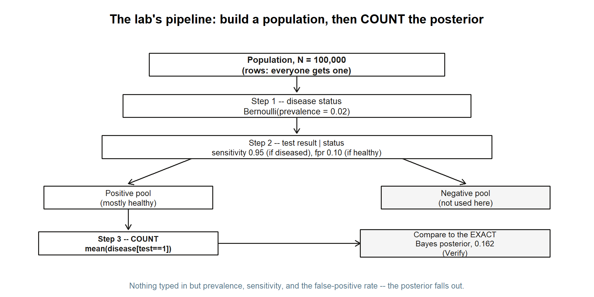
Each of the three boxes in the middle is exactly one of the three steps below; the comparison box on the right is the Verify section at the end. Keep this picture in mind as a map — it is easy to lose the thread inside the R code.
Goal
By the end of this lab you should be able to:
- Simulate a labelled population in base R: draw each person’s true disease status from a Bernoulli trial at the prevalence rate, then draw each person’s test result from a Bernoulli trial whose success probability depends on that person’s status.
- Recover a conditional probability by counting, using subsetting —
mean(disease[test == 1])reads literally as “the proportion who have the disease, among those who tested positive.” - Watch the Bayes denominator appear on its own: the overall positive rate
mean(test)should sit near \(0.117\) without our ever having computed it, because total probability is just bookkeeping over the two groups. - Compare the simulated posterior to the exact value \(0.162\), and explain the small gap as Monte Carlo error — sampling noise that shrinks as the population grows.
- Articulate the base-rate surprise in population terms: a good test, applied to a rare condition, produces a pool of positives that is mostly false positives.
This is a study lab: all data are synthetic, seed 35003 set, and the code is shown for you to read and run yourself.
Setup
You need nothing beyond base R — no packages. If you have not set up R, RStudio (or Posit Cloud), and Quarto yet, the R · Quarto setup page walks through it. Open a fresh script or a Quarto document and keep these three facts from Week 5 in front of you, because they are the only inputs the simulation is allowed to know:
| Quantity | Symbol | Value | Role in Bayes |
|---|---|---|---|
| Prevalence | \(\pi = P(D)\) | \(0.02\) | the prior |
| Sensitivity | \(P(+\mid D)\) | \(0.95\) | the likelihood if diseased |
| False-positive rate | \(P(+\mid D^{c})\) | \(0.10\) | the likelihood if healthy |
A note on the false-positive rate: Week 5 was handed specificity \(P(-\mid D^{c}) = 0.90\), and took the complement to get \(P(+\mid D^{c}) = 1 - 0.90 = 0.10\). We will do that one complement explicitly in the code so the connection to the note is visible, then use \(0.10\) as the healthy-person positive rate.
The two targets we are trying to recover — and which we therefore do not type as inputs — are the marginal \(P(+) \approx 0.117\) and the posterior \(P(D\mid +) \approx 0.162\). Keep them on a sticky note as answers to check against, not as numbers to enter.
The population size is a modelling choice. We use \(N = 100{,}000\). That is large enough that the counted proportions are stable to about two decimal places, yet small enough to run in a blink. Setting set.seed(35003) makes the whole thing reproducible: you and a classmate running the same code get the same “random” population, so you can compare results exactly.
Steps
The plan has three moves: build true disease status, build the test result conditional on that status, and then count the posterior. Read each chunk before you run it — the point of the lab is understanding the construction, not just seeing the final number.
Step 1 — Simulate true disease status
First give every one of the \(N\) people a true, hidden disease status. Each person independently “has the condition” with probability equal to the prevalence, \(\pi = 0.02\). That is exactly a Bernoulli trial, and rbinom(N, size = 1, prob = prevalence) draws \(N\) of them at once: it returns a vector of \(N\) values, each a \(1\) (“has the condition”) or a \(0\) (“does not”). Think of disease as the column of ground truth that, in real life, you never get to see directly — the test is your only window onto it.
set.seed(35003)

N          <- 100000
prevalence <- 0.02

# Each person: 1 = has the condition, 0 = does not. Bernoulli(prevalence).
disease <- rbinom(N, size = 1, prob = prevalence)

# How many true cases did this synthetic world produce?
sum(disease)         # roughly prevalence * N  ~ 0.02 * 100000 = 2000
mean(disease)        # the realized prevalence; should be close to 0.02
Two sanity checks are built in. sum(disease) counts the true cases — expect something near \(0.02 \times 100{,}000 = 2{,}000\), though not exactly, because the count is itself random. mean(disease) reports the realized prevalence in this particular population; it should sit close to \(0.02\) but rarely equal it on the nose. That small wobble is your first sight of Monte Carlo error: even the input rate is only approximately reproduced in any finite sample. Hold that thought — it explains the gap we will see at the end.
The figure below is what this chunk’s two sanity checks actually produced in one run: a population split into a small diseased group and a large healthy group.
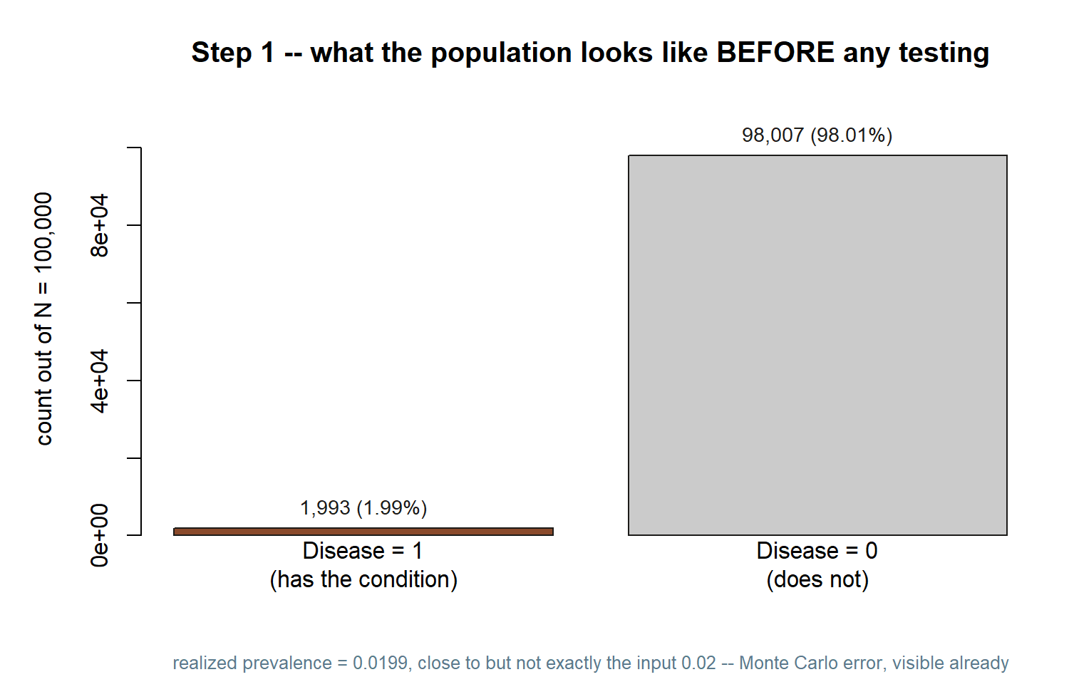
Notice how short the “Disease = 1” bar is next to “Disease = 0” — that size gap between the two groups is the whole reason the base-rate surprise happens, and Step 3 will make its consequence concrete.
Step 2 — Simulate the test, conditional on status
Now test everyone. The crucial point — and the place where Bayes lives — is that the test’s behaviour depends on the person’s true status. A diseased person tests positive with probability \(0.95\) (the sensitivity); a healthy person tests positive with probability \(0.10\) (the false-positive rate). So each person does not share one positive-probability; each carries their own, set by their disease value.
We build a per-person probability vector with ifelse: wherever disease == 1, use sensitivity; wherever disease == 0, use fpr. Then a single rbinom call draws each person’s test result from their own Bernoulli trial. Passing a whole vector to the prob argument is the idiom that makes this conditional simulation a one-liner.
set.seed(35003)

# (Re-run Step 1's draws so this chunk stands alone.)
N           <- 100000
prevalence  <- 0.02
sensitivity <- 0.95
specificity <- 0.90
fpr         <- 1 - specificity        # 0.10

disease <- rbinom(N, size = 1, prob = prevalence)

# Each person's OWN positive-probability, chosen by their true status:
#   diseased  -> sensitivity (0.95)
#   healthy   -> fpr         (0.10)
p_positive <- ifelse(disease == 1, sensitivity, fpr)

# Draw each test result from that person-specific Bernoulli trial.
test <- rbinom(N, size = 1, prob = p_positive)

# The OVERALL positive rate -- the Bayes denominator P(+) -- falls out here.
mean(test)           # expect ~ 0.117, and we never typed 0.117 anywhere
Look hard at mean(test). We never computed the denominator \(P(+) = 0.95(0.02) + 0.10(0.98) = 0.117\); we only told the simulation how each group behaves. Yet the overall positive rate lands near \(0.117\) all the same. That is the law of total probability happening physically: the population splits into a true-case group and a healthy group, each contributes positives at its own rate, and the marginal is just the size-weighted blend of the two. The formula in the note and this counted average are two descriptions of one fact.
One structural caution worth noting now. The diseased group is small — only about \(2{,}000\) people out of \(100{,}000\). The vast healthy group, \(98{,}000\) strong, throws off false positives at a \(10\%\) clip, which is roughly \(9{,}800\) of them. So the positive pool is dominated by healthy people. That imbalance is precisely the base-rate surprise, and Step 3 will read its consequence straight off the data.
Splitting the same run into all four (disease, test) combinations makes the imbalance concrete:
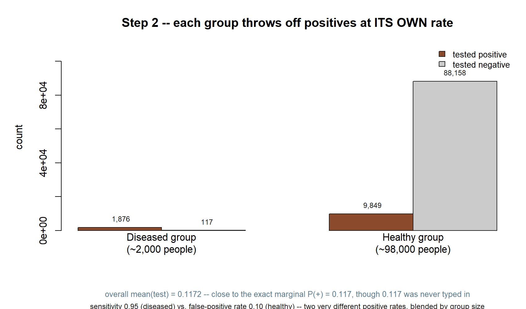
mean(test) this run gives is \(0.1172\) — close to the exact marginal \(P(+)=0.117\), though \(0.117\) was never typed in anywhere.
Compare the two “tested positive” bars: \(1{,}876\) from the tiny diseased group versus \(9{,}849\) from the enormous healthy group. Positives are already outnumbered by false alarms before you compute anything else — that is exactly what Step 3 counts directly.
Step 3 — Recover the posterior by counting
Now the payoff. The posterior \(P(D\mid +)\) is, by definition, a conditional probability: the probability of disease among the subgroup that tested positive. In data terms that is a proportion within a subset — so we subset. The expression disease[test == 1] keeps the true-status values for only the people who tested positive, and mean(...) of that subset is the fraction of them who actually have the condition. That single number is the simulated posterior.
set.seed(35003)

# (Stand-alone: rebuild the population.)
N           <- 100000
prevalence  <- 0.02
sensitivity <- 0.95
specificity <- 0.90
fpr         <- 1 - specificity

disease    <- rbinom(N, size = 1, prob = prevalence)
p_positive <- ifelse(disease == 1, sensitivity, fpr)
test       <- rbinom(N, size = 1, prob = p_positive)

# Among everyone who tested positive, what fraction truly has the condition?
# disease[test == 1]  : true-status values for the positive subgroup only
# mean(...)           : the proportion of that subgroup with disease == 1
posterior_sim <- mean(disease[test == 1])
posterior_sim        # expect ~ 0.162

# It helps to see the counts behind the proportion:
n_positive      <- sum(test == 1)                 # size of the positive pool
n_true_positive <- sum(disease == 1 & test == 1)  # truly sick AND positive
n_positive
n_true_positive
n_true_positive / n_positive   # same as posterior_sim, written as a ratio
The last line spells out what mean(disease[test == 1]) is doing: it is n_true_positive / n_positive, the share of the positive pool that is genuinely sick. Run it and you should see roughly \(0.16\) — about one in six positives is a true case, and the other five in six are false alarms. We arrived there with no Bayes formula in sight; the population did the bookkeeping for us, and mean read off the answer.
A small detail keeps this honest: at no point did we type the posterior or the denominator. The inputs were only prevalence, sensitivity, and fpr. Everything else — the marginal \(0.117\) in Step 2, the posterior \(0.162\) here — emerged from counting. That is what makes the agreement in the next section meaningful rather than circular.
The picture below is the payoff of the whole lab, drawn directly from this run’s counts: inside the positive pool only, who is actually sick?
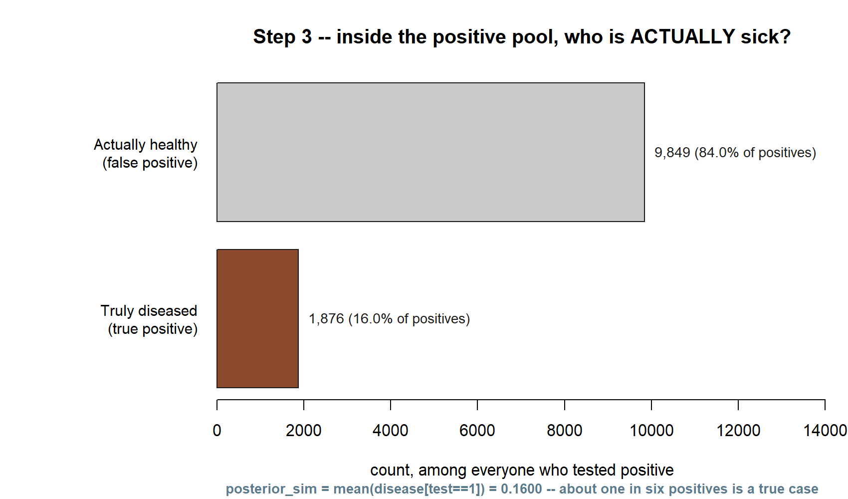
This is the base-rate surprise, seen as two stacks of people rather than asserted in words: most of the positive pool is false alarms, not because the test is bad, but because the disease is rare. The short bar in this figure, divided by the pool’s total, is exactly posterior_sim.
Verify
Now hold the simulated posterior up against the exact value the note derived by hand. Compute the Bayes number directly from the same three inputs and compare:
# Exact Bayes from the three inputs (mirrors the Week-5 derivation):
p_marginal_exact  <- sensitivity * prevalence + fpr * (1 - prevalence)   # P(+)
posterior_exact   <- (sensitivity * prevalence) / p_marginal_exact       # P(D | +)

p_marginal_exact   # 0.117
posterior_exact    # ~ 0.1623932 ... rounds to 0.162

# Side-by-side with the simulated values from the steps above:
c(simulated_marginal  = mean(test),
  exact_marginal      = p_marginal_exact,
  simulated_posterior = posterior_sim,
  exact_posterior     = posterior_exact)
This chunk’s output, from an actual run, is shown side by side with the exact algebra below:
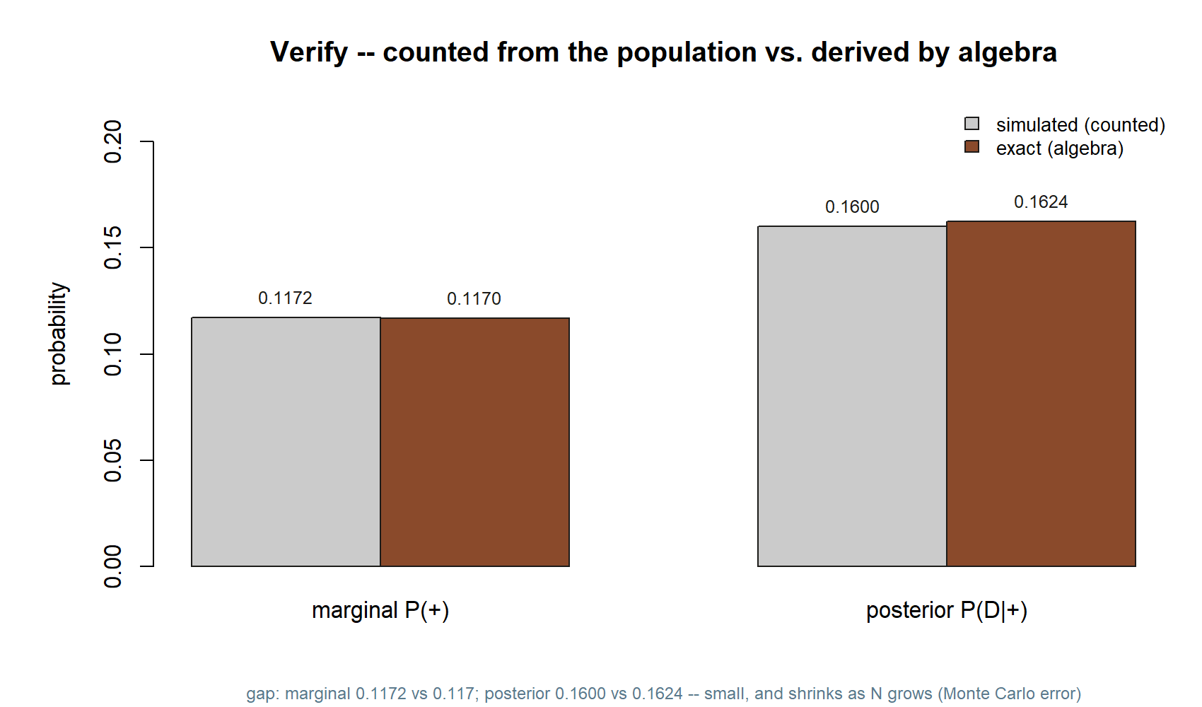
You should find the simulated and exact values agree to about two decimal places — the marginal near \(0.117\), the posterior near \(0.162\). They will not match exactly, and that is correct and expected. The simulation estimates the posterior from a finite population, so it inherits sampling noise; this is Monte Carlo error. Two things govern its size. First, the whole population is large (\(N = 100{,}000\)), which keeps the estimate stable. Second — and this is the real bottleneck here — the posterior is a proportion computed within the positive subgroup, and only the truly-sick-and-positive people (around \(1{,}900\) of them) carry the signal. A proportion based on a couple thousand cases still jitters in the third decimal. If you want a sharper estimate, raise \(N\) (say to a million) and rerun; the counted posterior will tighten toward \(0.162\). If you want to see the noise, change the seed a few times and watch the third decimal move while the first two hold steady.
Both of those knobs are visible in the same picture:
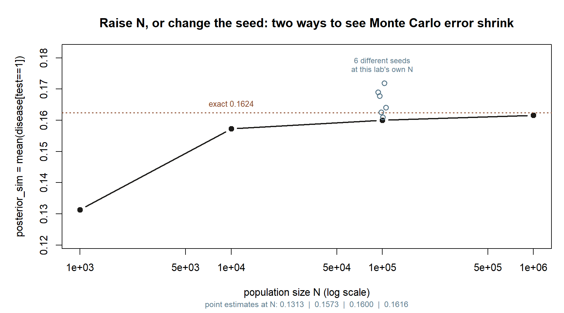
Raising \(N\) moves you left-to-right along the black line; changing the seed at fixed \(N\) moves you up and down within the cluster of open circles. Both shrink the gap to the dashed exact line, but only raising \(N\) shrinks it systematically — a new seed can land you closer or farther away by chance.
Finally, read the base-rate surprise off your own counts. The positive pool had roughly \(11{,}700\) people in it, but only about \(1{,}900\) were truly sick — so a positive result, on this genuinely good test, still leaves a person far more likely healthy than not. The reason is structural and the simulation makes it tangible: a rare condition means the healthy group, even at a modest \(10\%\) false-positive rate, simply outnumbers the true cases in the positive pool. The posterior is small not because the test is bad but because the prior was small — the same lesson Week 5 drew from algebra, now visible as two stacks of people.
AI use note
If you used an AI assistant while working through this lab — to explain ifelse on a vector, to debug a subsetting error, or to reword a confusing message — record it honestly. The verification column is the one that matters: it is where you say how you confirmed the help was right, because an AI can produce confident nonsense and the responsibility for the result is yours.
| Tool | Purpose | Verification |
|---|---|---|
| AI assistant (general) | Explain why prob = p_positive accepts a vector in rbinom |
Re-read ?rbinom; confirmed prob is vectorized by testing a tiny 4-person vector by hand |
| AI assistant (general) | Debug a wrong posterior caused by disease[test = 1] (one =) |
Reproduced the error, fixed to test == 1, and re-checked that mean(disease[test == 1]) returned ~0.16 |
| AI assistant (general) | Reword the Monte-Carlo-error explanation in my own notes | Cross-checked the claim against the Verify section and rewrote it in my own words, citing \(N\) and the subgroup size |
Keep the table short and specific. “I used AI to do the lab” is not a record; “I used AI to explain X, and I verified it by Y” is.
See also
- Week 5 — Bayes’ rule & updating — the companion note: the algebraic derivation of the same posterior this lab recovers by counting.
- Lab 2 — Monte Carlo basics — the estimate-a-probability-by-counting habit this lab leans on, in its simplest form.
- Week 4 — Independence & information — why the test and the disease status are not independent, which is exactly what makes the conditional simulation work.
- R · Quarto setup — getting R, RStudio/Posit Cloud, and Quarto running so you can execute these chunks yourself.
- Notation glossary — the binding symbols, including prior, likelihood, evidence, and posterior.
The graded deliverable, its rubric, and due date live in Blackboard (the LMS) — this page is study and practice only.