# Base R only -- no packages needed.
set.seed(35003)

# The recurring-case model: Maya's commute time, in minutes.
# Normal parameterized by MEAN and STANDARD DEVIATION (the course convention).
mu    <- 22   # parameter E[C]: the long-run mean commute (a fixed truth of the model)
sigma <- 5    # parameter: the standard deviation of a single commute

# rnorm(n, mean, sd) takes the SD as its third argument -- not the variance.
# A quick sanity draw of five mornings:
rnorm(5, mean = mu, sd = sigma)Lab 13 — Law of large numbers and CLT
Watching averages settle and sums turn bell-shaped
Purpose. This lab is the hands-on companion to Week 13 — Sums, simulation & limit behavior. The note states the two big limit theorems in words and symbols; here you watch them happen. You will build one long stream of simulated commute times and see its running average drift toward a fixed number (the law of large numbers), and you will build a whole crowd of sample means and see their histogram take on a bell shape that gets narrower as the sample size grows (the central limit theorem). Nothing here is graded — it is a guided rehearsal you can run in your own R session.
The idea
All term the recurring “commuter’s morning” world has given us numbers we treated as fixed truths about the process: the probability the shuttle is on time, the average number of correct guesses on a quiz, the mean wait for the next shuttle. Those fixed truths are parameters — properties of the model, not of any one morning. This week we look at what happens when you actually collect data from such a model many times over and summarize it. The summary you compute from data is a statistic, and the two limit theorems describe how a particular statistic — the average — behaves as you collect more and more.
We anchor both demonstrations in one quantity from the recurring case: Maya’s morning commute time. We model it as
\[ C \sim \text{Normal}(\mu = 22,\ \sigma = 5), \]
a Normal distribution with mean \(\mu = 22\) minutes and standard deviation \(\sigma = 5\) minutes (this course always parameterizes the Normal by mean and standard deviation, never by variance — keep that in mind when you call rnorm). The number \(22\) is the parameter \(E[C]\): the long-run average commute the model is built around. It is not something you can read off a single morning; a single morning gives you one draw, which might be \(17\) or \(29\) or anything else. The lab is about what many draws, properly summarized, reveal about that hidden \(22\).
Two questions drive the two simulations:
- Law of large numbers (LLN). If you average more and more commute times, does the average settle? The LLN says yes: the sample mean \(\bar C_n = \frac{1}{n}\sum_{i=1}^{n} C_i\) converges to the parameter \(E[C] = 22\) as \(n\) grows. We will watch the running average flatten toward the dashed line at \(22\).
- Central limit theorem (CLT). A single sample mean is itself a random number — collect a different week of mornings and you get a slightly different \(\bar C_n\). The CLT describes how those sample means scatter: for large \(n\), the distribution of \(\bar C_n\) is approximately
\[ \bar C_n \ \approx\ \text{Normal}\!\left(\mu,\ \frac{\sigma}{\sqrt{n}}\right) = \text{Normal}\!\left(22,\ \frac{5}{\sqrt{n}}\right). \]
We will draw thousands of sample means, histogram them, and check that the spread matches \(5/\sqrt{n}\) and shrinks as \(n\) grows.
The single most important habit this lab is training: keep the statistic and the parameter distinct in your head and in your words. \(\bar C_n\) is the sample mean, a thing you compute from data and that wiggles from sample to sample. \(E[C] = 22\) is the expectation, a fixed feature of the model that never wiggles. The LLN is the statement that the first one homes in on the second; the CLT is the statement that the first one’s wiggle is Normal-shaped with a width you can predict. Everything below is in service of seeing that pair of facts.
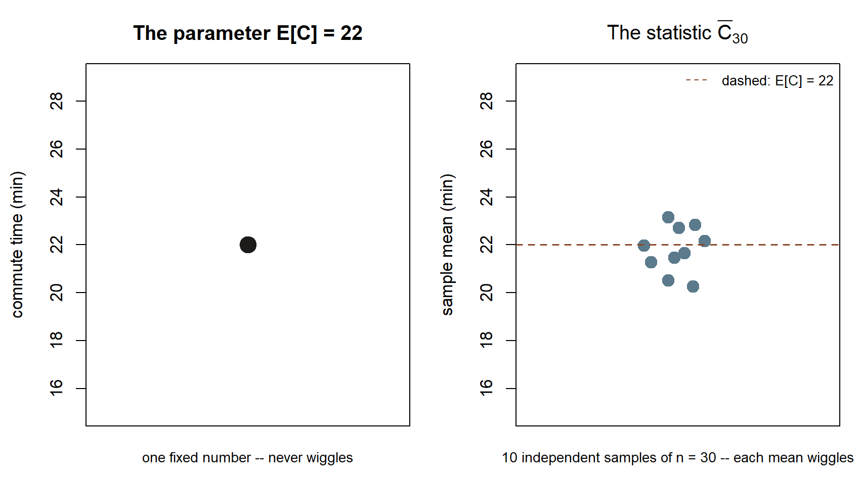
Look at the two panels before you run a single line of code. The left panel is the parameter — one number, \(22\), that does not change no matter how many times you re-draw the picture. The right panel is ten different statistics — ten sample means, each built from its own batch of 30 simulated mornings — scattered above and below the same dashed \(22\). Every step below is really one long answer to the question those two panels raise: how does the scatter on the right behave as you add more mornings per batch (Step 1), and as you collect more batches (Steps 2–4)?
All data in this lab are synthetic; seed 35003 is set so that anyone running the code gets the same stream. The code is shown for teaching and is not executed on this site (#| eval: false); run it yourself in RStudio or Posit Cloud to reproduce the figures described.
Goal
By the end of this lab you should be able to:
- Simulate a long stream of iid draws from \(C \sim \text{Normal}(22, 5)\) with
rnormand a fixed seed. - Compute a running mean with
cumsum(x) / seq_along(x)and read its plot as a picture of the LLN. - Generate many independent sample means of a fixed size \(n\) and histogram them.
- Compare the simulated standard deviation of those means to the theoretical \(5/\sqrt{n}\), and watch both fall as \(n\) grows.
- Say, in one clean sentence each, what the LLN and the CLT are claiming — without confusing the sample mean (a statistic) with \(E[C]\) (a parameter).
Setup
You need only base R; no add-on packages are required. Work in a single Quarto file or R script so the whole demonstration is reproducible end to end. Start every chunk that draws random numbers from the same seed so your stream matches the one described here.
A note on the convention you just used: rnorm’s third argument is the standard deviation, which lines up with how this course writes the Normal, \(\text{Normal}(\mu, \sigma)\). If you ever see a formula written with a variance \(\sigma^2\), remember to pass \(\sigma\) (here \(5\)), not \(\sigma^2\) (which would be \(25\)). This is exactly the kind of silent mix-up the notation ledger flags, so it is worth pausing on once.
Keep two names straight for the rest of the lab:
mu(value \(22\)) stands for the parameter \(E[C]\) — fixed, never estimated from the data below.- the things you will compute with
mean(...)stand for statistics — they are estimates that move from sample to sample. The whole point is to compare the second to the first.
Steps
Step 1 — Build one long stream and watch its running average settle (LLN)
The law of large numbers is about a single growing sample. Draw one long stream of commute times, then form the running mean: the average of the first observation, then the first two, then the first three, and so on. The compact base-R idiom is cumsum(x) / seq_along(x) — cumsum(x) gives the running totals and seq_along(x) gives the counts \(1, 2, 3, \dots\), so their ratio is the average so far at each step.
set.seed(35003)
mu    <- 22
sigma <- 5

n_stream <- 5000                       # one long stream of mornings
x <- rnorm(n_stream, mean = mu, sd = sigma)

# Running mean: average of the first 1, first 2, first 3, ... observations.
running_mean <- cumsum(x) / seq_along(x)

# Look at how the running average evolves -- jumpy at the start, then settling.
head(running_mean, 10)                 # the first ten partial averages
tail(running_mean, 1)                  # the average over all 5000 mornings

# A picture of the LLN: the running mean vs. the number of mornings averaged.
plot(seq_along(running_mean), running_mean, type = "l",
     xlab = "number of mornings averaged (n)",
     ylab = "running sample mean of commute time (min)",
     main = "Law of large numbers: the average settles toward E[C] = 22")
abline(h = mu, lty = 2)                # the fixed parameter E[C] = 22
Read the plot left to right. On the far left, you have averaged only a handful of mornings, so a single unusually long or short commute swings the average a lot — the curve is jagged and can sit well away from \(22\). As \(n\) climbs into the hundreds and thousands, each new morning is one voice in a large chorus and moves the average less and less; the curve flattens and hugs the dashed line at \(\mu = 22\). That dashed line is the parameter \(E[C]\), the fixed target. The wiggling curve is the statistic \(\bar C_n\), your sample mean as a function of how much data you have folded in. The LLN is precisely the claim that the wiggling curve homes in on the dashed line. Notice what it does not say: it does not say the average will ever equal \(22\) exactly, and it does not say individual commute times stop varying — single mornings are as scattered as ever. Only their average settles.
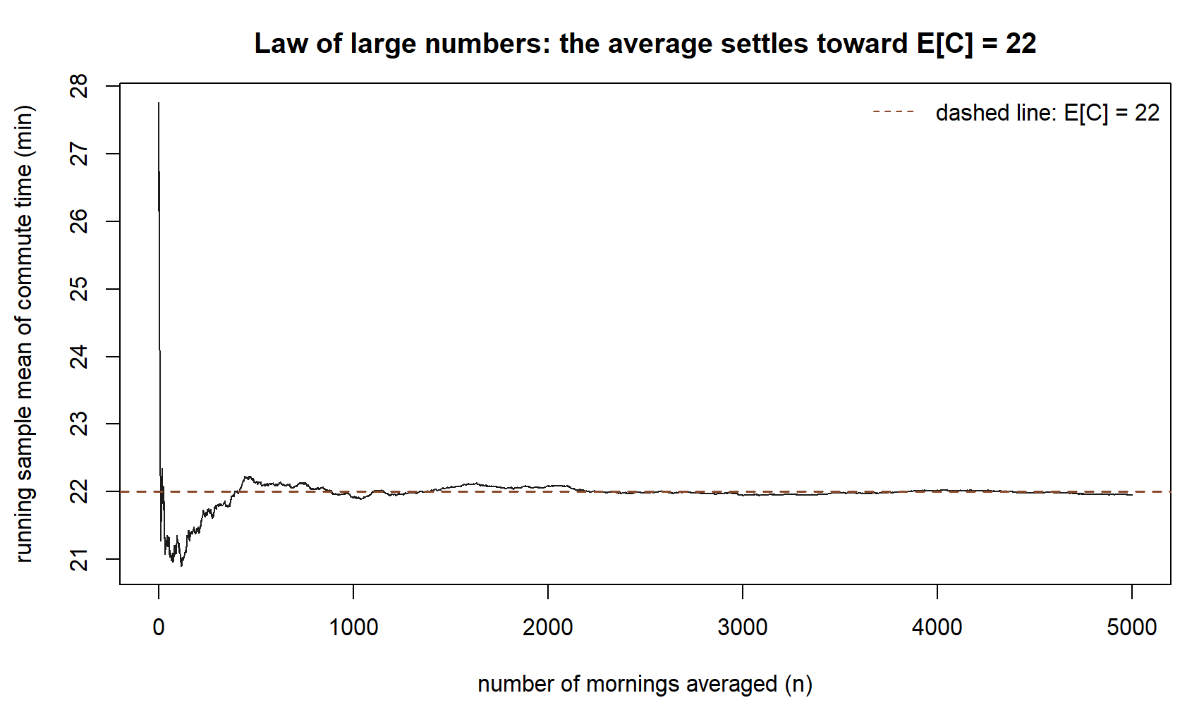
At \(n=10\) mornings the running mean sits at about \(22.2\); by \(n=1{,}000\) it is at about \(21.9\); by the full \(n=5{,}000\) it has settled to about \(21.9\) — each step closer to, and staying near, the dashed line. Because the chunk fixes set.seed(35003), running it in your own session reproduces this exact curve; what the LLN guarantees in general (for any seed) is the shape — wild at first, then flat near \(22\) — not this specific sequence of numbers.
Step 2 — Build a crowd of sample means of a fixed size (CLT, part one)
Now switch from one growing sample to many independent samples, each of the same fixed size \(n\). From each sample you keep only one number: its mean. Collecting many such means gives you a sample of sample means, and the CLT is a statement about the shape of that collection.
Drawing the means efficiently is a small base-R trick: put \(n \times m\) draws into a matrix with \(n\) rows and \(m\) columns, so each column is one sample of size \(n\), then take column means with colMeans.
set.seed(35003)
mu    <- 22
sigma <- 5

n <- 30        # size of each sample (number of mornings per "week-and-a-half")
m <- 10000     # how many independent samples we draw

# Each COLUMN of this matrix is one independent sample of n commute times.
draws <- matrix(rnorm(n * m, mean = mu, sd = sigma), nrow = n, ncol = m)

# One sample mean per column -> a crowd of m sample means.
sample_means <- colMeans(draws)

length(sample_means)   # m = 10000 sample means
mean(sample_means)     # a statistic: the average OF the sample means (near 22)
head(sample_means, 5)  # five individual sample means -- each one wiggles around 22
Each entry of sample_means is one \(\bar C_n\) — the average commute over \(n = 30\) simulated mornings. No two are identical, because each used a fresh draw of \(30\) mornings; that is the sense in which the sample mean is itself random. Their average, mean(sample_means), sits very close to \(22\), which is reassuring: the sample mean is centered on the parameter it is estimating. But centering is only half the story — the CLT also tells us the shape and the spread of this crowd, which is what the next step inspects.
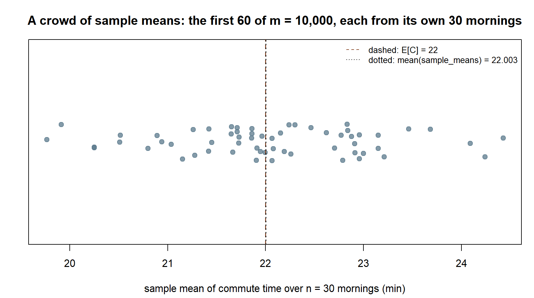
This is the “crowd” the CLT is a statement about: not commute times themselves, but sample means built from 30 commute times at a time. The dashed line at \(22\) and the dotted line at mean(sample_means) \(\approx
22.003\) are nearly on top of each other — the crowd is centered right where the parameter says it should be. What the picture does not yet show is how tightly the crowd clusters around that center; Step 3 puts a number and a curve on exactly that.
Step 3 — Histogram the means and compare the spread to the theory (CLT, part two)
Histogram the crowd of sample means and lay the theoretical curve over it. The CLT predicts that for a sample of size \(n\), the sample mean is approximately \(\text{Normal}\!\left(22,\ 5/\sqrt{n}\right)\). The center should be about \(22\); the width — the standard deviation of the sample means, often called the standard error — should be about \(5/\sqrt{n}\). Compute the simulated spread directly with sd(sample_means) and compare it to the theoretical \(5/\sqrt{n}\).
set.seed(35003)
mu    <- 22
sigma <- 5
n <- 30
m <- 10000

draws        <- matrix(rnorm(n * m, mean = mu, sd = sigma), nrow = n, ncol = m)
sample_means <- colMeans(draws)

# The two numbers to compare:
theory_se <- sigma / sqrt(n)   # predicted spread of the sample means: 5 / sqrt(30)
sim_se    <- sd(sample_means)  # simulated spread, straight from the data

theory_se                      # what the CLT predicts
sim_se                         # what the simulation produced -- should be close

# Histogram of the sample means with the predicted Normal curve drawn on top.
hist(sample_means, breaks = 40, freq = FALSE,
     xlab = "sample mean of commute time over n = 30 mornings (min)",
     main = "CLT: sample means are ~ Normal(22, 5/sqrt(n))")
curve(dnorm(x, mean = mu, sd = theory_se), add = TRUE, lwd = 2)
abline(v = mu, lty = 2)        # the parameter E[C] = 22, where the crowd is centered
You should see a tidy bell sitting over \(22\), with the overlaid Normal curve tracking the histogram closely, and sim_se landing very near theory_se. The histogram is the empirical distribution of the statistic \(\bar C_n\); the smooth curve is the CLT’s predicted distribution for it. When they match, you have seen the central limit theorem rather than merely been told it.
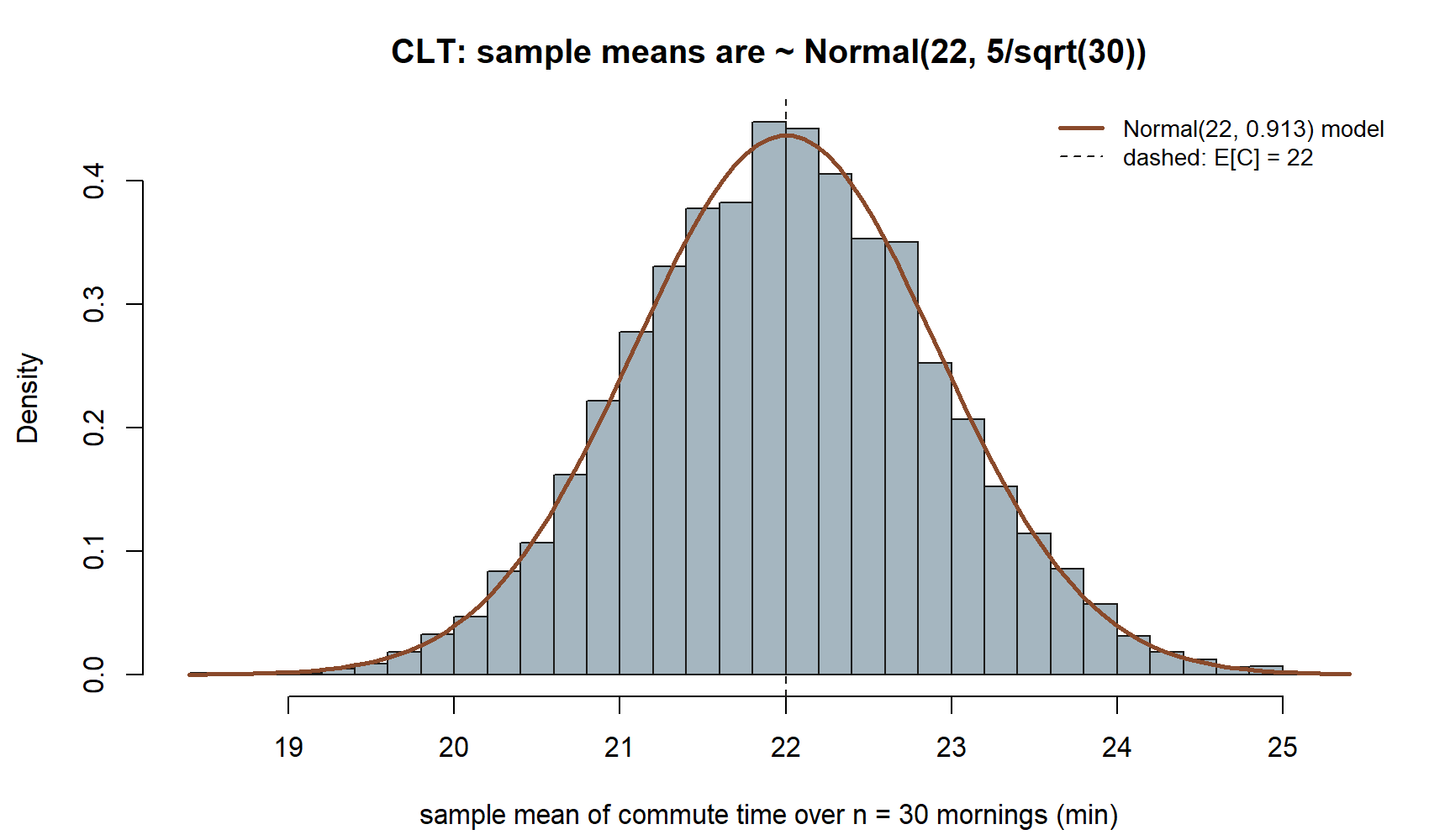
Numerically, theory_se \(=5/\sqrt{30}\approx 0.913\) and sim_se \(\approx 0.917\) in this run — close enough that the smooth curve and the bars in the figure are almost indistinguishable. That agreement, not just the bell shape, is the CLT’s real content: it predicts the width of the crowd, not only that the crowd is bell-shaped.
(In this particular lab the per-morning commute is already Normal, so the sample means are essentially exactly Normal at every \(n\) — a clean case for reading off the spread. The deeper claim of the CLT, which you can explore on your own, is that the bell shape emerges even when the thing you average is not Normal, as long as \(n\) is reasonably large. Try replacing rnorm with draws from a skewed shape and watch the crowd of means turn bell-shaped anyway.)
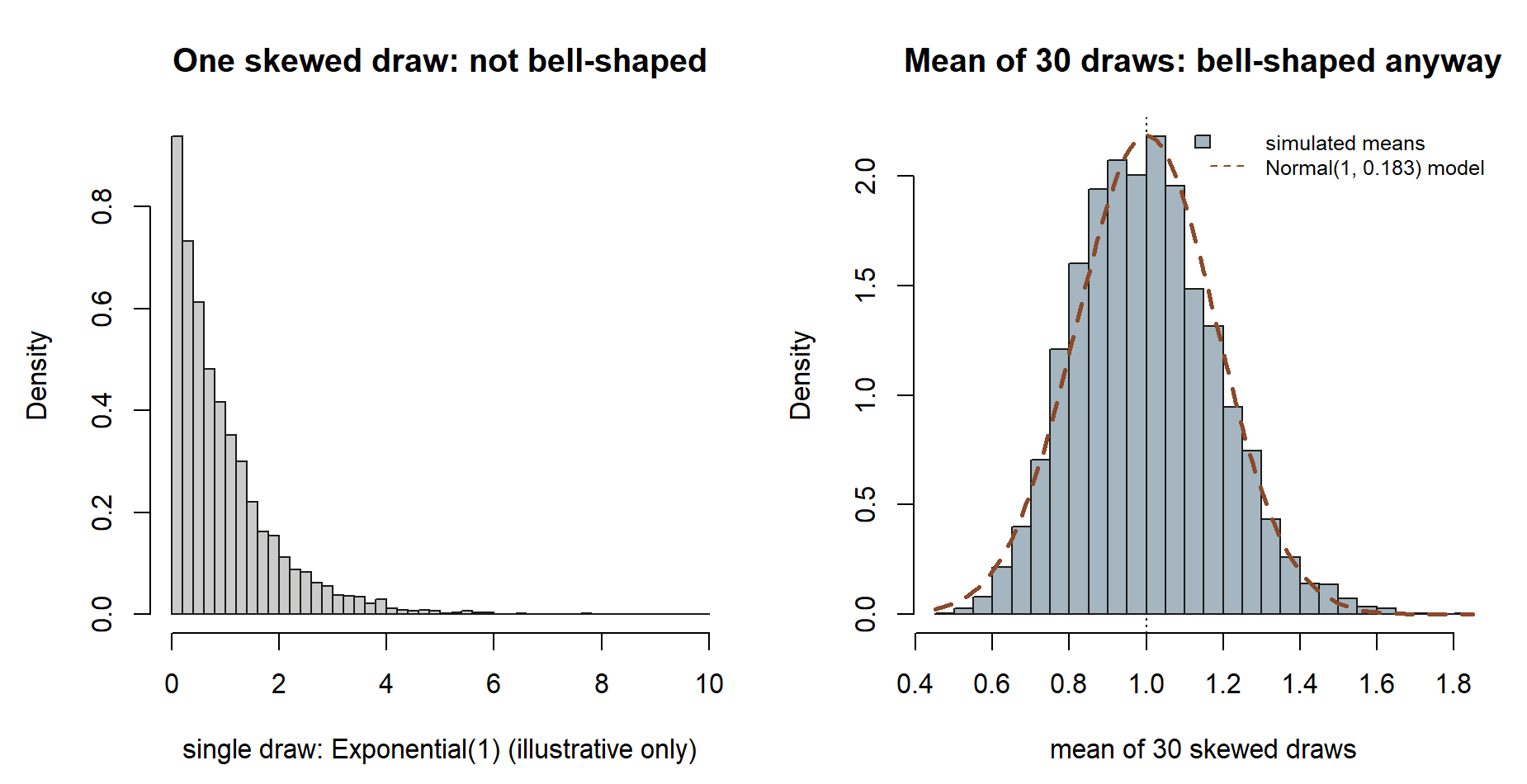
rnorm. Left: a single draw is heavily skewed, nothing like a bell. Right: the mean of 30 such draws is already close to bell-shaped, tracking a \(\text{Normal}(1,\ 1/\sqrt{30})\) curve. Synthetic; seed 35003.
Notice what stayed the same and what changed: the shape you average (badly skewed, on the left) has nothing to do with the shape of the average (bell-shaped, on the right) once \(n=30\) is large enough. That is the CLT’s universality — it does not require the per-observation distribution to be Normal, only that you are averaging enough of them. (This particular skewed example is a generic illustration for this exercise, not part of the recurring commuter’s-morning model.)
Step 4 — Shrink the spread by growing the sample size
The CLT’s \(5/\sqrt{n}\) has a \(\sqrt{n}\) in the denominator, so larger samples give narrower crowds of means: more mornings per sample means each sample mean is a better-pinned estimate of \(22\). Loop over a few sample sizes and watch the simulated spread fall in lockstep with the theoretical \(5/\sqrt{n}\).
set.seed(35003)
mu    <- 22
sigma <- 5
m     <- 10000

for (n in c(5, 30, 100, 400)) {
  draws        <- matrix(rnorm(n * m, mean = mu, sd = sigma), nrow = n, ncol = m)
  sample_means <- colMeans(draws)

  theory_se <- sigma / sqrt(n)
  sim_se    <- sd(sample_means)

  cat("n =", n,
      "| theoretical 5/sqrt(n) =", round(theory_se, 3),
      "| simulated sd of means =", round(sim_se, 3),
      "| center =", round(mean(sample_means), 3), "\n")
}
As \(n\) goes from \(5\) to \(400\), the theoretical spread \(5/\sqrt{n}\) falls from \(5/\sqrt{5} \approx 2.24\) down to \(5/\sqrt{400} = 0.25\), and the simulated sd of the means tracks it the whole way. The center stays glued to \(22\) throughout — growing \(n\) does not move the target, it only sharpens the aim. That single denominator is why “more data” buys you precision: to halve the spread of your average you need four times as many observations, because \(\sqrt{n}\), not \(n\), is doing the work.
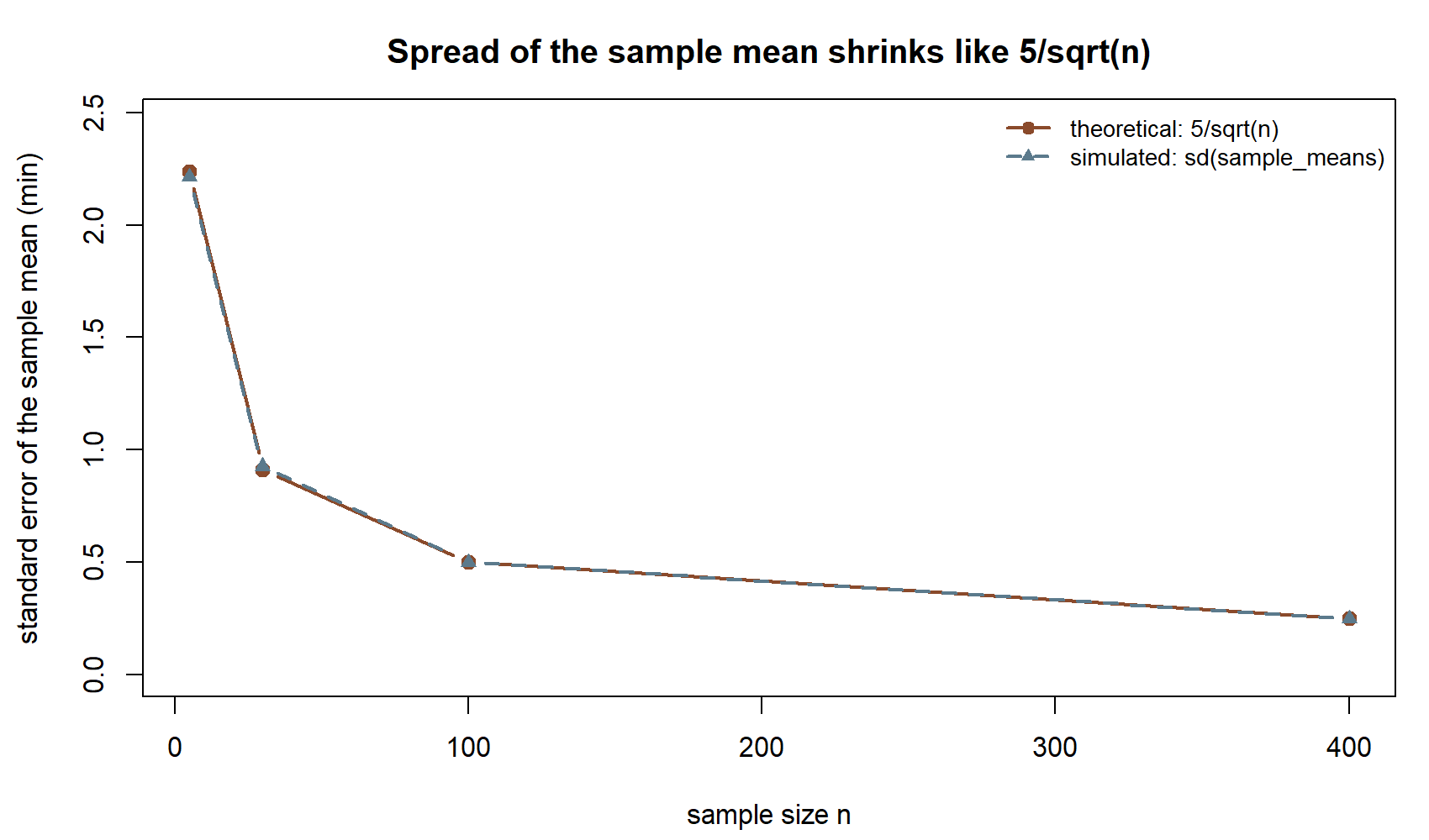
The two curves sit almost exactly on top of each other at every \(n\) — the simulated spread is not just falling, it is falling at the rate the formula predicts. Notice the curve is steep between \(n=5\) and \(n=30\) and much flatter between \(n=100\) and \(n=400\): the first handful of extra mornings buys you far more precision than the same number of extra mornings does later on, because it is \(\sqrt{n}\), not \(n\), in the denominator.
Verify
Run the four steps in your own session (with set.seed(35003)) and check each of these. They are quick, ungraded sanity checks — if any one fails, re-read the step it belongs to before moving on.
The stream is centered right. In Step 1,
tail(running_mean, 1)(the average over all \(5000\) mornings) should sit very close to \(22\). If it is far off, confirm you passedsd = 5tornormand notsd = 25.The running mean settles, it does not freeze. The Step 1 plot should be jagged on the left and flat on the right, hugging the dashed line at \(22\) — not a flat line from the start (that would mean you forgot the running average) and not still wild on the right (that would mean too short a stream).
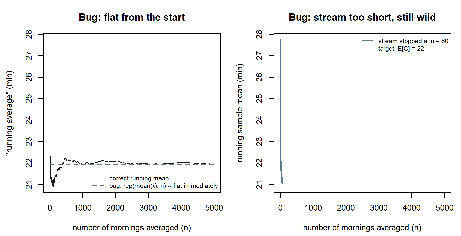
Figure 7: Both named failure modes, rendered so you can recognize them if your own plot looks like this. Left: the bug of forgetting the running average entirely and instead plotting the single overall mean, flat from the very first point. Right: the bug of stopping the stream too early (\(n=60\) instead of \(5{,}000\)), so the curve is still visibly wild at the right edge. Synthetic; seed 35003. If your own Step 1 plot looks like the flat dashed line in the left panel, you likely computed the overall
mean(x)once and repeated it, instead ofcumsum(x) / seq_along(x). If it looks like the short, still-wild line in the right panel, your stream is too short to show settling — increasen_stream.The crowd is centered on the parameter. In Step 2,
mean(sample_means)should be near \(22\). This is the statistic (the average of your sample means) closing in on the parameter \(E[C] = 22\).Simulated spread matches theory. In Step 3,
sim_seandtheory_seshould agree to about two decimal places. For \(n = 30\) both should be near \(5/\sqrt{30} \approx 0.913\).The spread shrinks like \(5/\sqrt{n}\). In Step 4, the two columns of numbers should move together as \(n\) grows, and the center should stay near \(22\) for every \(n\).
You can say it cleanly. Finish by writing one sentence for each theorem. A good LLN sentence: “The sample mean \(\bar C_n\) converges to the parameter \(E[C] = 22\) as \(n\) grows.” A good CLT sentence: “For large \(n\), the sample mean is approximately \(\text{Normal}(22,\ 5/\sqrt{n})\), narrowing as \(n\) grows.” Notice that both sentences name \(\bar C_n\) as the moving statistic and \(22\) as the fixed parameter — that distinction is the whole lesson.
AI use note
If you use an AI assistant while working through this lab, treat it as a study partner whose output you always check against the running code and the printed numbers — never as the source of truth. Disclose use where your course or assignment asks you to. Everything an assistant suggests here is verifiable in seconds by running the chunk and reading the result, so verify before you trust.
| Tool | Purpose | Verification |
|---|---|---|
| AI coding assistant | Explain what cumsum(x) / seq_along(x) computes step by step |
Run it on a tiny vector like 1:4 and confirm the partial averages by hand |
| AI coding assistant | Suggest a base-R way to histogram the sample means and overlay a Normal curve | Run the chunk; check the curve tracks the bars and the histogram centers on 22 |
| AI chat assistant | Restate the LLN and CLT in plain words | Compare its statement to the Week 13 note; confirm it keeps the sample mean (statistic) distinct from \(E[C]\) (parameter) and uses spread \(5/\sqrt{n}\) |
| AI chat assistant | Explain why the spread of the means is \(5/\sqrt{n}\) and not \(5/n\) | Recompute sd(sample_means) at two sample sizes and check it falls like \(1/\sqrt{n}\), not \(1/n\) |
See also
- Week 13 — Sums, simulation & limit behavior — the companion note stating the LLN and CLT in words and symbols.
- Lab 02 — Monte Carlo basics — where the simulate-many-times-and-summarize habit started; this lab is its limit-theorem payoff.
- Distribution reference — the Normal’s mean–standard-deviation parameterization and how it maps to
rnorm. - R and Quarto setup — getting a reproducible session running with
set.seedso your stream matches this page.
The graded deliverable, its rubric, and due date live in Blackboard (the LMS) — this page is study and practice only.