set.seed(35103)

n_reps   <- 10000   # number of simulated samples
n        <- 36       # sample size, matching the MAC Study visit-duration sample
true_mu  <- 48        # hypothetical true mean -- teaching device only
true_sd  <- 15        # hypothetical true SD -- teaching device only

xbar_values <- replicate(n_reps, {
  one_sample <- rnorm(n, mean = true_mu, sd = true_sd)
  mean(one_sample)
})

mean(xbar_values)  # should be close to 48
sd(xbar_values)    # should be close to 2.5
hist(xbar_values, breaks = 40)Week 2 — Sampling distributions and simulation
What happens to x̄ if you could draw the sample over and over again
The week question
If you took a sample of n values and computed the mean, you would get one number. If you took a different sample of the same size from the same world, you would get a different number. So: if you could repeat this process over and over, what would the collection of all those sample means look like? That collection has its own distribution — a sampling distribution — and this week is about understanding what that distribution is, why it has the shape it has, and how simulation lets you watch it take shape instead of only writing down its formula.
Why this matters
Almost everything later in this course — confidence intervals (Week 7), hypothesis tests (Week 8), power (Week 9), the bootstrap (Week 10) — depends on knowing how a sample statistic such as x̄ or p̂ behaves across hypothetical repeated samples. None of those later tools make sense unless you first accept a strange-sounding idea: a statistic computed from one sample is itself a random variable, because a different sample would have given a different value. The sampling distribution is the probability distribution of that random variable. Once you can picture it, standard errors, margins of error, and p-values stop being arbitrary formulas and become statements about how much a statistic would bounce around under repeated sampling.
Learning goals
By the end of this week you should be able to:
- State, in your own words, what a sampling distribution is and how it differs from (a) the distribution of one observation and (b) the distribution of the data in a single sample.
- Derive the mean and standard error of x̄ for a sample of independent draws from a Normal(μ, σ) world, and explain the role of
nin shrinking that standard error. - Explain how simulation (repeated resampling from a known world) allows you to approximate a sampling distribution empirically, and connect that to the exact derivation.
- Distinguish a hypothetical “true” population used only as a teaching device from the sample data an analyst actually has in hand.
Core vocabulary
- Statistic. A number computed from sample data (for example x̄, the sample mean, or s, the sample standard deviation). Because the sample varies, the statistic varies too.
- Sampling distribution. The probability distribution of a statistic across all the samples of a given size that could have been drawn from the same population.
- Standard error, SE(x̄). The standard deviation of the sampling distribution of x̄ — a measure of how much x̄ would typically vary from sample to sample.
- Simulation. Using a computer to draw many samples from a specified (assumed or hypothetical) population, compute the statistic on each one, and look at the resulting collection of statistic values as a stand-in for the true sampling distribution.
- Known-σ teaching simplification. Treating the population standard deviation σ as if it were known, so the sampling-distribution math is clean. This course uses that simplification through Week 9 and states it explicitly whenever it is in force.
Concept development
From one observation to one sample to one statistic
Start with a single MAC visit duration for one student in a given week. If you believe that duration behaves like a draw from Normal(μ, σ), then any one student’s duration is itself a random variable — it could come out higher or lower than μ, subject to the spread governed by σ.
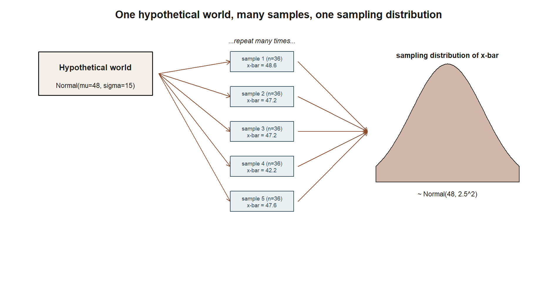
Now take a whole sample of n such visits, say n = 36, and compute the sample mean x̄ of those 36 numbers. x̄ is a single number computed from data you actually have. But notice: if a different set of 36 students had been sampled that week, you would have gotten 36 different numbers, and therefore a different x̄. x̄ is itself a random variable — its value depends on which sample happened to be drawn. The probability distribution that describes how x̄ varies across all the possible samples of size 36 is the sampling distribution of x̄.
This is the conceptual jump this week asks you to make: a sample statistic is not a fixed fact about the world. It is a random quantity with its own distribution, and that distribution is narrower than the distribution of a single observation, because averaging cancels out some of the individual noise.
A hypothetical true world, used only as a teaching device
To derive the sampling distribution of x̄ exactly, you need to stipulate a population — you need to say what μ and σ actually are. In real analysis you never know these values; that is exactly why inference exists. But for this one week (and again in Week 9, and in the Week 4 shrinkage-estimator example), the course uses a hypothetical “true” world purely as a teaching device, clearly flagged as such and never claimed to be a known fact about actual MAC visits:
Hypothetical, for teaching only: suppose MAC visit duration (in minutes), for a student who visits in a given week, truly follows Normal(μ = 48, σ = 15). This is a stipulated backdrop, not a known truth — real analysis never gets to assume μ and σ this way.
With that hypothetical world stipulated, you can ask a clean question: if you repeatedly drew samples of n = 36 visit durations from Normal(48, 15) and computed x̄ each time, what would the distribution of those x̄ values look like?
Deriving the sampling distribution of x̄
For independent draws X₁, X₂, …, X₃₆, each Normal(μ, σ), with sample mean x̄ = (1/n)Σxᵢ, two standard facts combine:
- The mean of the sampling distribution of x̄ equals the population mean: E[x̄] = μ. Averaging does not systematically push the statistic up or down — it is centered on the same value as the population.
- The spread of the sampling distribution shrinks with sample size. The standard error is \[SE(\bar{x}) = \frac{\sigma}{\sqrt{n}}.\] Larger samples average out more of the individual noise, so x̄ clusters more tightly around μ as
ngrows. - Because a sum (and hence a scaled average) of independent Normal random variables is itself Normal, the entire distribution of x̄, not just its mean and SE, is Normal: \[\bar{x} \sim \text{Normal}\!\left(\mu, \left(\frac{\sigma}{\sqrt{n}}\right)^2\right).\]
Plugging in the hypothetical world’s μ = 48 and σ = 15, with n = 36: \[SE(\bar{x}) = \frac{\sigma}{\sqrt{n}} = \frac{15}{\sqrt{36}} = \frac{15}{6} = 2.5.\]
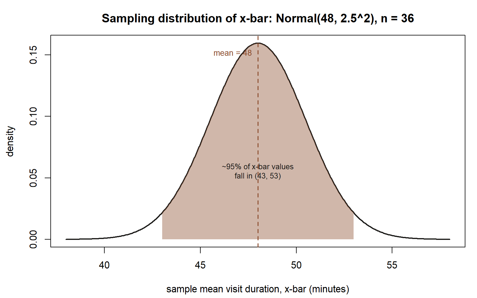
So under this hypothetical world, \[\bar{x} \sim \text{Normal}(48,\ 2.5^2).\]
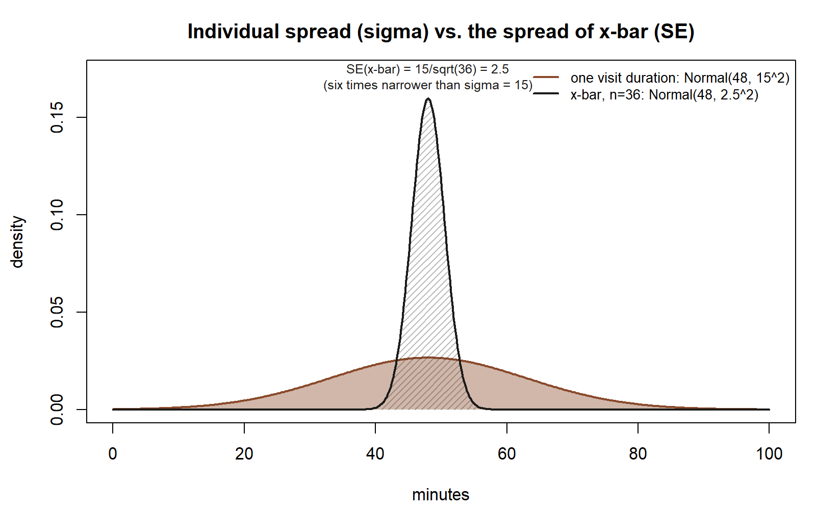
That is a complete description of the sampling distribution: it says x̄ is centered at 48, and it says how tightly x̄ clusters around 48 — about two-thirds of hypothetical repeated samples would give an x̄ within 2.5 minutes of 48 (that is, roughly between 45.5 and 50.5), and about 95% would fall within 2 × 2.5 = 5 minutes of 48 (roughly 43 to 53). Compare that to the spread of a single visit duration, which has standard deviation σ = 15 — six times wider. Averaging 36 visits together has shrunk the spread by a factor of √36 = 6.
Watching it happen: simulation as a second way of seeing the same distribution
The derivation above is exact, but it can feel abstract on first encounter. Simulation offers a second, complementary way to arrive at the same picture — one you can literally watch unfold rather than only prove.
The idea: instead of deriving the sampling distribution with algebra, you generate it empirically.
- Draw one simulated sample of n = 36 values from Normal(48, 15) (the hypothetical world).
- Compute x̄ for that one simulated sample; record it.
- Repeat steps 1–2 many times — say, 10,000 times — each time drawing a fresh sample of 36 and recording its x̄.
- Look at the resulting collection of 10,000 x̄ values: plot a histogram of them.
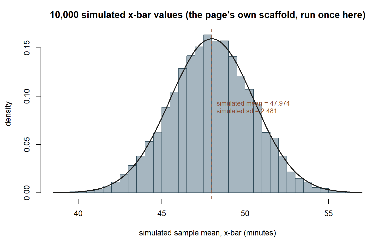
If the derivation above is correct, that histogram should look approximately Normal, centered near 48, with a spread whose standard deviation is close to 2.5. The more repetitions you run, the closer the simulated picture matches the exact derived distribution — simulation is an approximation that converges to the true sampling distribution as the number of repeated samples grows.
This is the point of simulation-based inference as a teaching tool: it lets you see a sampling distribution build up, draw by draw, rather than accepting its shape purely on faith in an algebraic argument. It also generalizes to situations where the exact algebra is hard or unavailable — you can simulate a sampling distribution for almost any statistic, from almost any population, as long as you can describe how to draw one sample and compute the statistic on it. The bootstrap (Week 10) and the permutation test (Week 11) both reuse this same “repeat, compute, collect” logic, just resampling from data in hand instead of from a hypothetical population.
Two kinds of numbers, and why you must not mix them
This week uses a hypothetical true population (μ = 48, σ = 15) purely so the sampling-distribution machinery has something concrete to run on. That is different from the sample data in hand — the actual n = 36 MAC visits this course tracks all term, with sample mean x̄ = 49.8 minutes and sample SD s = 15.2 minutes. Starting in Week 3, the course stops assuming a known population and instead works forward from that real sample toward unknown μ, exactly as a real analyst would — never peeking at a “true” value, because in real analysis there isn’t one to peek at. Keeping these two kinds of numbers straight — the hypothetical backdrop used only to teach the mechanics, versus the actual data used for real estimation — matters for the rest of the course.
Worked examples
Worked example — the MAC Study sampling distribution of x̄
Symbolic form. For independent draws from Normal(μ, σ), the sampling distribution of the mean of a sample of size n is \[\bar{x} \sim \text{Normal}\!\left(\mu, \left(\frac{\sigma}{\sqrt{n}}\right)^2\right), \qquad SE(\bar{x}) = \frac{\sigma}{\sqrt{n}}.\]
Numeric form. Using the hypothetical true world flagged above — Normal(μ = 48, σ = 15) — and n = 36: \[SE(\bar{x}) = \frac{15}{\sqrt{36}} = \frac{15}{6} = 2.5.\] \[\bar{x} \sim \text{Normal}(48,\ 2.5^2).\]
So if you repeatedly drew samples of 36 visit durations from this hypothetical world, the resulting x̄ values would cluster in a bell shape centered at 48 minutes, with about 95% of them falling within roughly 5 minutes of 48 (using the rough two-SE rule), i.e., between about 43 and 53 minutes.
A base-R sketch of the simulation described above — shown as teaching code, not executed in this build:
This chunk is shown but not executed on this page (eval: false) — running it yourself is the point. Running it (in your own R session) would produce a histogram of 10,000 simulated x̄ values that looks approximately Normal, centered near 48, with a spread close to 2.5 — the simulated picture converging on the exact derived sampling distribution above. The figure below reproduces exactly that (same seed, same n_reps), run once here so you can check a prediction against a real result:
Worked example — transfer: a manufacturing line’s batch-mean weights (synthetic)
Synthetic example, not from the MAC Study; numbers invented for illustration only.
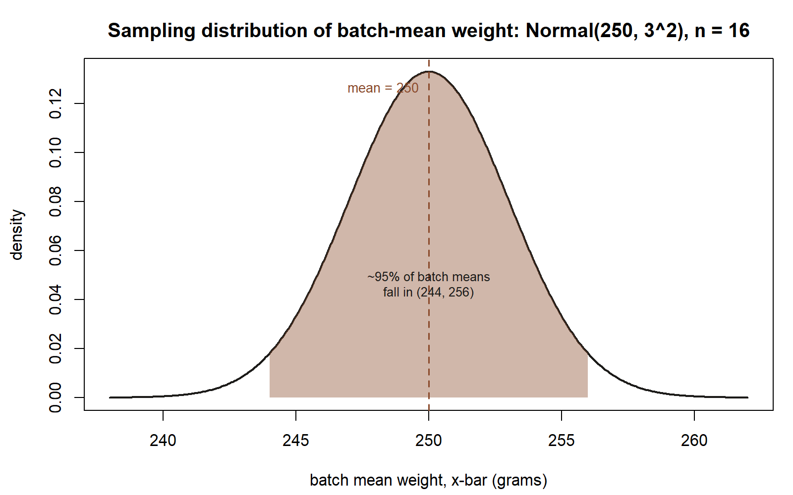
A production line packages batches of a component, and quality control weighs every unit in a batch, then records the batch’s mean weight. Suppose — purely as a stipulated, hypothetical teaching backdrop — that an individual unit’s weight (in grams) follows Normal(μ = 250, σ = 12), and a quality-control batch consists of n = 16 units.
Symbolic form (same result as above, applied to this new context): \[SE(\bar{x}) = \frac{\sigma}{\sqrt{n}}, \qquad \bar{x} \sim \text{Normal}\!\left(\mu, \left(\frac{\sigma}{\sqrt{n}}\right)^2\right).\]
Numeric form: \[SE(\bar{x}) = \frac{12}{\sqrt{16}} = \frac{12}{4} = 3.\] \[\bar{x} \sim \text{Normal}(250,\ 3^2).\]
So across many hypothetical batches of 16 units each, the batch mean weight would cluster around 250 grams, with about 95% of batch means falling within roughly 6 grams of 250 (that is, between about 244 and 256 grams) — far tighter than the spread of an individual unit’s weight, whose standard deviation is 12 grams. Exactly as in the MAC Study example, simulating many batches (drawing 16 simulated unit weights, averaging them, repeating thousands of times, and plotting a histogram of the batch means) would let you see this Normal(250, 3²) shape emerge, rather than only deriving it.
A common mistake
A very common confusion is treating the standard deviation of the data (σ, the spread of individual observations) as if it were the same thing as the standard error of the mean (SE(x̄), the spread of the sampling distribution of x̄). See the comparison figure above, in Deriving the sampling distribution of x̄, for exactly this contrast drawn out: two curves sharing a center but very different widths. They are related by SE(x̄) = σ/√n, but they answer different questions: σ describes how much one observation varies; SE(x̄) describes how much the average of n observations would vary if you resampled the whole batch of n again. Confusing the two makes people think a sample mean is just as noisy as a single observation, which badly overstates the uncertainty in x̄ once n is reasonably large. A second, related mistake is to think the sampling distribution describes “the data” — it does not; it describes the statistic (here, x̄) computed across hypothetical repeated samples of the data, which is a different object with a different (narrower) spread than the data itself.
Low-stakes self-checks (ungraded)
- If the hypothetical world’s σ were 30 instead of 15 (holding n = 36 fixed), what would SE(x̄) become? What would happen to the width of the sampling distribution of x̄?
- If instead n were increased to 144 (holding σ = 15 fixed), what would SE(x̄) become? Explain in words why quadrupling the sample size (36 → 144) only cuts the standard error in half rather than to a quarter.
- In the manufacturing transfer example, suppose batch size were n = 4 instead of 16 (holding σ = 12 fixed). Recompute SE(x̄) and describe, in a sentence, how the sampling distribution’s spread compares to the n = 16 case.
- In your own words, explain the difference between “the distribution of one visit duration” and “the sampling distribution of x̄ across samples of 36 visit durations.” Why is the second one narrower?
Reading and source pointer
This week’s spine reading is MIT OCW 18.05’s treatment of sampling distributions, which grounds the derivation of the mean and standard error of x̄ above and the Normal shape that follows from averaging independent Normal draws. Because this week’s center is simulation-based thinking, it is also genuinely supported by ModernDive’s simulation-based inference framing: ModernDive builds intuition for a sampling distribution by describing a repeated process of drawing a sample, computing a statistic, and collecting many such statistic values into a distribution you can visualize — in words, exactly the “draw many samples, keep the x̄ each time, look at the collection” idea developed above. This course keeps its base-R-only house style for every shown chunk (see the simulation code above using replicate(), rnorm(), and mean()), rather than ModernDive’s own infer-package pipeline (specify() / hypothesize() / generate() / calculate()); the underlying idea is the same, described here in words and shown in base R. These notes are the course’s own synthesis, grounded in but not copied from the sources.
- MIT OCW 18.05 — Introduction to Probability and Statistics — https://ocw.mit.edu/courses/18-05-introduction-to-probability-and-statistics-spring-2022/
- ModernDive — Statistical Inference via Data Science — https://moderndive.com/v2/
Public vs. graded
These notes, the examples, and the practice here are public and ungraded — study material only. No graded prompts, answer keys, rubrics, point values, or due dates appear on this site. Graded inference checkpoints, quizzes, homework, labs, the midterm, the project, and the final live in Blackboard (the LMS), which is authoritative for due dates, submissions, and grades. If this page and Blackboard ever disagree, follow Blackboard.
Looking ahead
Week 3 moves from this week’s hypothetical-true-world teaching device to the real situation an analyst actually faces: μ and π are unknown, and you must estimate them and their standard errors from the sample data in hand — the n = 36 visit-duration sample (x̄ = 49.8, s = 15.2) and the n = 100 usage-rate survey (p̂ = 0.38). The same SE = σ/√n logic derived this week reappears there, now applied to real estimation rather than a stipulated backdrop.