set.seed(35103)Lab 2 — Simulating sampling distributions
Watching x̄ ~ Normal(48, 2.5²) happen, instead of just writing it down
Purpose. Week 2’s note (see Week 2 — Sampling distributions and simulation) derives that, under the hypothetical true world Normal(μ = 48, σ = 15), the sampling distribution of the mean of n = 36 MAC visit durations is approximately Normal(48, 2.5²), where 2.5 = σ/√n = 15/√36 = 15/6. That claim is a statement about infinitely many hypothetical samples you will never actually collect. This lab makes it concrete by simulating a large but finite number of samples yourself, computing the mean of each one, and looking at what the resulting collection of means actually looks like — its center, its spread, and its shape — next to the theoretical curve the note derived. You are not proving the claim here; you are watching it happen.
The idea
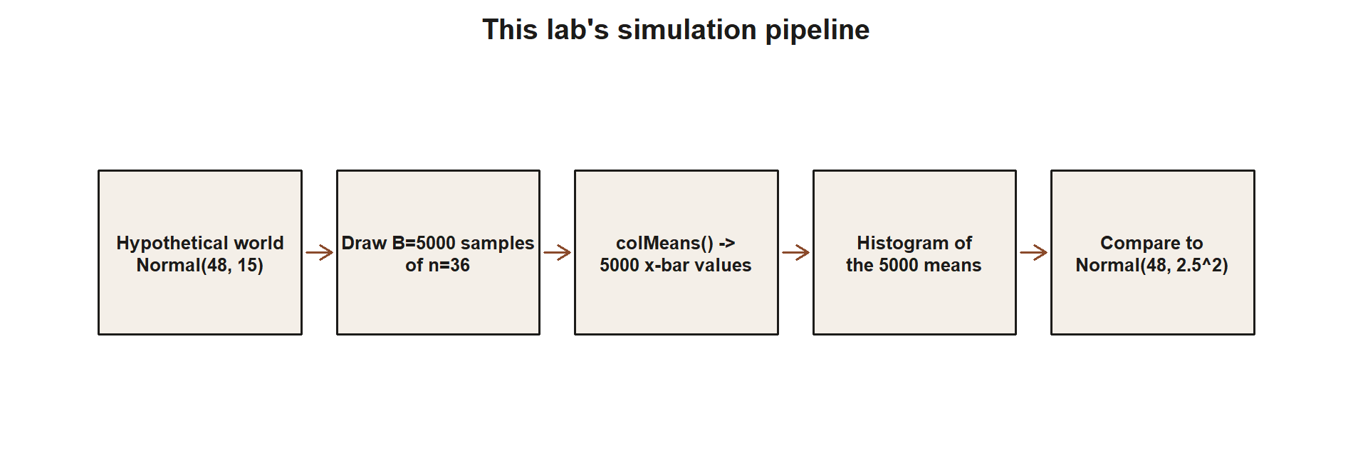
A sampling distribution is the distribution of a statistic (here, x̄) across repeated samples from the same world. You can never actually take infinitely many repeated samples of real MAC visits — you get one sample, once. But a computer can pretend to be the hypothetical true world as many times as you like, because Normal(μ = 48, σ = 15) is a world you get to fully specify yourself. This lab uses that trick: it draws many independent samples of size n = 36 from Normal(48, 15), computes the mean of each simulated sample, and then looks at the distribution of those means. If the Week 2 derivation is right, this simulated distribution of means should end up centered near 48 with a standard deviation near 2.5, and its shape should look Normal. The sample data in hand from the real MAC survey (x̄ = 49.8, n = 36) is never used inside the simulation itself — the simulation only ever draws from the hypothetical true world, exactly as flagged in the note. Comparing the simulated distribution to the theoretical Normal(48, 2.5²) curve is the whole point: it turns an algebraic formula (σ/√n) into something you can see settle into place as the number of simulated samples grows.
This is also a place where the course’s simulation-based framing (informed by ModernDive’s emphasis on seeing a sampling distribution by resampling) meets the course’s base-R-only convention (§5 of the build conventions): the idea of “generate many samples, compute a statistic from each, look at the resulting distribution” is exactly ModernDive’s simulation-based inference framing, but every step below is shown with base R (rnorm(), a loop or replicate(), mean()) rather than the infer package’s specify() / generate() / calculate() pipeline.
Goal
By the end of this lab you should be able to:
- Write base-R code that draws
Bindependent random samples of sizenfrom a specified Normal world. - Compute the sample mean of each simulated sample and collect the results into a single vector of length
B. - Summarize that vector (mean, SD) and compare the summary numbers to the theoretical mean and standard error from the Week 2 derivation.
- Plot a histogram of the simulated means and overlay the theoretical Normal density, and describe in words how the two compare.
Setup
You will need base R only — no packages beyond what ships with R. Before you run anything below in your own session (remember: in this build the chunks are shown, not executed, so you will run them yourself later), set your seed so your results match the ones described here:
Keep this set.seed(35103) call at the top of your script, before you draw any random numbers. If you re-run the whole script from the top with the same seed, you will get the same simulated numbers every time — that is what “reproducible” means in a simulation context, and it is why every simulation chunk in this course carries the same seed.
Recall from the Week 2 note the two numbers that anchor this whole lab, both hypothetical-world quantities, never the real sample facts:
- Hypothetical true world: Normal(μ = 48, σ = 15) — a stipulated truth used only for this teaching device.
- Sample size: n = 36 (matching the size of the real MAC visit-duration sample, so the comparison to that sample’s standard error is apples to apples).
- Theoretical sampling distribution of x̄, from the Week 2 derivation: Normal(48, 2.5²), since SE(x̄) = σ/√n = 15/√36 = 15/6 = 2.5.
Steps
Step 1 — Simulate B = 5000 samples of size 36 from Normal(48, 15)
The core idea is to draw not one sample of 36 values, but many independent samples of 36 values each, all from the same hypothetical true world. A convenient way to organize this in base R is to draw one long vector of B * n values, then arrange it into a matrix with n rows and B columns, so that each column is one simulated sample of size 36.
set.seed(35103)

mu_true    <- 48
sigma_true <- 15
n          <- 36
B          <- 5000

# One long draw of B * n independent Normal(48, 15) values, reshaped so each
# column is one simulated sample of size n = 36.
sim_values  <- rnorm(B * n, mean = mu_true, sd = sigma_true)
sim_samples <- matrix(sim_values, nrow = n, ncol = B)
After this step, sim_samples is a 36-by-5000 matrix. Each of the 5000 columns is a separate, independent pretend sample of 36 MAC visit durations, drawn from the hypothetical Normal(48, 15) world — not from the real survey data, and not from each other.
Step 2 — Compute the sample mean of each simulated sample
Now collapse each column of sim_samples down to a single number: that column’s sample mean. Base R’s colMeans() does exactly this in one line, giving you a vector of 5000 simulated sample means — one x̄ value per pretend sample.
set.seed(35103)

xbar_sim <- colMeans(sim_samples)

length(xbar_sim)   # should be 5000
head(xbar_sim)      # first few simulated sample means
xbar_sim is now the object of interest for the rest of the lab: it is a simulated approximation to the sampling distribution of x̄. Each of its 5000 entries is what you would have gotten as your sample mean, had that particular pretend sample of 36 visits been the one you actually drew from the hypothetical true world.
Step 3 — Summarize the distribution and plot a histogram
With 5000 simulated means in hand, compute their mean and standard deviation, and compare both numbers to the theoretical values the Week 2 note derived: a mean at 48 and a standard error of 2.5.
set.seed(35103)

mean(xbar_sim)   # expect a number close to 48
sd(xbar_sim)     # expect a number close to 2.5

hist(xbar_sim,
     breaks = 40,
     freq   = FALSE,
     main   = "Simulated sampling distribution of x-bar (B = 5000, n = 36)",
     xlab   = "simulated sample mean")
This chunk is shown but not executed on this page (eval: false) — running it yourself in your own R session, with set.seed(35103) restored at the top, is the point of this lab. The figure below was produced by running exactly this simulation separately (same seed, same mu_true/sigma_true/n/B), so you can compare its shape and its printed mean(xbar_sim)/sd(xbar_sim) values to what you get when you run it yourself:
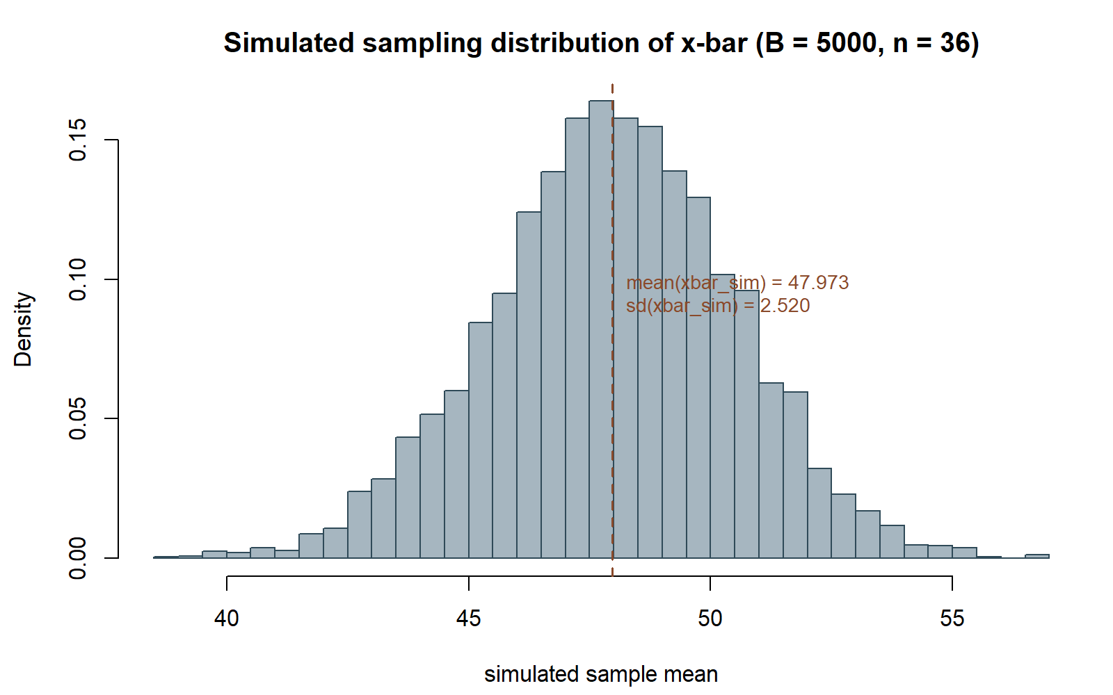
sd(xbar_sim) came out to 2.520, close to the theoretical SE of 2.5.
Because B = 5000 is large but finite, mean(xbar_sim) will not land on exactly 48, and sd(xbar_sim) will not land on exactly 2.5 — expect small simulation noise, typically numbers such as 47.9-something and 2.4-something-to-2.5-something, changing slightly if you rerun with a different seed or a different B. The point of the exercise is that these simulated numbers land close to the theoretical mean and SE, not that they match them digit for digit. The histogram itself, with freq = FALSE so it is on a density scale, should already look bell-shaped and centered near 48 even before you add the theoretical curve in Step 4.
Step 4 — Overlay the theoretical Normal(48, 2.5²) curve
Finally, draw the theoretical density curve for Normal(48, 2.5²) on top of the histogram, using base R’s dnorm() and curve(), so you can see directly how closely the simulated distribution tracks the formula from the Week 2 derivation.
set.seed(35103)

se_theoretical <- sigma_true / sqrt(n)   # 15 / 6 = 2.5

hist(xbar_sim,
     breaks = 40,
     freq   = FALSE,
     main   = "Simulated vs. theoretical sampling distribution of x-bar",
     xlab   = "simulated sample mean")

curve(dnorm(x, mean = mu_true, sd = se_theoretical),
      add = TRUE,
      lwd = 2)
This chunk is shown but not executed on this page (eval: false) — running it yourself is the point. The figure below was produced by running exactly this code separately (same seed, same xbar_sim as Step 3, same theoretical curve), so you can check whether the curve sits on your own histogram the way it sits on this one:
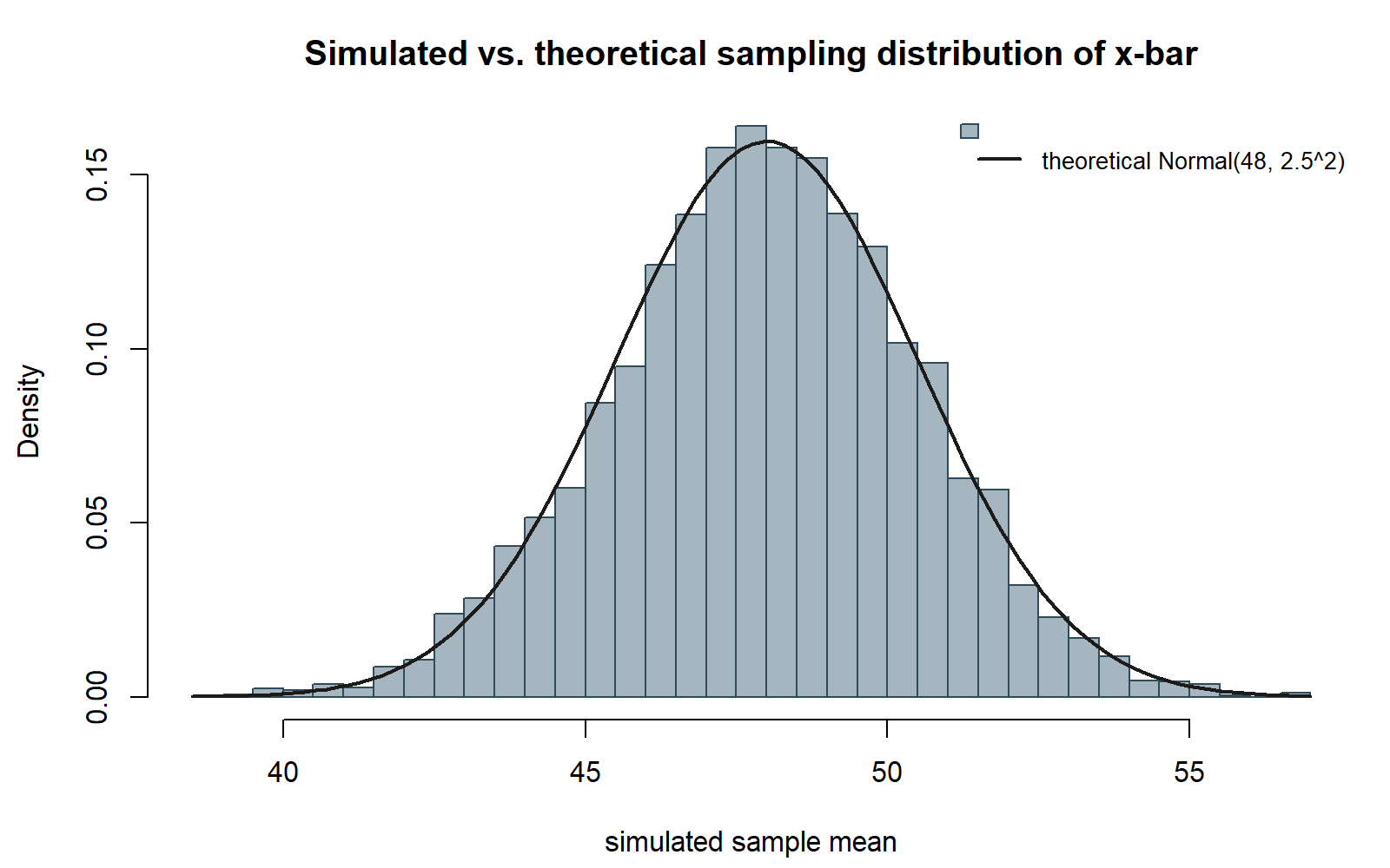
If the simulation and the theory agree, the smooth curve should sit almost exactly on top of the histogram’s bars, rising to a peak near x = 48 and falling off to near zero by roughly x = 40.5 and x = 55.5 (about three theoretical standard errors, 3 × 2.5 = 7.5, on either side of 48).
Verify
Before you consider this lab complete, check all of the following against your own output:
length(xbar_sim)equals 5000 — one simulated mean per simulated sample, no more and no fewer.mean(xbar_sim)is close to 48 (the hypothetical true μ), not close to 49.8 (the real sample’s x̄) — this simulation never touches the real MAC survey data, only the stipulated hypothetical world.sd(xbar_sim)is close to 2.5, matching σ/√n = 15/6 from the Week 2 derivation, not close to 15 (that would be the SD of a single observation, not of the sample mean).- The histogram from Step 3 looks unimodal and roughly symmetric, centered near 48, before you have added any theoretical curve — the bell shape should emerge from the simulation alone.
- The overlaid curve from Step 4 sits close to the histogram’s bars across the whole range, not systematically above or below them, and not shifted to one side.
- If you rerun the whole script from the very top with
set.seed(35103)restored at each chunk, you get the samexbar_simvalues and the same summary numbers every time.
As a second, unrelated context for the same idea, imagine (synthetic; seed 35103) a hypothetical true world of package delivery times, Normal(μ = 120, σ = 24) minutes, and a sample size of n = 16 deliveries. The same four-step recipe above — simulate B samples of size n, take colMeans(), summarize, overlay the theoretical curve — would produce simulated means centered near 120 with an SD near σ/√n = 24/√16 = 24/4 = 6. Nothing about the four steps changes: only the three numbers you feed in (mu_true, sigma_true, n) change. That portability — the same simulation recipe working for any Normal world and any sample size — is itself one of the lab’s lessons: a sampling-distribution simulation is a general tool, not something special to MAC visit durations.
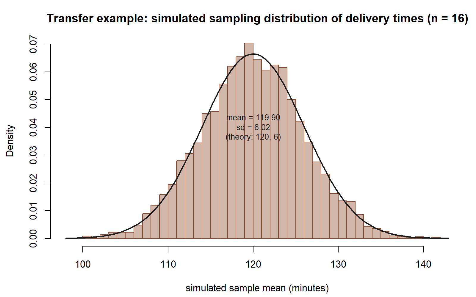
mu_true = 120, sigma_true = 24, n = 16 (same seed 35103, B = 5000) gives simulated means centered near 120 with SD near 6, matching the theoretical Normal(120, 6²) curve overlaid here — no part of the recipe itself changed, only the three input numbers.
AI use note
| Tool | Purpose | Verification |
|---|---|---|
| AI coding assistant (e.g. Claude, ChatGPT, Copilot) | Drafting or troubleshooting base-R simulation code such as the rnorm() / matrix() / colMeans() pattern above, or explaining an unfamiliar base-R function’s arguments |
Run the AI-suggested code yourself in your own R session with set.seed(35103) set, and confirm length(xbar_sim) == 5000, mean(xbar_sim) near 48, and sd(xbar_sim) near 2.5 before trusting any AI-assisted rewrite; never submit AI output you have not run and checked against these numbers |
The graded deliverable, its rubric, and due date live in Blackboard (the LMS) — this page is study and practice only.
See also
- Week 2 — Sampling distributions and simulation — the companion note deriving the Normal(48, 2.5²) sampling distribution this lab simulates.
- Labs index — the full list of course labs.
- Notation glossary — definitions for μ, σ, x̄, n, and SE(x̄).