Week 6 — Confounding and multivariable thinking
MATH 21003 · Introduction to Statistical Methods · Fall 2026 · Week 6 (Sep 28 – Oct 2, 2026)
Why this week matters
Last week we saw that two variables can move together — meat consumption and life expectancy across countries, height and weight in a clinic, exam-one scores and final course grades. We learned to read direction, form, and strength from a scatterplot, and to put a single number on the linear part of the relationship. We were also careful: an association is not a causal claim.
This week we make that caution concrete. The question that drives Week 6 is short and almost always worth asking:
What else could explain the relationship between these two variables?
That “what else” almost always has a name. A third variable that is associated with both the explanatory variable and the response variable can pull them together in a way that has nothing to do with one causing the other. That third variable is called a confounding variable (or, equivalently, a lurking variable).
This week’s habit is to stop, every time we see a striking association from observational data, and ask: what’s the third variable, and what would the picture look like inside a fairer comparison? When we do that — when we compare within subgroups that share the confounder — the apparent relationship sometimes weakens, sometimes vanishes, and sometimes reverses direction entirely. The reversal case has its own name: Simpson’s paradox.
Two big cautions live on top of everything this week:
- Stratification is a descriptive tool. Comparing within subgroups does not, by itself, prove anything causal. It just makes the comparison fairer with respect to the confounder we know about.
- “Adjusting for” a variable does not eliminate confounding in general. You can only adjust for confounders you have measured and thought to include. There can always be another one you haven’t named.
Confounding: a definition we can use
A confounding variable is a third variable that is associated with both the explanatory variable and the response variable in the relationship you are reading. When a confounder is present, an observed association between explanatory and response might be real and entirely not the explanatory variable’s “fault” — the confounder pulled both of them.
A short example that ISLBS uses, and that we’ll reuse all term:
A study tracks sunscreen use and skin-cancer rates and finds that people who use more sunscreen are more likely to develop skin cancer. Does sunscreen cause skin cancer?
Almost certainly not. The hidden third variable is sun exposure: people who spend more time in the sun both use more sunscreen and have more skin cancer. Sun exposure is associated with the explanatory variable (sunscreen use) and with the response (skin cancer), and it produces the apparent association by itself.
That is the entire shape of a confounder. Two associations meeting at a third variable.
A practical version of the test: when you see an observational association, name a candidate confounder out loud. Wealth for country-level health comparisons. Age for almost anything in medicine. Severity of disease at baseline for treatment comparisons. Time of day, experience, adherence. Many of the honest sentences in statistics start with we cannot rule out….
Stratification: compare within, not across
When we suspect a confounder, the basic descriptive move is to compare the explanatory and response variables within levels of the confounder — that is, to stratify. Strata are subgroups defined by the confounder: age cohorts, income brackets, hospital sites, treatment-adherence bands.
The picture inside each stratum is a fairer comparison than the overall picture, because the confounder is held roughly constant inside the stratum. If the explanatory–response relationship is similar inside each stratum, the overall pattern is not just a confounding artifact. If the relationship inside each stratum is much weaker than the overall pattern — or runs the other way — we have evidence the overall pattern was driven by the confounder.
A few honest things to say about stratification before we use it on real cases:
- It is descriptive, not magic. It does not “prove” causation in the way an experiment can.
- It only addresses the confounder you stratified on. The Wk 6 sunscreen-and-skin-cancer story stratifies on sun exposure. It still doesn’t rule out, say, skin type as a separate confounder.
- It needs enough cases in each stratum to compare. Stratifying too finely yields strata with two or three observations, where any apparent pattern is mostly noise.
We will not formalize this further. The Week 9 lesson on multivariable models will return to “after accounting for X” with a proper modeling tool. This week we keep the move at the level of look at the picture inside each subgroup, and compare.
Simpson’s paradox: when the strata disagree with the whole
The cleanest single illustration of confounding in this course is Simpson’s paradox: a relationship between two variables in one direction reverses when a third variable is taken into account.
The reading exercise is to look at one scatterplot of two numerical variables, see a clear trend, then look at the same scatterplot colored by a third variable and watch the trend within each colored group go the opposite way. The single best worked example in the course’s source materials is the Paralympic 1500m case study (IMS Ch 3).
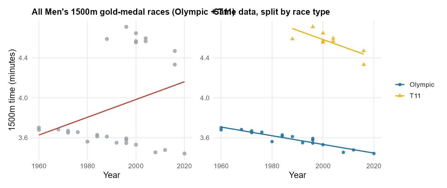
openintro::paralympic_1500 Men’s 1500m gold-medal records (the figure-generation script swaps in the real openintro::paralympic_1500 data automatically when that R package is installed).What’s going on? The two race types are imbalanced in three ways that together create the reversal:
- There are more Olympic data points than T11 data points.
- T11 times are slower on average than Olympic times (because the athletes are running with severe visual impairment).
- T11 races started later in history than the Olympic 1500m.
In the overall cloud, the recent years are pulled upward by the T11 points being concentrated there and being slower. When we look within each race type, the year-by-year pattern is what you would expect: both groups have gotten faster.
The honest summary is the stratified one. Within each race type, athletes have gotten faster over time. The overall trend was misleading — it was driven by the composition of the data, not by the relationship between year and time within either type of race. That is the textbook shape of Simpson’s paradox.
A clinical worked example: the California DDS case
A second example, from a different domain, makes the same point with hard numbers — and was the basis of an actual ethnic-discrimination allegation against a state agency.
The California Department of Developmental Services (DDS) allocates state funds to consumers with developmental disabilities. A team of researchers compared mean annual expenditures across ethnic groups, restricted the comparison to the two largest groups, and found:
| Group | Mean annual DDS expenditures |
|---|---|
| Hispanic consumers | $11,066 |
| White non-Hispanic consumers | $24,698 |
| Crude gap | $13,632 in favor of White non-Hispanic consumers |
On its face, that is a large and alarming gap. An allegation of ethnic discrimination was brought.
Now bring in the obvious third variable. The DDS gives more support to older consumers, because older consumers have more expensive needs. And in this dataset, Hispanic consumers skew younger than White non-Hispanic consumers — more than half of Hispanic consumers in the sample were under 18, while a third of White non-Hispanic consumers were in the 22–50 cohort and another one-sixth were 51 and older.
If we compare inside each age cohort instead of across the whole dataset, the picture changes completely.
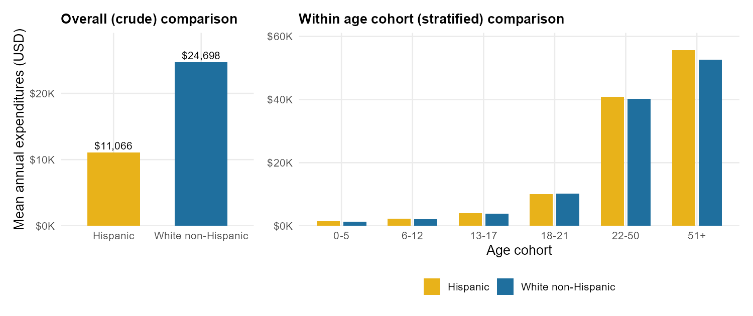
The honest reading is straightforward. The crude gap was real, but it was driven almost entirely by the age difference between the two populations, not by ethnicity. Within any given age cohort, expenditures for Hispanic consumers and White non-Hispanic consumers are nearly identical, and in most cohorts the Hispanic average is in fact slightly higher.
This is the analytical move at the heart of Week 6: the unadjusted comparison and the within-cohort comparison can give opposite answers, and the within-cohort comparison is the fairer one when the confounder is real. (And, again, this descriptive investigation does not by itself “prove” there is no discrimination — a separate model could ask harder questions, and a fuller analysis of this same example appears later in the course. But on the data we have, the crude headline overstated what the comparison supports.)
A second look at meat and life expectancy
Week 5 ended with the same caution at the level of a country-level scatterplot. Higher per-capita meat consumption was associated with higher life expectancy, with a moderately strong correlation of about \(r \approx 0.7\). The obvious third variable was wealth: richer countries consume more meat and have better health systems.
Stratifying by income bracket does what the DDS table did, only gentler.
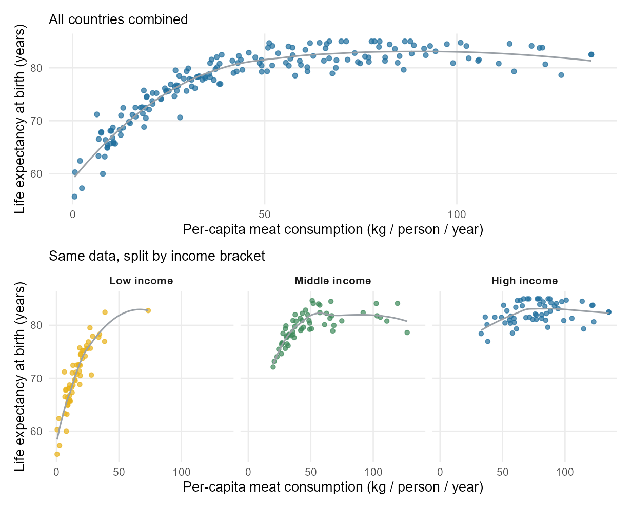
Inside each income bracket, the scatterplot is much flatter than the overall picture. Most of what looked like “meat consumption is associated with life expectancy” was income doing the work. That doesn’t mean meat consumption has zero relationship with life expectancy; it means the crude relationship overstated the relationship by ignoring the obvious confounder.
That is the Week 5 → Week 6 continuity for this term: the same dataset answers two different questions. Week 5 asked are they associated? and the answer was yes. Week 6 asks what else is going on? and a large chunk of the association turns out to be a third variable.
A useful plain-English phrasing
You will see the next sentence in many forms throughout the term:
Looking at the association between X and Y alone, the data suggest [some apparent effect]. After accounting for Z, the apparent effect [shrinks / disappears / reverses].
The word “alone” flags the crude / unadjusted view. The phrase “after accounting for” (or “after adjusting for”) flags the stratified / adjusted view. A formal modeling tool for this kind of accounting arrives later; this week we keep the move descriptive. The verbal habit is exactly the same honest move:
Looking at past bankruptcy alone, borrowers with a past bankruptcy paid about 0.74 percentage points more in interest on average. After accounting for the borrower’s other characteristics — debt-to-income ratio, credit utilization, whether their income source was verified — that gap shrinks to about 0.39 points. (IMS Ch 8.)
Same move, same honest sentence. We are reading the descriptive shape of confounding here. Week 9 will give us a tool that does this kind of accounting in a more general way.
Common mistakes
These come up every Week 6 and are worth heading off now.
- “Confounder = anything that affects the outcome.” No. A confounder must be associated with both the explanatory and the response variable. Sun exposure is associated with both sunscreen use and skin cancer; that is what makes it a confounder. A variable that only affects the outcome but is not associated with the explanatory variable is not a confounder.
- “If we control for one variable, the analysis is now correct.” It is fairer with respect to that one variable. Other confounders may still be hiding.
- “Simpson’s paradox is rare or weird.” It is common any time the subgroups have different compositions on the third variable — different age mixes, different baseline severities, different recruitment windows. The Paralympic case, the DDS case, the Florence Nightingale hospital-mortality story, the airline on-time-arrival story (IMS Ch 4 exercises), and the meat-by- income story are five examples in our own source material alone.
- “The overall comparison must be wrong if a stratified comparison disagrees.” Not always. Whether the overall or the stratified answer is the right one to report depends on the question. The overall trend is the right summary if the composition of the data is the question you care about. The stratified version is the right summary if the question is about the explanatory–response relationship for a comparable person. In practice, the stratified version is what most scientific and policy questions need.
- “Stratifying eliminates confounding.” Only with respect to the variable you stratified on. There can always be another one.
What you should be able to do by Friday
By the end of Week 6 you should be able to:
- Define confounding in plain language, using the sun-exposure / sunscreen / skin-cancer example or another short case.
- Identify a plausible confounder in a short observational scenario, and explain why it satisfies the “associated with both” definition.
- Read a crude comparison and a stratified comparison side by side and describe what changes.
- Recognize Simpson’s paradox when the overall direction of an association reverses (or vanishes) inside subgroups, and explain what about the subgroup composition produced it.
- Use the phrasing distinction: the association between X and Y alone… vs after accounting for Z…, and recognize when a reported “effect” is a crude versus an adjusted one.
Assignments this week
- Monday check. A short concept check on the definition of confounding and identifying a third variable in a one-paragraph scenario. Aim for about 3–5 minutes in class. Sheet: Week 6 Monday exit ticket.
- Wednesday check. A short application on reading a crude vs stratified comparison: an aggregate-vs-grouped scatterplot or a cohort-stratified table, and describing what changes and why. Aim for about 8–12 minutes in class. Sheet: Week 6 Wednesday exit ticket.
- 🔒 Friday quiz — handled through Blackboard or in class as directed. The quiz prompt is not posted here. Exact timing and submission details live in Blackboard.
- 🔒 Homework 3 (biweekly, Weeks 5–6) — posted and submitted through Blackboard. Due near the start of Week 7; exact due date is on Blackboard.
Read more in IMS / ISLBS
The course page above is the main explanation for this week. If you want a second voice on the same material, these readings cover the same concepts at similar depth:
- IMS — Chapter 3 (“Applications: Data”), §3.2 Simpson’s paradox. The Paralympic 1500m case study in IMS is the same one used above.
IMS also touches the adjusted vs unadjusted idea qualitatively in Chapter 8, §8.1–§8.2 (Lending Club bankruptcy / verified income). Read those passages for the narrative only — the regression mechanics return in Weeks 8 and 9.
Hosted IMS book: https://openintro-ims.netlify.app/ - ISLBS — Introductory Statistics for the Life and Biomedical Sciences, Chapter 1 §1.7.1 Case study: discrimination in developmental disability support. This is the DDS case used above, with the full set of figures and tables. §1.3 of the same chapter introduces the confounding vocabulary with the sunscreen example.
OpenIntro book page: https://www.openintro.org/book/biostat/
Sources adapted in this lesson: OpenIntro Introduction to Modern Statistics (2e), Çetinkaya-Rundel & Hardin, Chapter 3 (Applications: Data), §3.2 Simpson’s paradox (Paralympic 1500m case study), and Chapter 8 (Linear regression with multiple predictors), §8.1–§8.2 qualitative confounding framing, both CC BY-SA 3.0; and OpenIntro Introductory Statistics for the Life and Biomedical Sciences, Vu & Harrington, Chapter 1 §1.3 Data collection principles (confounding vocabulary, sunscreen example) and §1.7.1 Case study: discrimination in developmental disability support (the DDS case), CC BY-SA 3.0. Source files at github.com/openintrostat/ims and github.com/OI-Biostat/oi_biostat_text. The Paralympic 1500m data are publicly available from the International Paralympic Committee and are packaged as paralympic_1500 in the openintro R package. The California DDS data are based on real attributes of the state’s developmental-services consumers and have been altered to maintain privacy; the version used above is dds.discr in the oibiostat R package. The meat-and-life-expectancy data are real, from You W. et al., BMC Nutrition 8 (2022), as in Week 5.