Week 3 — One-variable summaries
MATH 21003 · Introduction to Statistical Methods · Fall 2026 · Week 3 (Sep 7–11, 2026)
Why this week matters
In Weeks 1 and 2 you learned to read a study: what one case is, what the variables are, where the data came from, and what kind of claim the design can support. This week you start summarizing what is actually in the data.
A single variable — one column of a dataset — can have hundreds or thousands of values. Nobody can hold all of them in their head. So we describe a variable with a small number of well-chosen summaries: a table or a graph that shows the overall pattern, plus a few numbers that pin down where the values sit and how spread out they are.
The skill this week is choosing the right summary and reading it honestly. A bar chart answers different questions than a histogram. The mean and the median both claim to describe “the typical value,” but they can disagree, and which one to trust depends on the shape of the data. By Friday you should be able to look at one variable, pick an appropriate summary, and describe it in careful sentences.
First, what kind of variable is it?
Everything this week branches on one question you already know how to answer: is the variable categorical or numerical? The two types get different summaries.
- Categorical variables (labels — blood type, treatment group, genotype) are summarized with counts and proportions, shown in a frequency table or a bar chart.
- Numerical variables (quantities — blood pressure, recovery time, age) are summarized with a center, a spread, and a description of shape, shown in a histogram, dot plot, or box plot.
Get the variable type right and the rest of the week follows.
Summarizing one categorical variable
For a categorical variable, the basic summary is a frequency table: how many cases fall in each level. A relative frequency table shows the same thing as proportions (counts divided by the total), which makes it easier to compare groups of different sizes.
Suppose a genetics study records each participant’s genotype at one location on a gene, with three possible levels — CC, CT, and TT.
| Genotype | Count | Proportion |
|---|---|---|
| CC | 173 | 0.29 |
| CT | 261 | 0.44 |
| TT | 161 | 0.27 |
| Total | 595 | 1.00 |
The same information is shown as a bar chart, where the height of each bar is the count (or the proportion) in that level. A bar chart makes the comparison between levels immediate: CT is clearly the most common genotype here.
A pie chart shows the same breakdown as slices of a circle. Pie charts can work when there are only a few levels and the slices are simple fractions, but they get hard to read fast. With more than three or four levels, or when two slices are close in size, a bar chart is almost always easier to read. Be careful: a pie chart can hide an ordering that a bar chart makes obvious.
One rule worth stating plainly: a bar chart is not a histogram. Bar charts are for categorical variables, and the bars have gaps between them because the levels are separate groups. Histograms (next section) are for numerical variables, and the bars touch because the number line is continuous.
Summarizing one numerical variable: shape
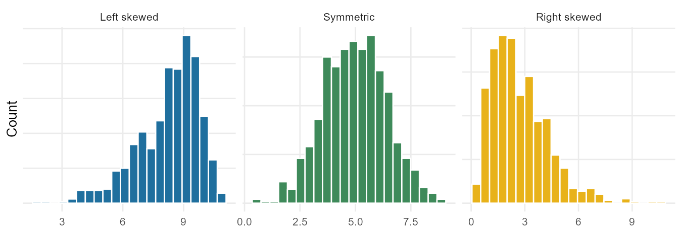
For a numerical variable, start by looking at the whole distribution before you compute anything. A histogram groups the values into bins and draws a bar for the count in each bin. The picture tells you the shape of the distribution.
The vocabulary for shape:
- A distribution is symmetric if the two sides are rough mirror images.
- It is right skewed if it has a long tail stretching to the right (a few unusually large values). Income, hospital length of stay, and reaction times are usually right skewed.
- It is left skewed if the long tail stretches to the left.
- The number of clear peaks is the modality: one prominent peak is unimodal, two is bimodal, three or more is multimodal. A bimodal distribution is often a hint that two different groups are mixed together (for example, heights of children and adults measured as one variable).
Shape matters because it tells you which numerical summaries will be trustworthy — that is the punch line of this whole week.
Center: mean and median
Two summaries describe the center of a numerical variable.
- The mean (written \(\bar{x}\), read “x-bar”) is the average: add up all the values and divide by the number of cases, \(n\). It is the balancing point of the distribution.
- The median is the middle value when the data are sorted. Half the cases fall below it and half above. If \(n\) is even, the median is the average of the two middle values.
When a distribution is roughly symmetric, the mean and the median land in about the same place. When it is skewed, they separate: the mean gets pulled toward the long tail. In a right-skewed income distribution, a handful of very large incomes drag the mean above the median, so the mean overstates the “typical” income. That gap between the mean and the median is itself a clue about shape.
A note on notation you’ll see all term: \(\bar{x}\) is the mean of a sample, the cases we actually measured. The mean of the whole population is written \(\mu\) (the Greek letter “mu”) and is usually unknown — we estimate it with \(\bar{x}\). That sample-versus-population distinction is the same one from Week 2.
Spread: standard deviation and IQR
Center alone is not enough. Two variables can have the same mean and look completely different because their values are spread out differently. Two summaries describe spread.
- The standard deviation (written \(s\)) measures, roughly, how far a typical value sits from the mean. A larger \(s\) means the values are more spread out. The exact formula squares each value’s distance from the mean, averages those, and takes a square root; you will not be asked to grind through it by hand, but you should know what it means — typical distance from the mean.
- The interquartile range (IQR) is the range of the middle half of the data: \(\text{IQR} = Q_3 - Q_1\), where \(Q_1\) (the first quartile) is the 25th percentile and \(Q_3\) (the third quartile) is the 75th percentile. A percentile is the value below which that percent of the data falls — the 25th percentile has 25% of the data below it.
There is a rough rule of thumb for symmetric, bell-shaped distributions: about two-thirds of the values fall within one standard deviation of the mean, and about 95% within two. Treat this as a loose guideline, not a law — it fails badly for skewed or bimodal data, and we will make it precise much later in the course.
Box plots and the five-number summary
A box plot packs the center and spread of a numerical variable into one compact picture built from five numbers: the minimum, \(Q_1\), the median, \(Q_3\), and the maximum.
How to read it:
- The box spans \(Q_1\) to \(Q_3\), so its length is the IQR — the middle 50% of the data.
- The line inside the box is the median.
- The whiskers reach out to the smallest and largest values that are not unusually far from the box.
- Points beyond the whiskers are flagged as potential outliers — values that sit far from the rest. A common rule flags anything more than \(1.5 \times \text{IQR}\) beyond the quartiles.
A box plot is excellent for comparing center and spread, and it makes outliers and skew easy to spot: when the median sits closer to \(Q_1\) and there are high outliers, the distribution is right skewed. But a box plot cannot show modality — a bimodal distribution and a unimodal one can produce the same box. That is why we look at a histogram too.
Robust summaries: which number do you trust?
Here is the most important judgment of the week. Outliers and skew pull the mean and the standard deviation around, but barely move the median and the IQR. Watch what happens to summaries of the same variable when one extreme value is moved:
| Scenario | Median | IQR | Mean | SD |
|---|---|---|---|---|
| Original data | 11.0 | 6.1 | 11.6 | 5.0 |
| Move the largest value up a lot | 11.0 | 6.1 | 12.4 | 6.8 |
| Move it down into the pack | 11.0 | 6.0 | 11.1 | 4.3 |
The median and IQR hardly budge; the mean and SD swing. Because the median and IQR resist extreme values, we call them robust statistics. The mean and standard deviation are not robust.
So which do you report?
- For a roughly symmetric distribution with no wild outliers, the mean and standard deviation are fine and are the usual choice.
- For a skewed distribution, or one with outliers, the median and IQR describe the typical value and spread more honestly.
This is a choice you make on purpose, after looking at the shape — not a default you reach for without thinking. Reporting the mean income of a neighborhood with one billionaire in it is technically correct and deeply misleading.
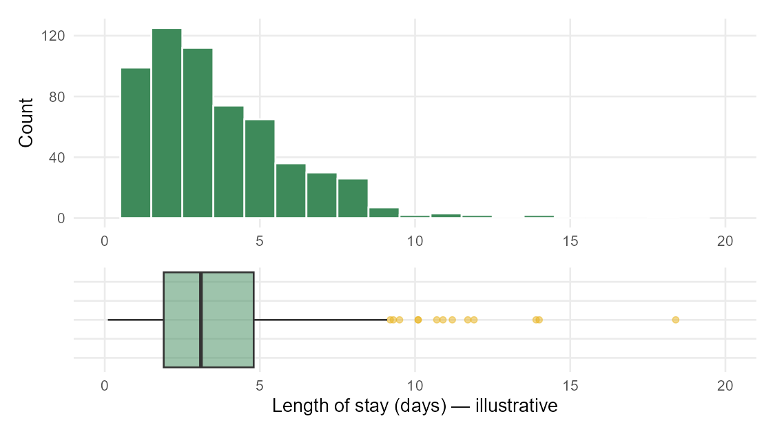
Worked example: describing one variable
A clinic records the length of stay, in days, for every patient admitted in a month. A histogram shows a single peak near 3 days, most stays between 1 and 8 days, and a long right tail with a few stays past 15 days. The five-number summary is: minimum 1, \(Q_1 = 3\), median 4, \(Q_3 = 7\), maximum 19.
A careful description:
- Shape: unimodal and right skewed — most stays are short, with a few long stays stretching the tail.
- Center: the median stay is 4 days. Because the distribution is right skewed, the mean would be pulled above 4 by the long stays, so the median is the more honest “typical” value here.
- Spread: the middle half of patients stayed between 3 and 7 days, an IQR of 4 days.
- Unusual values: a handful of stays beyond about 15 days sit far from the rest and would be flagged as outliers. They are worth asking about — a data error, or genuinely complicated cases? — not automatically deleting.
Notice the description names shape, center, spread, and unusual values, chooses the median over the mean and says why, and stays in context (days, patients). That is exactly the kind of answer we want.
Common mistakes
- Using a bar chart for a numerical variable (or a histogram for a categorical one). Bars with gaps = categories; bars that touch = numbers on a continuous scale.
- Reporting the mean for a skewed variable without thinking. When the tail is long, the mean is pulled toward it; the median is often the more honest center.
- Reading modality off a box plot. Box plots hide peaks. If the question is about shape or modality, look at a histogram.
- Treating the 68%/95% rule of thumb as a law. It only roughly holds for symmetric bell shapes, and not at all for skewed data.
- Deleting every outlier on sight. An outlier can be an error or a real, important case. Investigate before you discard.
- Confusing the spread with the center. “The values are around 5” describes center; “the values range widely from 1 to 19” describes spread. A complete summary needs both.
What you should be able to do by Friday
By the end of Week 3 you should be able to:
- Decide whether a variable is categorical or numerical and choose an appropriate summary for it.
- Build and read a frequency / relative-frequency table and a bar chart for a categorical variable.
- Read a histogram and describe a distribution’s shape (symmetric, right or left skewed; unimodal, bimodal, multimodal).
- Interpret the mean and median as measures of center, and explain why they separate when a distribution is skewed.
- Interpret the standard deviation and the IQR as measures of spread, and read a five-number summary and a box plot.
- Decide whether the mean/SD or the median/IQR better describe a given variable, and justify the choice from the shape.
- Describe one variable in careful sentences covering shape, center, spread, and unusual values.
Assignments this week
- 📄 Monday exit ticket — short concept check: classify a variable and pick the right one-variable summary (counts vs proportions; bar chart vs histogram). Aim for 3–5 minutes.
Download the Monday exit ticket (PDF) - 📄 Wednesday exit ticket — read a histogram or a box plot and describe a distribution’s shape, center, spread, and unusual values. Aim for 8–12 minutes.
Download the Wednesday exit ticket (PDF) - 🔒 Friday quiz — handled through Blackboard or in class as directed. The quiz prompt is not posted here. Exact timing and submission details live in Blackboard.
- 🔒 Homework 2 (biweekly, covers Weeks 3–4) — posted and submitted through Blackboard. The due date is on Blackboard.
(In-class exit-ticket handouts are distributed in class or through Blackboard. Day-to-day timing in Week 3 may shift around the Monday holiday; follow the schedule on Blackboard.)
Read more in IMS / ISLBS
The course page above is the main explanation. If you want a second voice on this week’s material:
- IMS — Introduction to Modern Statistics (2e), Chapter 5, “Exploring numerical data” for the mean, median, standard deviation, IQR, histograms, and box plots; and Chapter 4, “Exploring categorical data” for frequency tables, bar charts, and pie charts.
- ISLBS — Introductory Statistics for the Life and Biomedical Sciences, Chapter 1, the “Numerical data” section (center, spread, robust estimates, histograms and box plots) and the “Categorical data” section (frequency tables and bar plots), for the same ideas in a clinical and biological context.
These are alternate readings, not replacements for the page above.
Sources adapted in this lesson: OpenIntro Introduction to Modern Statistics (2e), Çetinkaya-Rundel & Hardin, Chapter 5 (“Exploring numerical data”), §§ dot plots and the mean, histograms and shape, variance and standard deviation, box plots and quartiles, and robust statistics; and Chapter 4 (“Exploring categorical data”), single-variable frequency tables, bar plots, and pie charts; both CC BY-SA 3.0. Also OpenIntro Introductory Statistics for the Life and Biomedical Sciences, Vu & Harrington, Chapter 1, “Numerical data” and “Categorical data” sections, CC BY-SA 3.0. Source files at github.com/openintrostat/ims and github.com/OI-Biostat/oi_biostat_text. Histogram, shape, and box-plot figures on this page use illustrative data generated for teaching.