Week 4 — Comparing groups
MATH 21003 · Introduction to Statistical Methods · Fall 2026 · Week 4 (Sep 14–18, 2026)
Why this week matters
Last week you described one variable at a time. But most real questions are comparisons: Does the new treatment shorten recovery compared with standard care? Is the failure rate lower in one group than another? Did the outcome differ across the genotypes?
A comparison is just two (or more) one-variable summaries placed side by side — but the new skill is reading the difference between groups honestly. This week you learn to compare a numerical outcome across groups (difference in centers and spreads) and to compare a categorical outcome across groups (difference in proportions), and to tell the difference between a difference that is large in the numbers and one that matters in practice.
One boundary up front: this week is still descriptive. We compare what the groups actually did. The question “could this difference be just chance?” is real, and we will spend Weeks 11 and 12 on it. For now, we describe the observed gap clearly and resist over-claiming.
Comparing a numerical outcome across groups
When the outcome is numerical and you want to compare it across groups defined by a categorical variable, the workhorse display is the side-by-side box plot: one box plot per group, drawn on the same scale.
Read it the same way you read one box plot, but now you compare:
- Center. Which group’s median is higher? By how much? The difference in medians (or in means) is the headline of the comparison — the spine’s “difference in means.”
- Spread. Is one group more variable than the other? Compare the box lengths (IQRs) and the whiskers.
- Shape and outliers. Is one group more skewed? Does one group have outliers the other lacks?
Overlaid (hollow) histograms are a good companion display: they show the shape of each group’s distribution more fully than a box plot, at the cost of being busier. Use a box plot to compare center and spread quickly; reach for histograms when shape matters.
When you report a numerical comparison, name the size of the difference in context: “median recovery was about 2 days shorter under the new protocol” tells the reader far more than “the groups differed.”
Comparing a categorical outcome across groups
When the outcome is categorical, the comparison runs on proportions, not raw counts. This is the single most common mistake in group comparison, so it is worth stating plainly: if the groups are different sizes, comparing raw counts is misleading. Always compare the rate — the proportion in each group.
Two-way tables
A two-way table (also called a contingency table) cross-tabs two categorical variables: one defines the groups, the other the outcome. Here is the result of a real peanut-allergy prevention trial, in which infants were assigned to either avoid or consume peanut products, and later tested with an oral food challenge (OFC):
| Group | Failed OFC | Passed OFC | Total |
|---|---|---|---|
| Avoidance | 36 | 227 | 263 |
| Consumption | 5 | 262 | 267 |
| Total | 41 | 489 | 530 |
The row totals and column totals around the edge are the marginal totals. The interesting question is not “how many failed” but “what fraction of each group failed.”
Conditional proportions
To compare the groups, compute the proportion of each group that had the outcome — a conditional proportion (the outcome rate conditional on being in that group):
- Avoidance group: \(36 / 263 \approx 0.14\), so about 14% failed.
- Consumption group: \(5 / 267 \approx 0.019\), so about 2% failed.
That is the comparison: a 14% failure rate versus a 2% failure rate. The difference in proportions is about 12 percentage points — a large gap. (You may recognize these as the LEAP numbers from Week 1; now you are reading them as a formal group comparison.)
Be careful which way you condition. The proportion of the avoidance group that failed (14%) answers “how risky was avoidance?” The proportion of those who failed who were in the avoidance group is a different number answering a different question. Condition on the group (the explanatory variable) when you want to compare outcome rates across groups.
Bar charts for two categorical variables
Two bar charts display this comparison, and they answer different questions:
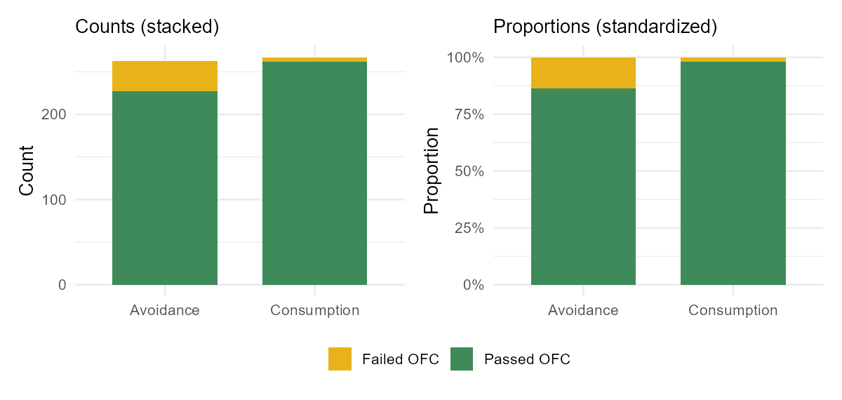
- A stacked bar chart of counts shows how big each group is, but makes it hard to compare rates because the groups are different sizes.
- A standardized (filled) bar chart rescales every bar to 100%, so each bar shows the proportion in each outcome. This is the display that makes a difference in rates jump out — when the colored segments are different heights across groups, the two variables are associated.
- A dodged (side-by-side) bar chart places the bars next to each other rather than stacking them; it is good for reading individual counts but needs more room.
Pick the display that answers your question. To compare rates across groups, the standardized bar chart is usually the clearest choice.
Is the difference real? (a Week-4 boundary)
When two groups differ, three explanations are always on the table, and you already have the vocabulary for the first two from Weeks 1–2:
- The design. Was this an experiment with random assignment, or an observational study? Random assignment (as in the peanut trial) supports a causal reading of the difference. An observational difference may be driven by a confounder — and untangling that is the Week 6 topic, so we only flag it here.
- Practical vs numerical importance. A difference can be real and still be too small to matter, or be measured in units that sound big but aren’t. “Statistically there is a gap” is not the same as “this gap changes what a clinician should do.” Always ask how big the difference is in context.
- Chance. Even with no real underlying difference, two groups will rarely come out exactly equal. Deciding whether an observed gap is more than chance noise is the heart of Weeks 11–12. This week we do not make that call; we describe the observed difference and leave the “is it beyond chance?” question for later.
You may sometimes see a group comparison summarized as a single ratio — for instance, “the failure rate was about seven times higher in the avoidance group.” That is a useful, intuitive way to describe how two rates compare, and it is fine to read it that way this week. The formal machinery for these ratios comes later in the course, when we study categorical outcomes in depth; for now, treat it as plain language for “one group’s rate relative to another’s.”
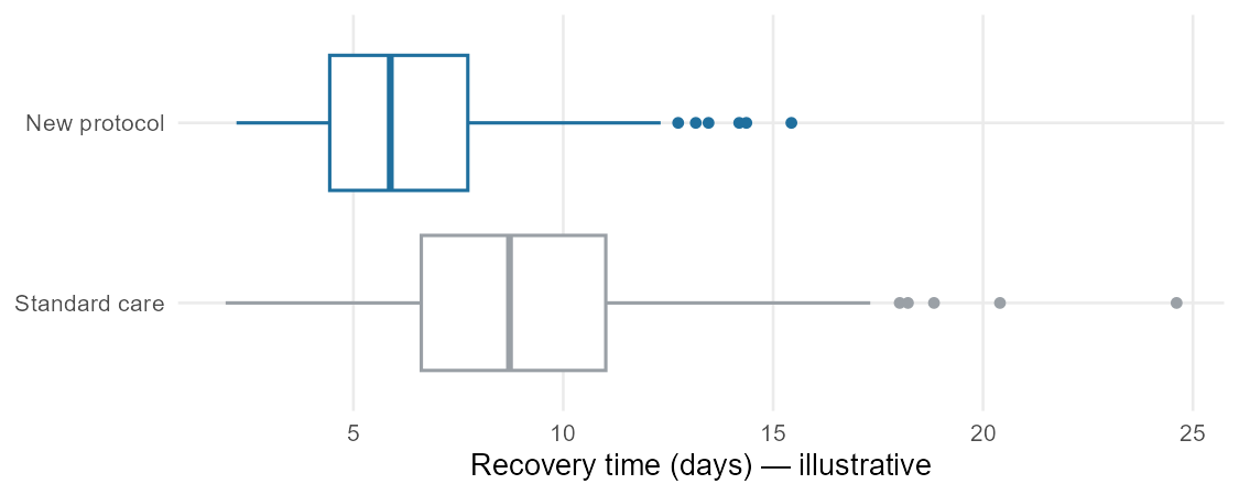
Worked example: reading a group comparison
A hospital compares recovery time (in days) for patients on a new post-surgical protocol versus standard care, using side-by-side box plots. The standard-care median is about 8 days with an IQR of roughly 5 days; the new-protocol median is about 6 days with a similar IQR. Both distributions are right skewed, and the standard-care group has a couple of high outliers.
A careful reading:
- Center: median recovery is about 2 days shorter under the new protocol (6 vs 8 days) — that is the headline difference.
- Spread: the two groups are about equally variable (similar IQRs), so the new protocol shifts the typical patient earlier without making recovery times wildly more or less consistent.
- Shape and outliers: both right skewed; the standard-care group’s high outliers are the longest recoveries and are worth investigating.
- What we can and can’t say: if patients were randomly assigned to protocols, a 2-day shorter median is a defensible signal that the protocol helps. If this was observational (clinicians chose which patients got the new protocol), a confounder — sicker patients kept on standard care, say — could explain the gap, and we would hold off on a causal claim. Either way, we report the 2-day difference in context and save the “is it beyond chance?” question for later.
Common mistakes
- Comparing raw counts across unequal groups. Always compare proportions (rates) when the groups are different sizes.
- Conditioning the wrong way. “What fraction of the avoidance group failed?” and “what fraction of those who failed were avoiders?” are different questions. Condition on the group to compare outcome rates.
- Using a stacked count chart to compare rates. Stacked counts hide rate differences; use a standardized (proportion) bar chart.
- Reading a descriptive difference as a proven cause. A group difference supports a causal claim only when the design (random assignment) earns it; otherwise a confounder may be at work.
- Confusing “large number” with “important.” State the size of the difference in context and ask whether it matters in practice.
- Declaring a difference “real” from the data alone. Whether a gap is beyond chance is a Week 11–12 question, not a Week 4 one.
What you should be able to do by Friday
By the end of Week 4 you should be able to:
- Compare a numerical outcome across groups with side-by-side box plots (and overlaid histograms), reading differences in center, spread, and shape.
- Build and read a two-way table, including marginal totals.
- Compute and interpret conditional proportions, and report a difference in proportions between groups.
- Choose the right categorical display (stacked, standardized, or dodged bar chart) for the comparison you want to make.
- State the size of an observed difference in context and distinguish numerical from practical importance.
- Explain why a group difference does or does not support a causal claim, based on the study’s design.
- Recognize that “is the difference beyond chance?” is a later question and not over-claim from descriptive comparisons.
Assignments this week
- 📄 Monday exit ticket — short concept check: choose a comparison display and compute a difference in proportions from a two-way table. Aim for 3–5 minutes.
Download the Monday exit ticket (PDF) - 📄 Wednesday exit ticket — read a side-by-side box plot or a two-way table and describe how the groups differ, in context. Aim for 8–12 minutes.
Download the Wednesday exit ticket (PDF) - 🔒 Friday quiz — handled through Blackboard or in class as directed. The quiz prompt is not posted here. Exact timing and submission details live in Blackboard.
- 🔒 Homework 2 (biweekly, covers Weeks 3–4) — posted and submitted through Blackboard. The due date is on Blackboard.
(In-class exit-ticket handouts are distributed in class or through Blackboard.)
Read more in IMS / ISLBS
The course page above is the main explanation. If you want a second voice on this week’s material:
- IMS — Introduction to Modern Statistics (2e), Chapter 4, “Exploring categorical data”: contingency tables, row/column proportions, stacked, standardized, and dodged bar charts, and the “comparing numerical data across groups” section (side-by-side box plots and overlaid histograms).
- ISLBS — Introductory Statistics for the Life and Biomedical Sciences, Chapter 1, the “Relationships between two variables” section — two categorical variables (contingency tables and proportions) and a numerical variable compared across a categorical one (side-by-side box plots) — for the same ideas in a clinical and biological context.
These are alternate readings, not replacements for the page above.
Sources adapted in this lesson: OpenIntro Introduction to Modern Statistics (2e), Çetinkaya-Rundel & Hardin, Chapter 4 (“Exploring categorical data”), §§ contingency tables and bar plots, visualizing two categorical variables, row and column proportions, and comparing numerical data across groups; CC BY-SA 3.0. Also OpenIntro Introductory Statistics for the Life and Biomedical Sciences, Vu & Harrington, Chapter 1, “Relationships between two variables” section, CC BY-SA 3.0. Source files at github.com/openintrostat/ims and github.com/OI-Biostat/oi_biostat_text. The peanut-allergy trial is the LEAP study, Du Toit et al., NEJM 372 (2015) 803–813; the two-way table and bar charts use its reported counts. The side-by-side box-plot figure uses illustrative data generated for teaching.