Week 15 — Final review & method choice
The whole course as one decision: reason from the data and the question
Source basis. Original instructor-authored review; all data is synthetic (two groups of “response times”, a fixed generator, seed 45215). Open texts are conceptual companions cited by section title only (map-don’t-mine); no prose, figures, examples, or exercises are reproduced. See Open readings & attribution. Ungraded — Blackboard is authoritative for graded work.
This week. No new method. We step back and ask the question that has run underneath every week: given this data and this question, how do I choose — and defend — a method? The answer is not a flowchart lookup. It is a short chain of reasoning that we can now run end to end, and a habit of triangulating an answer with more than one tool.
Learning goals
By the end of this review you should be able to:
- Walk a method-choice map from a data structure and a question to a defensible candidate method.
- Analyze one dataset three ways (t-test, Wilcoxon/Hodges–Lehmann, bootstrap) and read whether the conclusions triangulate.
- Name the recurring loop — build a reference distribution, place a quantity on it, read the answer — and recognize it behind testing, estimation, and simulation alike.
- Explain why method choice is reasoning, not a lookup, and what an honest report carries.
The course as one decision
Every week added a tool, but the tools share a spine. We always start from the same two questions: what is fragile here? and what do we actually want to know? Skew, outliers, a pairing, an ordinal scale, a small sample — each is a kind of fragility, and each points toward a family of methods that does not lean on the assumption that just broke. The map below is the capstone: read the left column for your situation, and it names a candidate on the right.
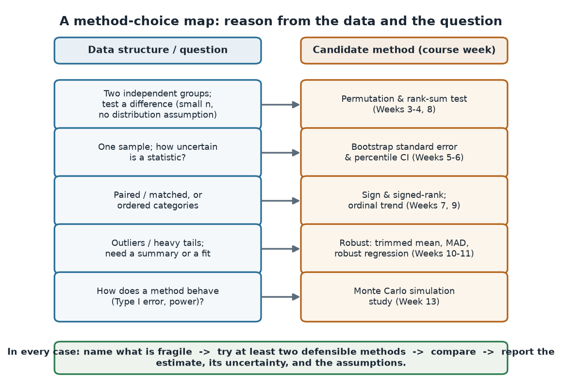
What to notice. The map is not a lookup that ends the thinking — it starts it. Each row is a first candidate, not a verdict. The banner is the real rule: name what is fragile, try at least two defensible methods, compare, and report the estimate with its uncertainty and its assumptions.
The map, as a table (nonvisual equivalent).
| If the data / question is… | Consider… | Course weeks |
|---|---|---|
| Two independent groups; test a difference | Permutation & rank-sum test | 3–4, 8 |
| One sample; uncertainty of a statistic | Bootstrap SE & percentile CI | 5–6 |
| Paired / matched, or ordered categories | Sign / signed-rank; ordinal trend | 7, 9 |
| Outliers / heavy tails; a summary or a fit | Trimmed mean, MAD, robust regression | 10–11 |
| How does a method behave (error, power)? | Monte Carlo simulation study | 13 |
As a quick walk-through, take our running dataset: two groups of response times (seconds), group A (control, n = 16) and group B (treatment, n = 14), both right-skewed. The question is is B slower, and by how much? That is a two-group difference with a fragile mean (skew), so the map points at rank-sum / bootstrap — and, because we also want a number with an interval, at estimation, not just a test. That is exactly the worked example below.
Worked example — one dataset, three methods
We analyze the same group difference three ways and lay the answers side by side. Group A has mean 10.18 s (median 7.1); group B has mean 17.87 s (median 18.05); the observed mean difference is 7.70 s (computed from the unrounded means; subtracting the two rounded means shown gives 7.69).
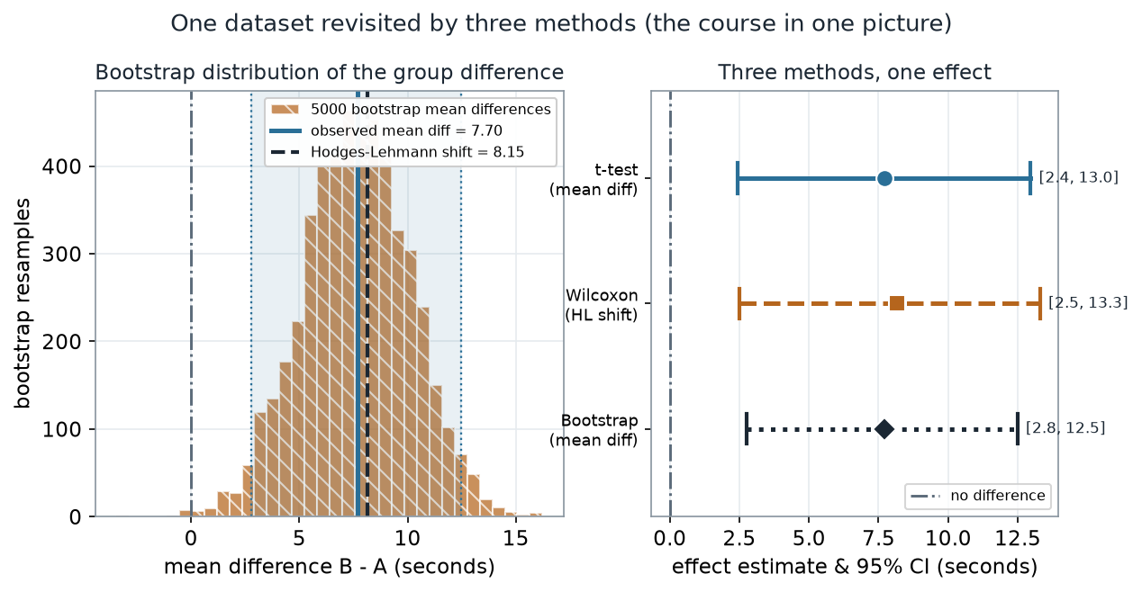
What to notice. The three intervals triangulate. They are not identical — the rank method centers a touch higher (8.15 vs 7.70) and the bootstrap interval is a little wider on the left — but every one excludes zero and lands near an 8-second slowdown. When several defensible methods agree, your conclusion does not hinge on one modeling choice. That agreement is the finding, not any single p-value.
The R you would run computes all three — and notice there is no plotting in it; the pictures are downstream:
# Schematic: the named data objects are the sample(s) described in the text above; this illustrates the analysis, not a self-contained runnable block.
# one effect, three views (no plotting here — the figure is downstream)
t.test(B, A)                        # Welch mean-difference CI + p
wilcox.test(B, A, conf.int = TRUE)  # Hodges-Lehmann shift + rank-based CI
set.seed(45215)
d <- replicate(5000, mean(sample(B, replace = TRUE)) - mean(sample(A, replace = TRUE)))
quantile(d, c(0.025, 0.975))        # bootstrap percentile interval for the mean difference
Three methods, as numbers (nonvisual equivalent).
| Method | Estimate (s) | 95% interval (s) | p-value |
|---|---|---|---|
| Welch t-test (mean difference) | 7.70 | [2.43, 12.96] | 0.006 |
| Wilcoxon / Hodges–Lehmann (shift) | 8.15 | [2.50, 13.30] | 0.009 |
| Bootstrap (mean difference, B = 5000) | 7.70 | [2.77, 12.49] | — |
The recurring loop across topics
Here is the thread that ties the syllabus together. Testing, estimation, and even evaluating a method all run the same loop: build a reference distribution, place a quantity on it, and read an answer off its shape. Only the reference distribution and the read-off change.
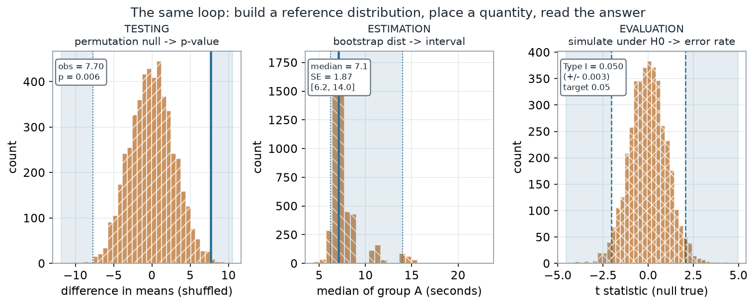
What to notice. The three panels answer three different questions — is there an effect? how big, with what uncertainty? does the method keep its promises? — with one mechanical habit. Testing shades a tail and reads a proportion; estimation shades a middle 95% and reads an interval; evaluation shades a rejection region and reads a long-run rate. Learn the loop and every topic is a variation.
The loop, as numbers (nonvisual equivalent).
| Job | Reference distribution | What you read off | Value |
|---|---|---|---|
| Testing | Permutation null of the mean difference | Two-sided p-value | 0.006 |
| Estimation | Bootstrap distribution of median A | SE and 95% interval | SE 1.87; [6.2, 14.0] |
| Evaluation | Simulated t under a true null | Type I error rate | 0.050 (± 0.003) |
The four resampling engines we met differ in what they hold fixed and what they estimate, even though their arithmetic rhymes. It is worth seeing them contrasted in one place.
| Engine | What is held fixed | What varies | What it estimates | Course week |
|---|---|---|---|---|
| Permutation test | The pooled values | Group labels shuffled | Null distribution → p-value | 3 |
| Randomization test | The observed units | The assigned treatment re-drawn | Design-based p-value | 4 |
| Bootstrap | The sample as a stand-in | Resample with replacement | Sampling variability → SE / CI | 5–6 |
| Monte Carlo simulation | A known truth (DGP) | Fresh datasets generated | Method behavior → error, power | 13 |
Four resampling engines compared: what each holds fixed, what it varies, and what it estimates.
What to notice. Permutation and randomization share the label-shuffle arithmetic but differ in warrant — an exchangeability assumption versus the physical randomization the study actually ran. The bootstrap resamples to estimate variability, not a p-value. Simulation is the odd one out: it invents the truth on purpose so we can watch a method succeed or fail.
# Schematic: the named data objects are the sample(s) described in the text above; this illustrates the analysis, not a self-contained runnable block.
# the same loop wearing three hats (no plotting)
mean(abs(perm) >= abs(obs))                 # permutation p-value          (testing)
quantile(replicate(5000, median(sample(A, replace = TRUE))), c(.025, .975))  # (estimation)
mean(replicate(4000, t.test(rnorm(14), rnorm(16))$p.value < 0.05))           # Type I error (evaluation)
Is there one “right” method?
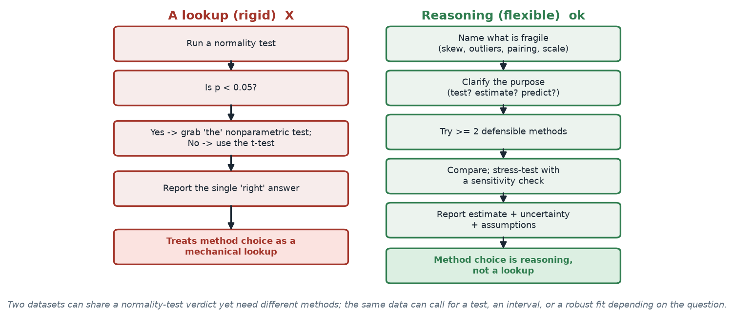
What to notice. The left path outsources judgment to a single normality test and pretends one method is the answer. The right path treats the map as a starting point, tries more than one method, and stress-tests the result. Two datasets can share a normality-test verdict yet need different methods; the same data can call for a test, an interval, or a robust fit depending on the question.
Two habits, side by side (nonvisual equivalent).
| Rigid lookup (discouraged) | Reasoned choice (encouraged) |
|---|---|
| Run a normality test; branch on p < 0.05 | Name what is fragile (skew, outliers, pairing, scale) |
| Pick “the” one method the branch names | Clarify the purpose (test? estimate? predict?) |
| Report a single answer | Try ≥ 2 methods; compare; add a sensitivity check |
| Thinking stops | Report estimate + uncertainty + assumptions |
“There is always one correct method — find the right box on the chart.” No. A decision map narrows the field; it does not end the reasoning. Nonparametric methods are not a backup triggered by a failed normality test, and a single significance verdict is not a conclusion. The professional move is to choose for a purpose, run more than one defensible analysis, and report where they agree and where they part. Method choice is reasoning, not a lookup.
Check your understanding (ungraded)
- Walk the method-choice map for a study with matched before/after pairs and a couple of wild outliers. Which two candidate methods would you try, and why not just one?
- The three methods in the worked example all cleared zero and landed near 8 seconds. In your own words, what does that agreement buy you that any single p-value would not?
- Fill in the loop for a confidence interval for a median: what is the reference distribution, what quantity do you place on it, and what do you read off?
- A classmate says, “the normality test passed, so the t-test is the correct method — done.” Name two things this skips.
Reading guide
- OpenIntro Statistics 4e — Inference for numerical data — a companion for the two-group comparison and interval logic behind the worked example; read for the framing, then check it against the figure.
- IMS — Foundations of inference / bootstrapping — reinforces the reference-distribution idea that the recurring loop makes explicit.
- Learning Statistics with R — Comparing two means / hypothesis testing — a companion for the parametric-versus-rank contrast (cited, not reproduced).
- NIST/SEMATECH e-Handbook — Exploratory data analysis — an instructor reference on letting the data structure, not a reflex, drive the method.
Accessibility notes
Mathematics is live text (, intervals, and rates render as MathML, not images). Every figure carries an alt line stating its message, a “what to notice” reading, and an adjacent data-summary table, so each point survives without the picture. Distributions and paths are distinguished by linestyle, hatch, and marker (solid teal = observed/parametric, dashed/hatched ochre = resampled/robust; red ✗ vs green ✓ for the discouraged-vs-encouraged habit) plus labels, never color alone. A clean lint and a clean render are evidence; the rendered assistive-technology review is a human step.
Assessment (descriptive only)
This review contributes learning evidence toward choosing and defending a method for a purpose and triangulating a conclusion across resampling, rank, and robust tools. That is the shape only; the actual graded prompts, point values, and due dates live in Blackboard.
Public vs. graded. These are public, ungraded notes and practice. Graded prompts, keys, rubrics, point values, and due dates live in Blackboard Ultra, which governs.
Looking ahead
That is the course. You leave with a map for choosing, a loop that unifies testing, estimation, and simulation, and a habit of triangulating and reporting honestly. Carry all three into your final project and into any dataset that does not look the way a textbook promised — which is most of them.