Predicting new data and checking whether the model could have produced ours
The week question
We spent five weeks asking what does the data tell us about the parameter? This week we turn the telescope around and ask a different question: if the model is right, what new data should we expect to see — and does the data we actually saw look like something this model could have produced?
Where we are and why this matters
By now the posterior is an old friend. In the running bike-to-campus survey we started with a mild prior \(f(\theta) = \text{Beta}(2,2)\) on \(\theta\), the unknown proportion of students who bike to campus, observed \(y = 8\) bikers out of \(n = 24\) surveyed, and updated to the posterior \(f(\theta \mid y) = \text{Beta}(10, 18)\), with posterior mean \(10/28 \approx 0.357\). That posterior is a full distribution over \(\theta\) — a statement about a quantity we will never directly observe. You cannot walk onto campus and measure “the proportion.” You can only ever observe counts in samples.
That gap is the whole point of this week. Inference lives in \(\theta\)-space; the world hands us data in \(y\)-space. To predict the next survey, or to ask whether our model is any good, we have to push our posterior uncertainty about \(\theta\) back out into uncertainty about future data. The tool that does this is the posterior predictive distribution, and the discipline it enables — posterior predictive checking — is one of the most practical, honest things Bayesian modeling offers: a built-in way to ask the model “could you have generated what I actually saw?”
This connects two ideas you already hold. First, the posterior is over \(\theta\), not over data (Weeks 3–5). Second, every model carries a data model — the likelihood’s distributional form, e.g. Binomial counts (Week 4). Prediction is what you get when you let those two talk to each other.
Learning goals
By the end of this week you should be able to:
Define the posterior predictive distribution as the data model averaged over the posterior.
Explain why prediction integrates out \(\theta\), and what that averaging buys you.
Distinguish parameter uncertainty from predictive uncertainty, and say which is wider and why.
Simulate posterior predictive data and read a predictive distribution and predictive interval.
Run a posterior predictive check: compare simulated replicated data to the observed data.
Interpret a passed or failed check carefully — what it does, and does not, license you to conclude.
Core vocabulary
Data model / likelihood form — the distribution we assume generated each observation given \(\theta\) (here, Binomial counts). It is the recipe for turning a parameter into data.
Posterior predictive distribution — written \(f(y_{\text{new}} \mid y)\): the distribution of a new dataset, given the data we already have, after accounting for all our uncertainty about \(\theta\).
Replicated data (\(y^{\text{rep}}\)) — synthetic datasets generated from the model as if it were true, used for checking. “Replicated” means the same kind and size of data we collected.
Predictive uncertainty — spread in \(y_{\text{new}}\). It bundles together two sources: we are unsure about \(\theta\), and even a known \(\theta\) produces random data.
Posterior predictive check (PPC) — comparing observed data (or a summary of it) to the distribution of replicated data, to judge model adequacy.
From “what is θ?” to “what data comes next?”
Suppose we knew \(\theta\) exactly — say \(\theta = 0.357\). Predicting the number of bikers in a fresh sample of \(m\) students would be a pure probability problem: \(y_{\text{new}} \sim \text{Binomial}(m,
0.357)\). There would still be randomness, because sampling is random, but it would be the only randomness.
We do not know \(\theta\) exactly. We have a posterior \(f(\theta \mid y)\) that spreads belief across a range of plausible values. The honest prediction must account for both the randomness in sampling and our remaining uncertainty about which \(\theta\) is true. The posterior predictive distribution does exactly this by averaging the data model over the posterior — integrating out \(\theta\):
Read this left to right as a recipe, not just a formula. For every possible value of \(\theta\), take the data model \(f(y_{\text{new}} \mid \theta)\) — what data that \(\theta\) would produce — and weight it by how much the posterior believes in that \(\theta\). Sum (integrate) over all \(\theta\). What comes out is a distribution over future data that already has our parameter uncertainty baked in.
There is a beautifully simple way to do this without integrals, and it is the way we will actually work all term: simulate. Draw a \(\theta\) from the posterior, then draw a dataset from the data model at that \(\theta\); repeat thousands of times. The collected datasets are draws from the posterior predictive distribution. This two-step draw — first \(\theta\), then \(y_{\text{new}} \mid \theta\) — is the computational heart of next week, and it is why prediction and simulation are taught back to back.
Why predictive uncertainty is wider than parameter uncertainty
This is the idea most worth carrying out of the week. The posterior \(f(\theta \mid y)\) describes our uncertainty about a number. The posterior predictive \(f(y_{\text{new}} \mid y)\) describes our uncertainty about future data. The second is always at least as spread out as the first, and usually wider, because it stacks two sources of variation:
Parameter uncertainty — we are not sure which \(\theta\) is true (the width of the posterior).
Sampling variability — even if we knew \(\theta\) perfectly, a fresh sample of size \(m\) would come out differently each time (the spread of \(\text{Binomial}(m, \theta)\)).
Predictive uncertainty is the sum of these effects, not just the first. A common and costly error is to predict using only the posterior — for example, predicting that a new sample of 24 will contain “about \(24 \times 0.357 \approx 8.6\) bikers, give or take a little” using only how tightly the posterior is concentrated. That undersells the spread badly, because it forgets that sampling alone scatters counts. We will see this concretely in the figures below.
Posterior predictive checking: can the model generate data like ours?
A model is a story about how data came to be. A good story should be able to produce data that resembles what we actually collected. Posterior predictive checking turns this into a procedure:
Fit the model and get the posterior.
Generate many replicated datasets\(y^{\text{rep}}\) from the posterior predictive distribution — each the same size and shape as your real data.
Compute a summary (a “test quantity”) on each replicate and on the observed data.
Compare: does the observed summary look like a typical draw from the replicates, or does it sit far out in the tail?
If the observed data looks like an ordinary member of the replicated crowd, the model has passed this particular check — it is at least capable of producing data like ours. If the observed summary is extreme relative to the replicates, the check has flagged a mismatch: the model, as specified, would be surprised by your own data, which is a signal that some assumption may be off.
The choice of summary matters. You check what you care about: a proportion, a maximum, a count of zeros, the spread, the number of “extreme” observations. A model can pass on the mean and fail badly on the variance. Predictive checking is therefore less a single pass/fail stamp than a flexible diagnostic conversation with the model.
Worked example — predicting bikers in a NEW sample (recurring case)
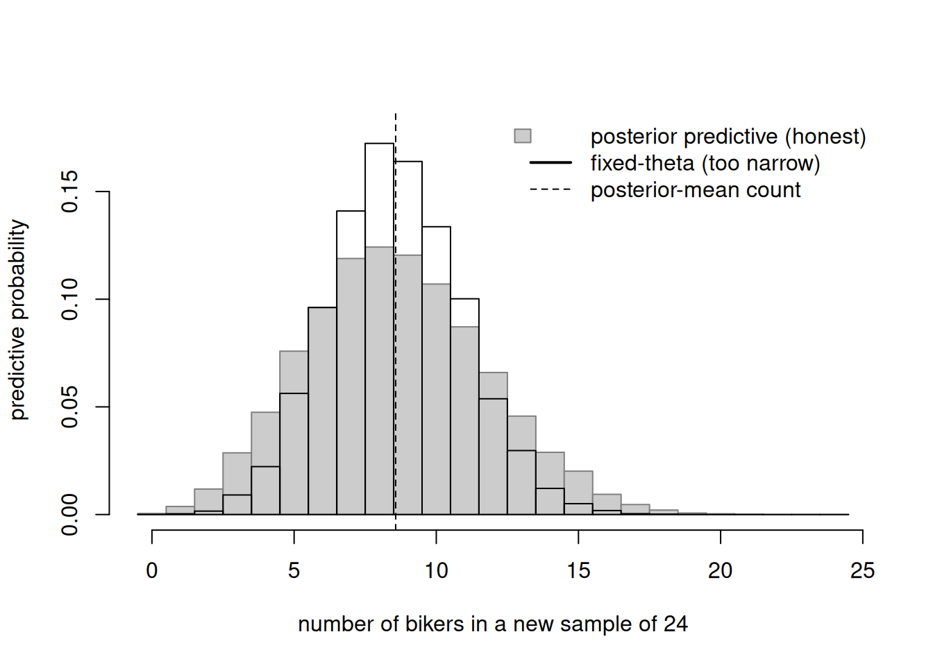
Take our posterior \(f(\theta \mid y) = \text{Beta}(10, 18)\) from the bike survey. We plan a new survey of \(m = 24\) students and ask: how many bikers should we expect, honestly accounting for all our uncertainty? We simulate the posterior predictive distribution with the two-step draw, then overlay what we would have gotten if we (wrongly) pretended \(\theta\) were fixed at its posterior mean.
set.seed(606)m <-24N <-20000# Two-step draw: first theta from the posterior, then data given thetatheta_draws <-rbeta(N, 10, 18) # posterior Beta(10,18)y_ppd <-rbinom(N, size = m, prob = theta_draws) # new counts# The WRONG, too-narrow version: fix theta at the posterior meantheta_mean <-10/28y_fixed <-rbinom(N, size = m, prob = theta_mean)brks <-seq(-0.5, m +0.5, by =1)h1 <-hist(y_ppd, breaks = brks, plot =FALSE)h2 <-hist(y_fixed, breaks = brks, plot =FALSE)plot(h1, freq =FALSE, col ="grey80", border ="grey50",main ="", xlab ="number of bikers in a new sample of 24",ylab ="predictive probability",ylim =c(0, max(h1$density, h2$density) *1.05))plot(h2, freq =FALSE, col =NA, border ="black", lwd =2, add =TRUE)abline(v = m * theta_mean, lty =2)legend("topright", bty ="n",legend =c("posterior predictive (honest)","fixed-theta (too narrow)","posterior-mean count"),fill =c("grey80", NA, NA),border =c("grey50", NA, NA),lty =c(NA, 1, 2), lwd =c(NA, 2, 1))
Figure 1: Posterior predictive distribution for the number of bikers in a new sample of m = 24, from the Beta(10,18) posterior (gray), compared with the narrower Binomial(24, 0.357) you would wrongly get by fixing θ at its posterior mean (outline). Predictive spread is the wider one.
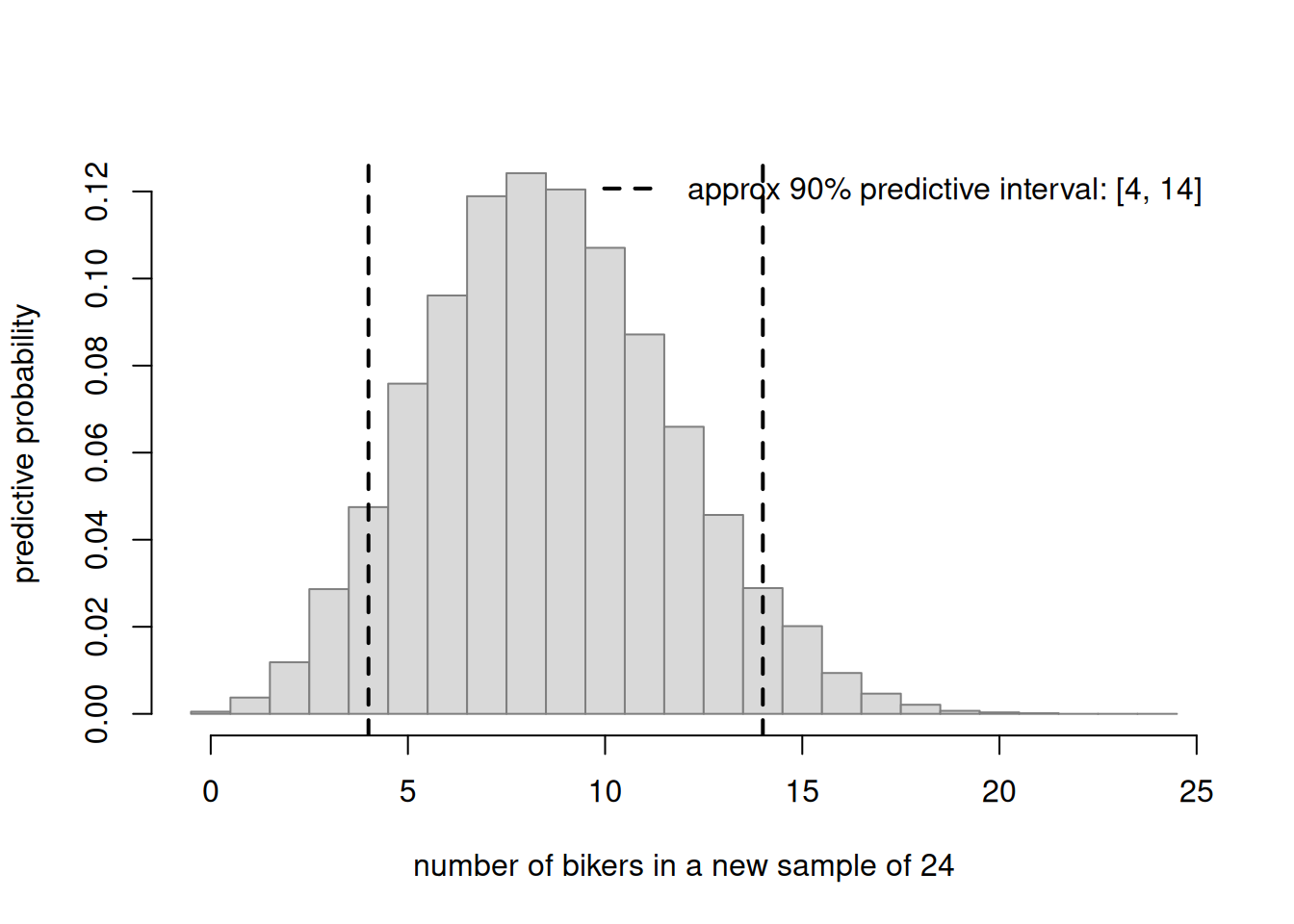
Both distributions center near \(24 \times 0.357 \approx 8.6\). But the gray posterior predictive is wider — that extra width is exactly the parameter uncertainty the fixed-\(\theta\) version threw away. A defensible “central guess plus interval” comes from the gray one. We can read a predictive interval straight off the simulation:
set.seed(606)m <-24theta_draws <-rbeta(20000, 10, 18)y_ppd <-rbinom(20000, size = m, prob = theta_draws)pi90 <-quantile(y_ppd, c(0.05, 0.95))hist(y_ppd, breaks =seq(-0.5, m +0.5, by =1), freq =FALSE,col ="grey85", border ="grey50",main ="", xlab ="number of bikers in a new sample of 24",ylab ="predictive probability")abline(v = pi90, lty =2, lwd =2)legend("topright", bty ="n", lty =2, lwd =2,legend =sprintf("approx 90%% predictive interval: [%d, %d]",round(pi90[1]), round(pi90[2])))
Figure 2: An approximate 90% posterior predictive interval for the number of bikers in a new sample of 24, read off the simulated posterior predictive counts as the 5th and 95th percentiles.
The interpretation is plain-language and honest: if our model is right, then in a new sample of 24 students we would predict roughly the mid-single-digits to low-teens bikers, with about 90% predictive probability. Note this is a predictive interval about future counts, not a credible interval about \(\theta\) — different objects, different widths. Always say which one you mean.
Worked example — a posterior predictive CHECK on the bike data (recurring case)
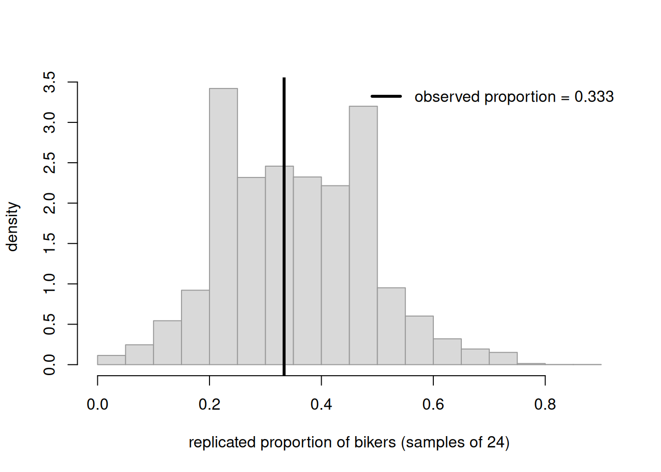
Now the checking move. We have the observed data: \(y = 8\) bikers in \(n = 24\). Is that an ordinary thing for our fitted model to produce? We generate many replicated datasets of the same size (\(n = 24\)) from the posterior predictive distribution, summarize each by its observed proportion \(y^{\text{rep}}/24\), and see where our actual observed proportion \(8/24 \approx 0.333\) falls in the crowd.
set.seed(606)n <-24theta_draws <-rbeta(10000, 10, 18)y_rep <-rbinom(10000, size = n, prob = theta_draws)prop_rep <- y_rep / nobs_prop <-8/24hist(prop_rep, breaks =20, freq =FALSE,col ="grey85", border ="grey60",main ="", xlab ="replicated proportion of bikers (samples of 24)",ylab ="density")abline(v = obs_prop, lwd =3)legend("topright", bty ="n", lwd =3,legend =sprintf("observed proportion = %.3f", obs_prop))# A rough "predictive position": fraction of replicates at or below the observedmean(prop_rep <= obs_prop)
[1] 0.5011
Figure 3: Posterior predictive check for the bike survey: simulated replicated proportions (gray) from samples of size 24, with the observed proportion 8/24 marked. The observed value sits comfortably inside the bulk, so the model passes this check.
The observed proportion lands near the middle of the replicated cloud — not out in a tail. The printed fraction of replicates at or below the observed value is comfortably away from 0 and 1. This check passes: a Beta-Binomial model with this posterior is entirely capable of generating data like ours. That is reassuring but modest — it confirms consistency on this summary, nothing more.
(Of course this check should pass: we fit the model to this data, so the data ought to look typical of its own posterior predictive. Predictive checks earn their keep on summaries the model was not tuned to match — overdispersion, zero counts, extreme values — and that is the real diagnostic skill.)
Worked example — transfer: a clinic wait-time count check (Gamma-Poisson)
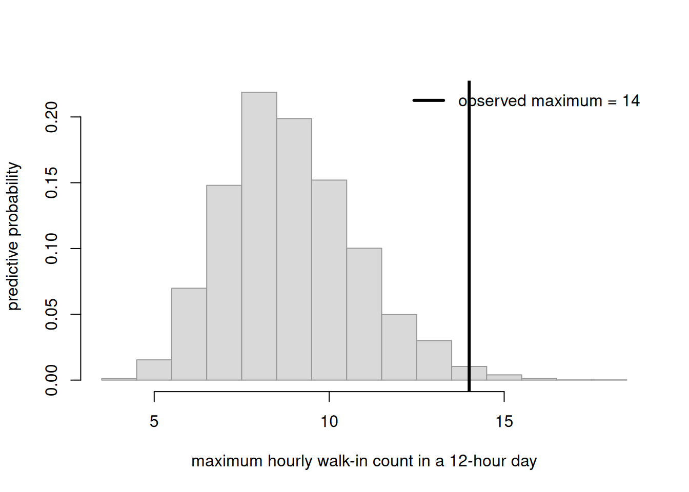
A different context, same logic. A small campus clinic models the number of walk-ins per hour as \(\text{Poisson}(\lambda)\) and has arrived at a posterior \(f(\lambda \mid y) = \text{Gamma}(40, 8)\) (the Gamma–Poisson conjugate update — a Gamma prior with Poisson counts, the same posterior \(\propto\) likelihood \(\times\) prior logic in a new family — which we take as given for this check; posterior mean \(40/8 = 5\) walk-ins/hour). Staff suspect the real data has more very-busy hours than a plain Poisson allows. A natural test quantity is the maximum count seen in a 12-hour day. We generate replicated days and compare the observed maximum (say it was 14) to the replicated maxima.
set.seed(606)hours <-12Nday <-5000lambda_draws <-rgamma(Nday, shape =40, rate =8) # posterior Gamma(40,8)# For each replicated day, simulate 12 hourly counts and take the maxrep_max <-sapply(lambda_draws, function(lam) max(rpois(hours, lam)))obs_max <-14hist(rep_max, breaks =seq(min(rep_max) -0.5, max(c(rep_max, obs_max)) +0.5, by =1),freq =FALSE, col ="grey85", border ="grey60",main ="", xlab ="maximum hourly walk-in count in a 12-hour day",ylab ="predictive probability")abline(v = obs_max, lwd =3)legend("topright", bty ="n", lwd =3,legend =sprintf("observed maximum = %d", obs_max))mean(rep_max >= obs_max) # how often replicates are this extreme
[1] 0.016
Figure 4: Posterior predictive check for clinic walk-ins: the distribution of the maximum hourly count over a 12-hour replicated day from a Gamma(40,8)-Poisson model, with an observed maximum of 14 marked far in the right tail — a flagged mismatch.
Here the observed maximum sits far in the right tail, and the printed fraction of replicates that are this extreme is tiny. The check has flagged a mismatch: a plain Poisson with this posterior almost never produces a day this busy, yet we saw one. That does not tell us what to do — but it points exactly where to look (perhaps the count is overdispersed, or busy hours cluster), which is what a good check is for.
A common mistake
Treating parameter uncertainty as if it were predictive uncertainty — and getting the width wrong.
The trap sounds reasonable: “My posterior says \(\theta\) is about \(0.357\) and fairly precise, so the number of bikers in the next 24 should be about \(8.6\), very tightly.” That confuses two different questions. The posterior’s tightness is about the parameter; the next sample’s spread also includes sampling variability, which is often the larger part for a single new dataset. A predictive statement built only from the posterior is too confident — its interval is too narrow, and it will be “surprised” by ordinary future data far too often.
How to catch it: ask yourself what object am I describing — a parameter or future data? If it is future data, you must simulate the full two-step draw (posterior \(\theta\), then data \(\mid \theta\)), or your interval is missing a whole source of variation. The figure @fig-bike-ppd is the antidote: the wider gray distribution is honest; the narrow outline is the mistake.
Interpretation guidance
What a passed check means: the model is capable of producing data like yours on the summary you chose. It is a consistency check, not a certificate of truth. Many wrong models pass many checks; a pass simply means you have not found this particular flaw. Passing one summary says nothing about others you did not test.
What a failed check means and does not mean: a failure says the observed data is surprising under this model on this summary — a genuine, useful signal that some assumption may be inadequate. It does not tell you which assumption is wrong, it does not prove the model is “false” in any absolute sense, and it does not by itself tell you the fix. It is a flashlight pointing at a discrepancy, not a verdict. A sensible response is to look at which summary failed and reason about what modeling change would address it (a different data model, more structure), then re-check.
Two framing reminders carried from earlier weeks. Predictive intervals are about future data, not about \(\theta\) — keep them verbally distinct from credible intervals. And as always, report a central predictive value with its predictive interval; a single predicted number with no spread hides the very uncertainty this week is built to expose.
Practice (ungraded)
Use these to check your own understanding. No solutions are posted here.
In your own words, why does the posterior predictive distribution integrate out \(\theta\) rather than just plug in the posterior mean? What would be lost by plugging in?
Using the bike posterior \(\text{Beta}(10,18)\), sketch (or simulate) the posterior predictive for a new sample of \(m = 50\). Would you expect the proportion spread to be wider or narrower than for \(m = 24\)? Why?
A classmate reports a “95% interval of \(0.34\) to \(0.37\) for the number of bikers next week.” Name what has gone wrong and what they were probably computing instead.
For the clinic example, suggest two different test quantities (besides the maximum) you could use in a posterior predictive check, and say what kind of model failure each would be sensitive to.
A posterior predictive check passes on the mean but fails on the variance. What can and cannot you conclude, and what would you investigate next?
Reading guide
This week maps to Bayes Rules! Ch 8 — Posterior inference & prediction. Chapter 8 develops three strands of using a posterior: summarizing it, testing claims about \(\theta\), and — our focus — prediction. Read the chapter’s treatment of the posterior predictive model as the bridge from \(\theta\)-inference to data-prediction: its core message is the same averaging-over-the-posterior idea we wrote as the integral above, and its simulation recipe is the same two-step draw we used in every figure. As you read, hold our running bike example beside the book’s worked case so the structure transfers even though the numbers differ. The chapter also previews why simulation is the practical engine for all of this, which is exactly where Week 7 goes. We adapt the chapter’s concepts in the course’s own framing and synthetic examples; the text is used under CC BY-NC-SA 4.0.
Public vs. graded
These notes and the ungraded practice above are public and for learning only. No answer keys are posted here, and nothing on this page sets graded prompts, rubric values, point values, or due dates. For anything that counts toward your grade — homework specifics, quiz scope, deadlines — the LMS (Blackboard) is authoritative. Where this page and the LMS differ, the LMS governs.
Looking ahead
Every figure this week leaned on the same trick — draw a \(\theta\), then draw data — done thousands of times. Next week, Week 7 — Simulation-first computation, we make that trick the explicit foundation: building, summarizing, and trusting posteriors and predictions through simulation, and turning it into a reproducible workflow. See Week 7 — Simulation-first computation.
See also
Labs — the reproducible computation strand; the predictive simulation here is built on the same two-step draw practiced in Lab 7 — Grid approximation in Quarto.
Notation glossary — symbols for \(\theta\), \(y\), \(f(\theta \mid y)\), and the posterior predictive \(f(y_{\text{new}} \mid y)\).
Syllabus — course shape and outcomes (O3, O8 are the focus this week).