set.seed(35103)

n <- 100   # full MAC usage-rate survey: students surveyed
k <- 38 # students who used the MAC at least once this weekLab 6 — Likelihood curves
Plotting the Binomial likelihood by hand-in-code and reading off the maximum
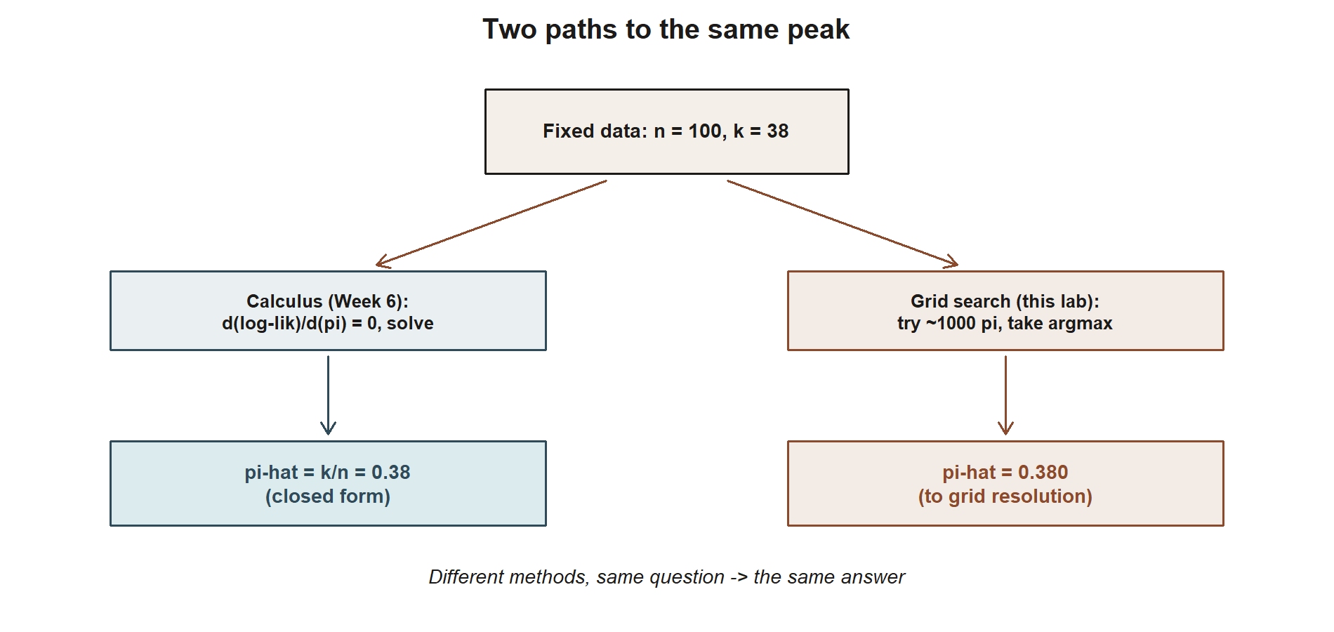
Purpose. This lab is the computational companion to Week 6 — Maximum likelihood estimation. There, you derived the Binomial MLE by calculus: differentiate the log-likelihood with respect to \(\pi\), set the derivative to zero, and solve to get \(\hat\pi_{MLE} = k/n\). Here, you build the likelihood curve directly from the definition, over a grid of candidate \(\pi\) values, and confirm numerically that the highest point on that curve sits exactly where the calculus said it would. Seeing the curve, and watching a search over candidate values land on the same answer as the derivative, is the point: calculus finds the peak of a curve, and this lab lets you look at the curve.
The idea
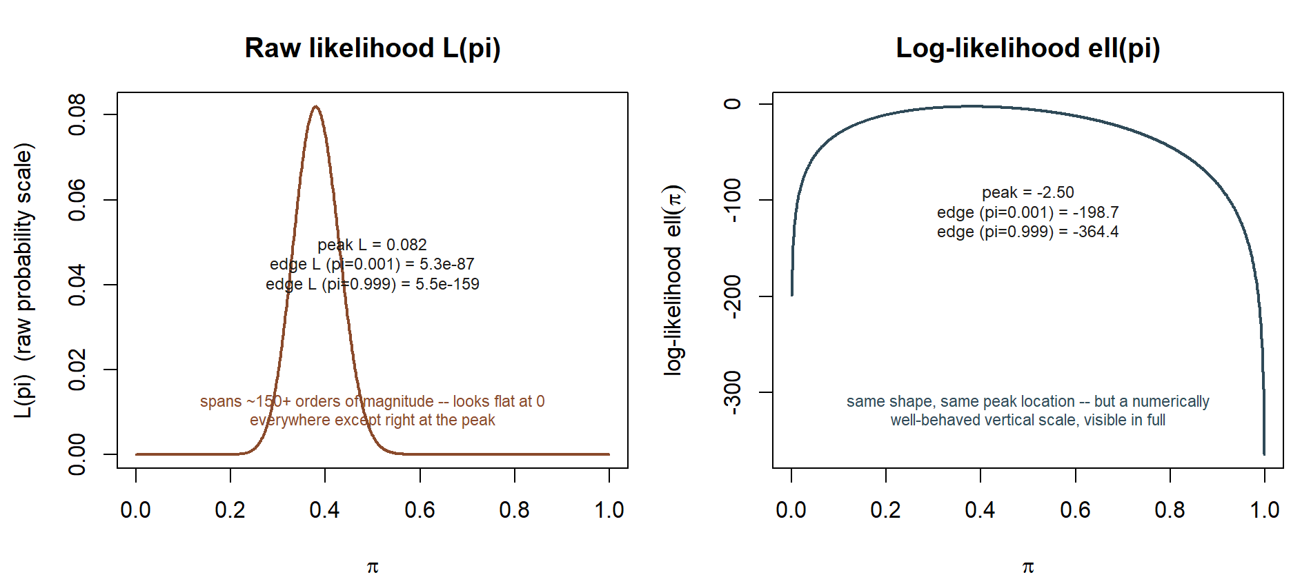
A likelihood function \(L(\pi)\) is not a probability distribution over \(\pi\) — it is an ordinary function of \(\pi\), built from data that is already fixed. For the MAC usage-rate survey, the data in hand is fixed: \(n = 100\) students surveyed, \(k = 38\) of them used the MAC at least once this week. Once \(n\) and \(k\) are fixed, the Binomial probability mass function
\[ P(K = k \mid \pi) = \binom{n}{k}\pi^k(1-\pi)^{n-k} \]
can be re-read as a function of \(\pi\) for that fixed \(k\), and that re-reading is exactly \(L(\pi)\). Because \(\binom{n}{k}\) does not involve \(\pi\), it does not shift where the maximum falls, but this lab keeps it in place anyway, so the curve you plot is the actual likelihood, not just the kernel.
The idea of this lab is almost embarrassingly direct: instead of taking a derivative, you can just try a lot of values of \(\pi\), compute \(L(\pi)\) (or, better, \(\ell(\pi) = \ln L(\pi)\)) at each one, and see which value gives the largest result. This is a grid search. It does not replace the calculus derivation from Week 6 — it cannot tell you the maximum is a maximum in any exact sense, and it cannot hand you a clean closed-form answer like \(\hat\pi_{MLE} = k/n\). But it is an excellent way to see what the calculus derivation is doing, and a useful sanity check whenever you are not sure you trust an algebraic derivative.
Two housekeeping points before you start.
First, why work with \(\ell(\pi) = \ln L(\pi)\) instead of \(L(\pi)\) itself. With \(n = 100\), a term like \(\pi^{38}(1-\pi)^{62}\) is an extremely small number — computing it directly risks numerical underflow, where a value that is mathematically positive gets rounded to exactly 0 in floating-point arithmetic because it is too small for the computer’s number representation to distinguish from zero. Logarithms turn that tiny product into a sum of manageable-sized terms (\(k\ln\pi + (n-k)\ln(1-\pi)\), plus a constant from the binomial coefficient), which is numerically well behaved at any sample size. Because \(\ln(\cdot)\) is a strictly increasing function, the location of the maximum is identical whether you maximize \(L(\pi)\) or \(\ell(\pi)\) — only the vertical scale changes. This lab plots \(\ell(\pi)\) for exactly that numerical-stability reason, and says so at the point it matters.
Second, a grid search finds the best value among the grid points you tried — it is only as fine as the grid. A grid stepping by \(0.001\) across \((0, 1)\) gives 999 candidate values, which is plenty of resolution to land on \(\pi = 0.380\) to three decimal places; a coarser grid (say, steps of \(0.05\)) would only be able to land on \(0.35\) or \(0.40\), missing \(0.38\) entirely. The finer the grid, the closer the numerical maximum sits to the true calculus answer — in the limit of an infinitely fine grid, they coincide exactly.
Goal
Using the full MAC usage-rate survey (\(n = 100\), \(k = 38\)), build a grid of candidate \(\pi\) values, compute the (log-)likelihood at each one, plot the resulting curve, and confirm that its numerical maximum sits at \(\hat\pi = 0.38\) — matching \(k/n = 38/100 = 0.38\), the closed-form MLE derived by calculus in Week 6.
Setup
- Base R only; no packages beyond what ships with R.
set.seed(35103)is included in the setup chunk for consistency with the rest of the course’s convention, even though this particular lab does not simulate random data — every number here (the grid, \(n\), \(k\)) is fixed and deterministic, and the plot you produce will be identical every time you run it.- You will need:
dbinom()(density/mass function, here used withlog = TRUE),seq()(to build the grid),which.max()(to locate the peak), and base graphics (plot(),abline(),points()). - The two numbers that drive this whole lab are fixed by the MAC Study and must not be changed: \(n = 100\) survey respondents, \(k = 38\) of whom used the MAC at least once this week.
Steps
Step 1 — Define a grid of candidate \(\pi\) values
A proportion can only take values in \([0, 1]\), so that is the natural range for the grid. Avoid the exact endpoints \(0\) and \(1\): at \(\pi = 0\) the term \(\ln(\pi)\) is undefined (and \(k > 0\), so \(\pi = 0\) cannot be the right answer anyway), and at \(\pi = 1\) the term \(\ln(1-\pi)\) is undefined (and \(k < n\), so \(\pi = 1\) cannot be right either). A step of \(0.001\) gives 999 candidate values between (but not including) \(0\) and \(1\), which is fine enough resolution to recover \(\hat\pi = 0.380\) to three decimal places.
pi_grid <- seq(0.001, 0.999, by = 0.001)

# sanity checks on the grid before using it
length(pi_grid)     # 999 candidate values
range(pi_grid)       # (0.001, 0.999) -- neither endpoint is exactly 0 or 1
Step 2 — Compute the (log-)likelihood at each grid value
For each candidate \(\pi\) in the grid, compute the log-likelihood of observing \(k = 38\) successes in \(n = 100\) trials, treating that candidate \(\pi\) as if it were the true success probability. dbinom(k, size = n, prob = pi, log = TRUE) does exactly this: it returns \(\ln P(K = k \mid \pi) = \ln\!\binom{n}{k} + k\ln\pi +
(n-k)\ln(1-\pi)\), evaluated at whatever pi you hand it, for the fixed k and n. Because dbinom() is vectorized, handing it the whole grid at once returns a same-length vector of log-likelihood values — one per candidate \(\pi\) — without writing an explicit loop.
log_lik <- dbinom(x = k, size = n, prob = pi_grid, log = TRUE)

# a peek at the shape: log-likelihood is large-negative at the extremes...
head(data.frame(pi = pi_grid, log_lik = log_lik), 3)
tail(data.frame(pi = pi_grid, log_lik = log_lik), 3)

# ...and (we expect) least negative -- i.e. largest -- somewhere in the middle
summary(log_lik)
Two things are worth noticing in that output before moving on. Every value of log_lik is negative, because dbinom() returns a log-probability, and a probability strictly between 0 and 1 always has a negative natural log. And the values near the two ends of the grid (pi close to 0.001 or 0.999) are large in magnitude and very negative — those candidate values are extremely poor explanations of seeing 38 successes out of 100 trials, and the log-likelihood says so emphatically.
Step 3 — Plot the log-likelihood curve and mark its numerical maximum
which.max() returns the position in a vector where the largest value occurs — here, the grid index of the candidate \(\pi\) with the highest log-likelihood. Use that position to pull out both the best \(\pi\) and its log-likelihood, then draw the curve with that point marked.
best_index   <- which.max(log_lik)
pi_hat_grid  <- pi_grid[best_index]
loglik_at_hat <- log_lik[best_index]

pi_hat_grid     # the numerical MLE read off the grid
loglik_at_hat   # the log-likelihood value at that point

plot(pi_grid, log_lik, type = "l", lwd = 2,
     xlab = expression(pi), ylab = expression(paste("log-likelihood  ", ell(pi))),
     main = "Binomial log-likelihood, MAC usage survey (n = 100, k = 38)")
abline(v = pi_hat_grid, lty = 2, col = "gray40")
points(pi_hat_grid, loglik_at_hat, pch = 19, col = "firebrick", cex = 1.3)
This chunk is shown but not executed on this page (eval: false) — running it yourself is the point. The figure below was produced by running exactly this grid search separately (same pi_grid, same dbinom() call, same which.max() logic), so you can compare its shape and its marked peak to what you get when you run it yourself:
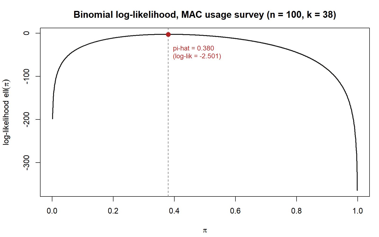
The curve should look like a single smooth hill: rising from a very negative value near \(\pi = 0.001\), reaching one clear peak, and falling away again toward \(\pi = 0.999\). That single-peaked (unimodal) shape is a general feature of the Binomial log-likelihood, not a coincidence of these particular numbers — it is exactly what lets a derivative-based search (Week 6’s calculus) find the same maximum a grid search finds here.
Step 4 — Confirm the numerical maximum against the calculus MLE
Week 6 derived, by setting \(\dfrac{d\ell}{d\pi} = 0\) and solving, that the Binomial MLE has the closed form \(\hat\pi_{MLE} = k/n\). For this survey, \(k/n = 38/100 = 0.38\). Compare that closed-form value directly against pi_hat_grid from Step 3.
pi_hat_calculus <- k / n
pi_hat_calculus     # 0.38, from Week 6's derivative-based derivation

pi_hat_grid         # 0.38 (to the grid's 0.001 resolution), from the search above

all.equal(pi_hat_grid, pi_hat_calculus, tolerance = 0.001)
With a grid step of \(0.001\), pi_hat_grid lands at exactly 0.38, matching pi_hat_calculus to the grid’s resolution. This is the payoff of the whole lab: two completely different methods — an algebraic derivative set to zero, and a brute-force search over nearly a thousand candidate values — arrive at the same answer, because both are answering the same question (“which \(\pi\) makes the observed data most likely?”).
Verify
Work through this checklist before considering the lab complete.
length(pi_grid)returns999, andrange(pi_grid)shows neither endpoint is exactly0or1.log_likis the same length aspi_grid(length(log_lik) == length(pi_grid)isTRUE), and every entry is negative.- The plotted curve is single-peaked: it rises, reaches one maximum, and falls — with no second bump.
pi_hat_gridequals0.38(to three decimal places), matchingk / n = 38 / 100 = 0.38from Week 6.- Nudging the grid finer (e.g.
by = 0.0001instead ofby = 0.001) still lands the maximum at0.38— the answer is not an artifact of a particular grid spacing.
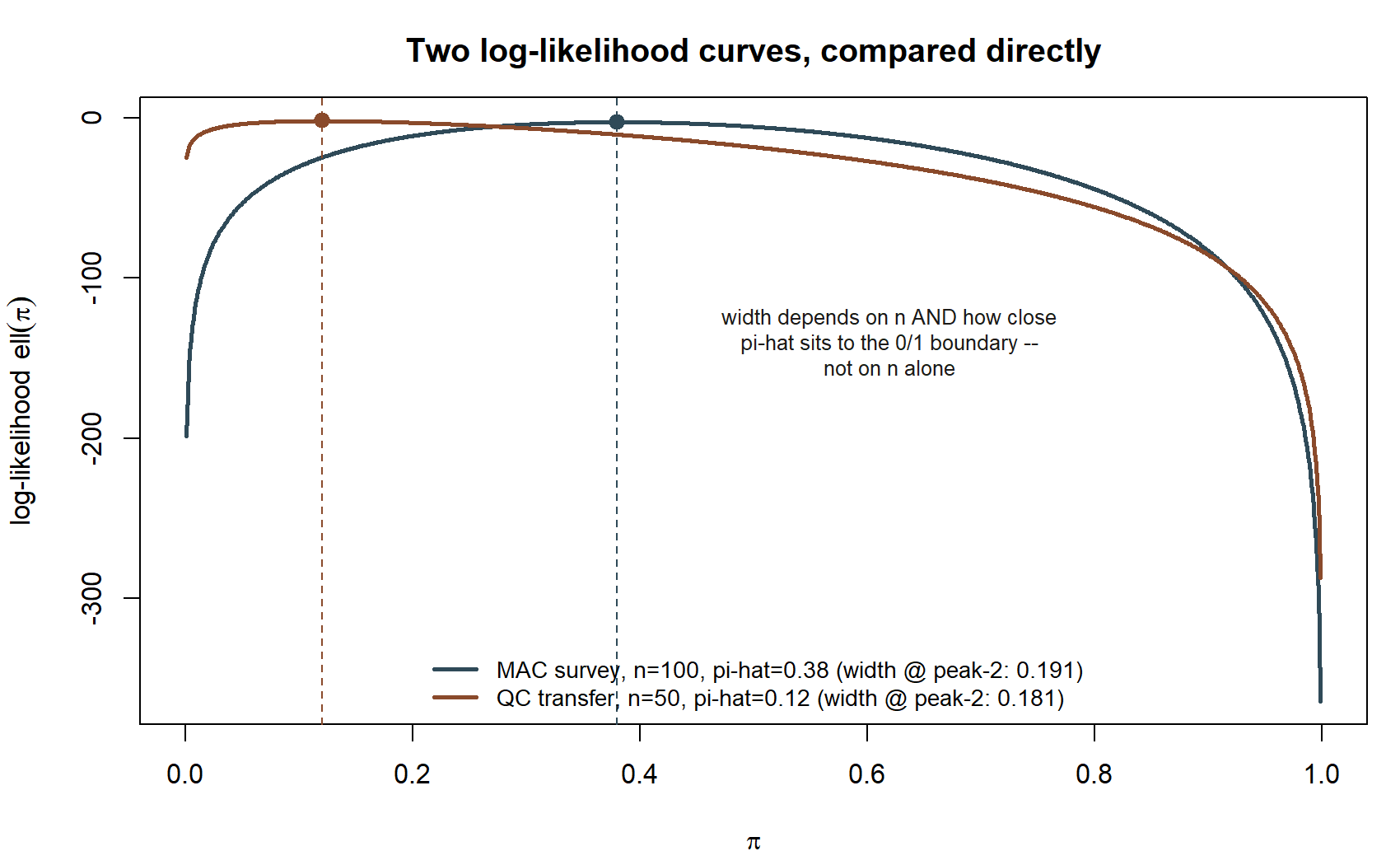
A transfer example — same idea, a different, synthetic context
To confirm you understand the method and not just this one dataset, repeat Steps 1–4 for a second, unrelated binomial scenario: synthetic data (not the MAC Study) from a small-business quality-control setting. A parts supplier tests a batch of \(n = 50\) synthetic component samples for a defect, and finds \(k = 6\) defective units. Under the same Binomial model, the calculus MLE is \(\hat\pi_{MLE} = k/n = 6/50 = 0.12\).
set.seed(35103)

# synthetic quality-control data -- NOT the MAC Study, illustrative only
n_qc <- 50
k_qc <- 6

pi_grid_qc <- seq(0.001, 0.999, by = 0.001)
log_lik_qc <- dbinom(x = k_qc, size = n_qc, prob = pi_grid_qc, log = TRUE)

best_index_qc  <- which.max(log_lik_qc)
pi_hat_grid_qc <- pi_grid_qc[best_index_qc]

pi_hat_grid_qc          # should land at 0.12
k_qc / n_qc             # 6 / 50 = 0.12, the calculus MLE for comparison

plot(pi_grid_qc, log_lik_qc, type = "l", lwd = 2,
     xlab = expression(pi), ylab = expression(paste("log-likelihood  ", ell(pi))),
     main = "Synthetic transfer example: quality-control defect rate (n = 50, k = 6)")
abline(v = pi_hat_grid_qc, lty = 2, col = "gray40")
points(pi_hat_grid_qc, log_lik_qc[best_index_qc], pch = 19, col = "firebrick", cex = 1.3)
This chunk is shown but not executed on this page (eval: false) — running it yourself is the point. The figure below was produced by running exactly this grid search separately (same synthetic n_qc/k_qc, same pi_grid_qc, same dbinom()/which.max() logic), so you can compare it to your own run:
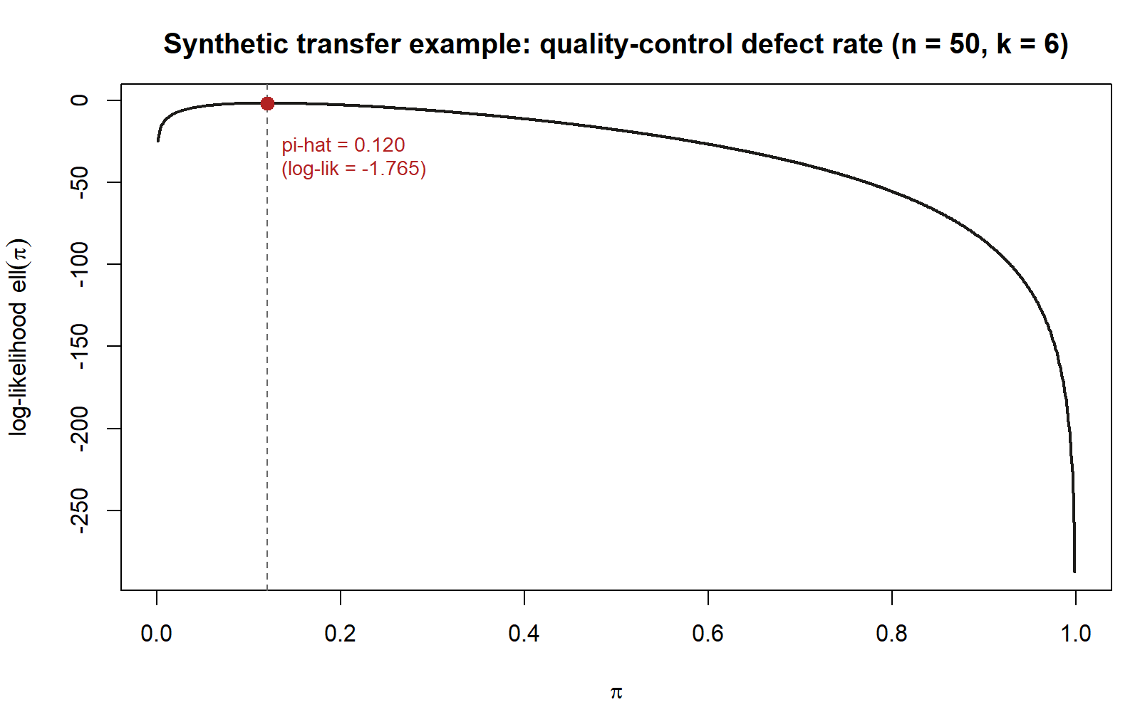
If pi_hat_grid_qc comes out to 0.12, matching k_qc / n_qc, you have confirmed the grid-search method generalizes beyond the MAC Study’s particular numbers — it is a property of the Binomial likelihood in general, not a coincidence of \(n = 100, k = 38\).
AI use note
| Tool | Purpose | Verification |
|---|---|---|
| AI coding assistant (e.g. an LLM-based chat or IDE completion tool) | Drafting or explaining a dbinom()/which.max() grid-search snippet, or debugging a plotting call |
Re-derive the calculus MLE (\(k/n\)) independently and check the grid-search output against it by hand before trusting any AI-suggested code; re-run the chunk yourself line by line rather than pasting a block unread |
See also
- Week 6 — Maximum likelihood estimation — the calculus derivation this lab confirms numerically.
- Week 5 — Likelihood — where the likelihood function itself was introduced, using the small five-response pilot batch.
- Inference formula reference
- Notation glossary
- R and Quarto setup
The graded deliverable, its rubric, and due date live in Blackboard (the LMS) — this page is study and practice only.