Week 14 — An applied robust-methods report
The project shape: two methods, a sensitivity check, and an honest conclusion
Source basis. Original instructor-authored notes; data is synthetic (two groups of 24 “resolution times” drawn from a fixed generator, seed 45214). Open texts are conceptual companions cited by section title only (map-don’t-mine); no prose, figures, examples, or exercises are reproduced. See Open readings & attribution. Ungraded — Blackboard is authoritative for graded work.
This week. We do not learn a new method. We assemble the ones you already have into the shape a project takes: read the data, name what is fragile, choose at least two methods, compare them, run a sensitivity check, and write an honest conclusion. The whole point of a robust-methods course is not a longer menu of tests — it is knowing what to trust when the tests disagree.
Learning goals
By the end of this week you should be able to:
- Walk a data question through the applied-report workflow: structure → fragility → ≥2 methods → comparison → sensitivity → conclusion.
- Analyze one case two ways — a mean with a t interval, and a median with a bootstrap interval — and read where they agree and where they part.
- Run a sensitivity analysis: refit with and without an influential point, and say how much the answer depends on it.
- Write a conclusion that reports the estimate, its interval, the sensitivity, and the assumptions — and recognize overselling when you see it.
Where we are
Every earlier week asked a version of the same question: what is fragile here, and what can we still say? This week that question becomes a procedure you can hand to someone else. There is no derivation to memorize — there is a habit to practice. The habit is drawn below, and the rest of the page walks one synthetic case through it end to end.
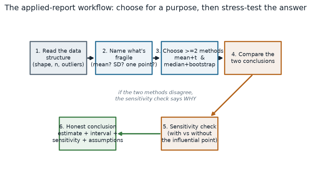
What to notice. Nothing in this chart is a formula. Steps 2 and 5 — name what is fragile and check the sensitivity — are the ones students skip, and they are exactly the ones that keep a small dataset honest. If two methods disagree at step 4, the sensitivity check at step 5 usually tells you why.
The workflow, as steps (nonvisual equivalent).
| Step | What you do |
|---|---|
| 1. Read the structure | shape, sample size, outliers, the scale of each variable |
| 2. Name what is fragile | which summary a single point could move (mean? SD? a slope?) |
| 3. Choose ≥ 2 methods | e.g. mean + t and median + bootstrap |
| 4. Compare conclusions | do the estimates and intervals point the same way? |
| 5. Sensitivity check | refit with and without the influential point |
| 6. Honest conclusion | estimate + interval + sensitivity + assumptions |
The case
A support team piloted a redesigned workflow B against the current workflow A and logged the resolution time (minutes) of 24 tickets under each. Workflow B looks slower — but one B ticket stalled for 118 minutes while a customer was unreachable. Is B really slower, or is that one ticket doing the talking? That is the fragility question (step 2), and it decides everything downstream.
The two samples, as numbers (nonvisual equivalent).
| Summary (minutes) | Current A (n = 24) | Redesigned B (n = 24) |
|---|---|---|
| Min · Q1 · Median · Q3 · Max | 3.5 · 11.0 · 14.7 · 21.4 · 31.2 | 8.5 · 17.4 · 24.4 · 35.5 · 118.0 |
| Mean | 15.9 | 28.9 |
| SD | 7.8 | 22.2 |
The 118-minute ticket is B’s maximum; the next-highest B value is only 47.0. That single point is why B’s SD (22.2) is nearly three times A’s (7.8). Remove it and B’s spread collapses to an SD of 11.7 — a first clue that the mean-and-SD summary of B is standing on one observation.
Worked example — the case analysed two ways
Following the workflow, we analyze the same question — how much slower is B? — with two methods that fail in different ways. Method 1 is the classic difference in means with a Welch t interval. Method 2 is the difference in medians with a percentile bootstrap interval (10,000 resamples of each group). The R is short and, deliberately, contains no plotting — the picture is downstream:
# Schematic: the named data objects are the sample(s) described in the text above; this illustrates the analysis, not a self-contained runnable block.
# the case: two workflows' resolution times (minutes)
A <- current_workflow            # n = 24
B <- redesigned_workflow         # n = 24, includes one 118-min ticket

# method 1 — difference in MEANS, Welch t interval
t.test(B, A)                     # mean difference, 95% CI, t, df, p

# method 2 — difference in MEDIANS, percentile bootstrap
set.seed(45214)
Bboot    <- 10000
diff_med <- replicate(Bboot,
  median(sample(B, replace = TRUE)) - median(sample(A, replace = TRUE)))
quantile(diff_med, c(0.025, 0.975))   # 95% percentile interval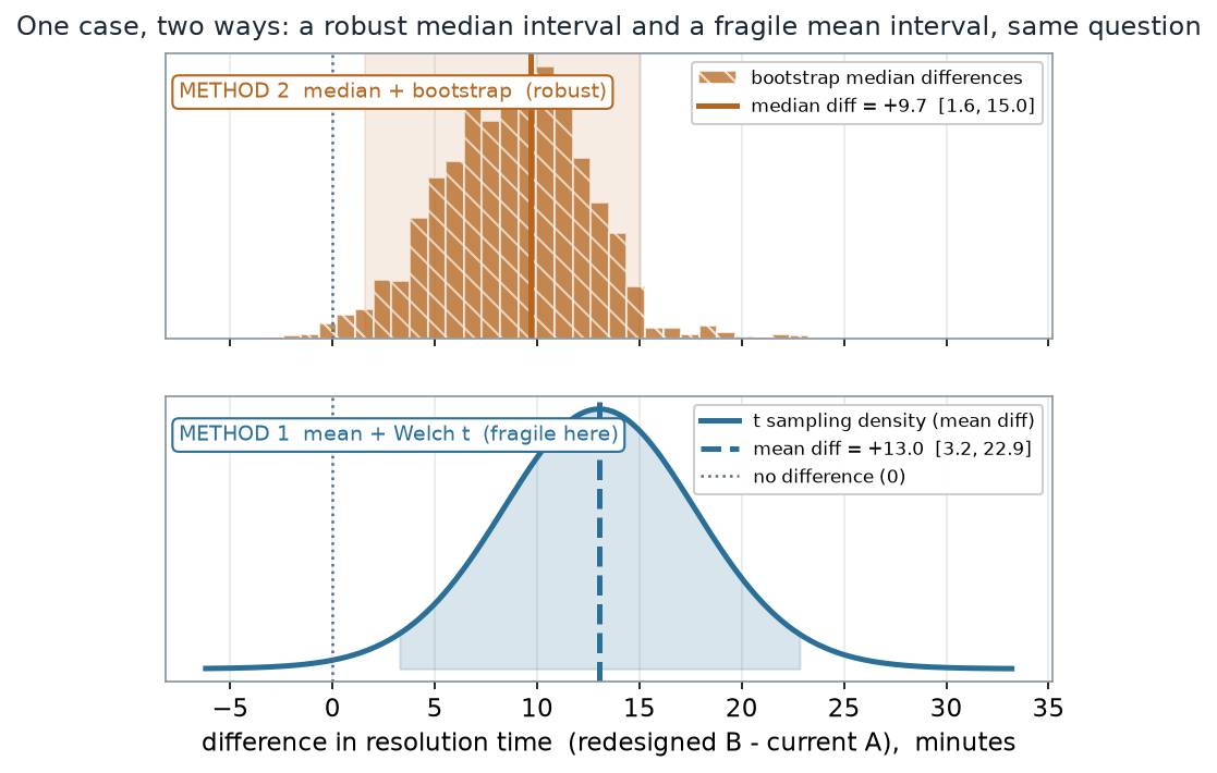
What to notice. Both intervals sit entirely to the right of zero, so both methods agree B is genuinely slower — this is not a case of one method finding an effect the other misses. Where they part is the size. The mean says +13.0; the median says +9.7. That 3-minute gap is the 118-minute ticket pulling the mean upward, and it also widens the t interval (up to 22.9) because one big value inflates the variance the t method depends on.
The two methods, as numbers (nonvisual equivalent).
| Method | Estimate of B − A | 95% interval | Detail |
|---|---|---|---|
| Mean difference (Welch t) | +13.0 min | [3.2, 22.9] | t = 2.72, df ≈ 28.6, p = 0.011 |
| Median difference (bootstrap, B = 10,000) | +9.7 min | [1.6, 15.0] | percentile interval |
Sensitivity — does one ticket move the answer?
Step 5 is the check that separates a report you can defend from one you cannot. We refit both methods on the same data with the one stalled ticket removed, and ask how far each estimate travels.
# Schematic: the named data objects are the sample(s) described in the text above; this illustrates the analysis, not a self-contained runnable block.
# sensitivity: refit both methods WITHOUT the one stalled ticket
B_red <- B[B < 100]              # drop the 118-min ticket (n = 23)
t.test(B_red, A)                 # the mean difference moves a lot
diff_med_red <- replicate(Bboot,
  median(sample(B_red, replace = TRUE)) - median(sample(A, replace = TRUE)))
quantile(diff_med_red, c(0.025, 0.975))   # the median difference barely moves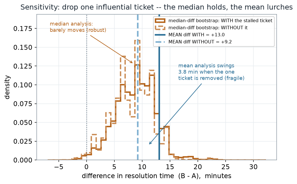
What to notice. The two median-difference bootstrap curves nearly lie on top of each other — the median barely knows the ticket exists. The two mean lines stand 3.8 minutes apart. So the honest size of the effect is “about 9 minutes,” and the extra 4 minutes the mean reports is one data point, not a property of workflow B. The robust estimate is the one that survives the sensitivity check.
Sensitivity, as numbers (nonvisual equivalent).
| Analysis | With the stalled ticket | Without it | Movement |
|---|---|---|---|
| Mean difference (Welch t) | +13.0 min, [3.2, 22.9] | +9.2 min, [3.3, 15.1] | −3.8 min |
| Median difference (bootstrap) | +9.7 min, [1.6, 15.0] | +9.2 min, [1.0, 14.4] | −0.5 min |
Notice the two analyses converge once the ticket is gone: mean +9.2 and median +9.2 now tell the same story. Agreement after a sensitivity check is itself evidence — it says the disagreement was caused by the point you just examined.
A common mistake
“Report only the analysis that looks strongest.” The temptation on a project is to run several analyses and present the one with the biggest number or the smallest p — here, the mean’s dramatic “+13 minutes, p = 0.011” — while quietly dropping the median result and never mentioning the 118-minute ticket. That is not a strong report; it is a hidden decision. The reader cannot tell whether your headline is a finding or an artifact. Honest reporting shows both methods, names the influential point, and lets the sensitivity check speak.
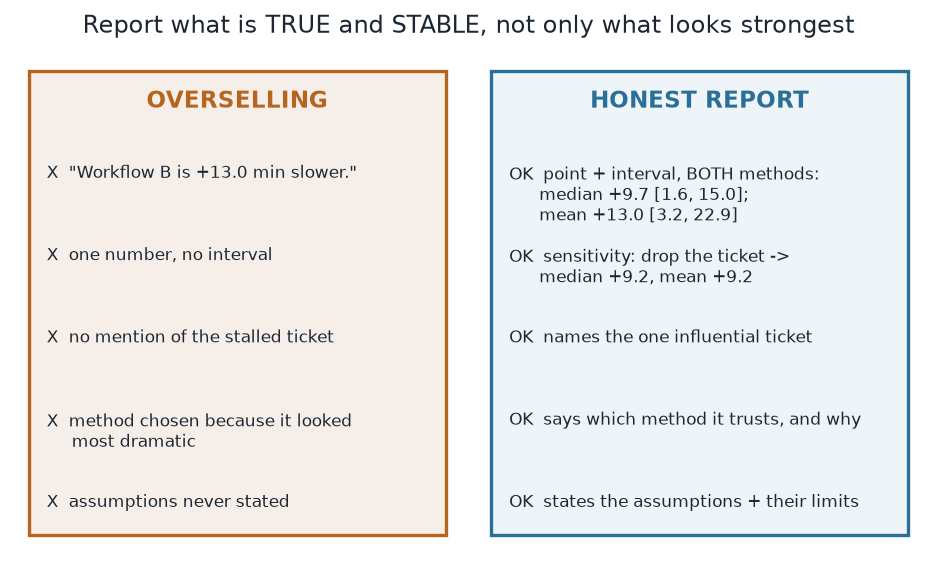
What to notice. The two columns describe the same data. The difference is entirely in what the author chose to disclose. Everything the honest column adds — an interval, a second method, the named ticket, the assumptions — makes the claim smaller and more trustworthy at the same time.
Overselling vs honest reporting (nonvisual equivalent).
| Overselling | Honest report |
|---|---|
| “B is 13 minutes slower.” — one number | point + interval, for both methods |
| method chosen because it looked biggest | says which method it trusts, and why |
| the 118-min ticket never mentioned | names the influential ticket + shows the sensitivity |
| assumptions unstated | states the assumptions and their limits |
The conclusion, written honestly
Here is how the case reads when the workflow is followed: “Across 24 tickets each, the redesigned workflow B resolved tickets about 9 to 10 minutes slower than the current workflow A (median difference +9.7 min, 95% bootstrap interval [1.6, 15.0]). A difference-in-means analysis reported a larger +13.0 min (95% t-interval [3.2, 22.9], p = 0.011), but that estimate is inflated by a single 118-minute ticket that stalled while a customer was unreachable; removing it brings the mean into agreement with the median at +9.2 min. We report the median difference as the primary result because it is stable under that one point, and we flag the stalled ticket as a data-quality question for the team.” That paragraph never hides a number, and it is more convincing for it.
Check your understanding (ungraded)
- In your own words, why does step 2 (“name what is fragile”) have to come before step 3 (“choose your methods”)? What would go wrong if you chose methods first?
- Both intervals excluded zero, so both methods agreed B is slower. Then what, exactly, was the disagreement between the mean and the median analysis about?
- The mean difference moved 3.8 minutes when one ticket was removed; the median moved 0.5. Which estimate would you headline, and what one sentence would you add about the ticket?
- A classmate writes: “The t-test gave p = 0.011, so the effect is real and about 13 minutes.” Name two things that sentence oversells, and rewrite it honestly.
Reading guide
- IMS — Inference for comparing two independent means — a companion for the mean-difference / t interval half of the case; read for the logic, then compare it to the bootstrap picture above.
- OpenIntro Statistics 4e — Inference for numerical data — reinforces what a two-group interval claims and does not claim.
- NIST/SEMATECH e-Handbook — Exploratory Data Analysis: assumptions & outliers — an instructor reference on checking whether the data support the summary you are about to report (the fragility step).
- Learning Statistics with R (Navarro) — Comparing two means / effect sizes — a companion on reporting an effect with its uncertainty rather than a bare significance verdict.
Accessibility notes
Mathematics and every statistic are live text, never baked into an image. Each figure carries an alt line stating its message, an adjacent “what to notice” reading, and a data-summary table repeating its key numbers, so every point survives without the picture. The two methods are distinguished by more than color. In the two-methods figure, median + bootstrap is a hatched ochre histogram with a solid ochre estimate line, while mean + t is a filled teal density with a dashed teal estimate line; in the sensitivity figure, linestyle instead marks with the ticket (solid) versus without it (dashed) for both methods, with median curves in ochre and mean lines in teal. Explicit value labels back every series, so nothing rests on color alone. A clean lint and a clean render are evidence, not proof; the rendered assistive-technology review is a human step.
Assessment (descriptive only)
This week contributes learning evidence toward carrying one question through the applied-report workflow and writing a conclusion that reports estimate, interval, sensitivity, and assumptions. That is the shape only; the actual project prompts, points, and due dates live in Blackboard.
Public vs. graded. These are public, ungraded notes and practice. Graded prompts, keys, rubrics, point values, and due dates live in Blackboard Ultra, which governs.
Looking ahead
Next week is the course synthesis: a method-choice decision guide that ties permutation, bootstrap, rank, robust, and simulation methods together — and one worked dataset revisited by three of them at once. The workflow you practiced here becomes the spine of that map.