Week 10 — Robust summaries & outliers
Summaries that don’t flinch, and outliers worth a second look
Source basis. Original instructor-authored notes; data is synthetic (a clean sample of 20 “task-completion times” in minutes plus one contaminating point, from a fixed generator, seed 45210). Open texts are conceptual companions cited by section title only (map-don’t-mine); no prose, figures, examples, or exercises are reproduced. See Open readings & attribution. Ungraded — Blackboard is authoritative for graded work.
This week. We have spent weeks building methods that survive when the Normal-shaped assumptions do not hold. Now we turn the same question on the summaries themselves: if one value in your sample is wrong — a stuck timer, a fat-fingered entry, a genuine but freak observation — which numbers break, and which barely notice? The answer separates fragile summaries (the mean, the standard deviation) from resistant ones (the median, a trimmed mean, the MAD), and it reframes an outlier from “an error to delete” into “a question to investigate.”
Learning goals
By the end of this week you should be able to:
- Contrast fragile and resistant location summaries — the mean vs the median and the 10%-trimmed mean — and predict which move when a sample is contaminated.
- Read a summary’s breakdown point: the fraction of the data you must corrupt before it can be driven arbitrarily far off.
- Do the same for spread: see the standard deviation inflate while a MAD-based scale resists.
- Explain why “robust” does not mean “delete the outlier,” and describe the investigate-then-report habit instead.
Where we are
Our recurring question is what is fragile here, and what can we still say? This week the fragile thing is the summary you report. Start with one clean sample of 20 task-completion times (minutes), then imagine a single run whose timer was left running, logging 185 minutes instead of the true ~40. The sample becomes 21 values, only one of them wrong. What happens to our headline numbers?
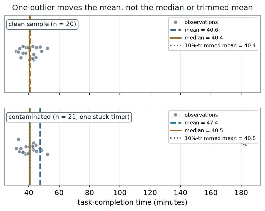
What to notice. One wrong value in 21 drags the mean up by nearly 7 minutes (40.6 → 47.4). The median moves by 0.1 and the 10%-trimmed mean by 0.5 — visually the two resistant lines stay locked over the bulk of the data while the mean is tugged toward the lone far-right point. The mean answers “where is the balance point of all values, including the bad one?”; the median and trimmed mean answer “where is the center of the crowd?”
Location summaries, clean vs contaminated (nonvisual equivalent).
| Location summary | Clean (n = 20) | Contaminated (n = 21) | Shift |
|---|---|---|---|
| Mean | 40.6 | 47.4 | +6.9 |
| Median | 40.4 | 40.5 | +0.1 |
| 10%-trimmed mean | 40.4 | 40.8 | +0.5 |
Shifts are computed from the unrounded values, so a shift can differ by 0.1 from subtracting the two rounded columns (the mean’s +6.9 is \(47.45 - 40.57 = 6.88\); the trimmed mean’s +0.5 is \(40.84 - 40.36 = 0.48\)).
The breakdown idea
Why does the mean cave while the median holds? Slide that one extra point along the number line and recompute each summary. The mean is a straight line in the point’s value: push the point to infinity and the mean goes with it. The median and trimmed mean instead level off — once the stray point is past the crowd, moving it further changes nothing, because a resistant summary throws that extreme position away.
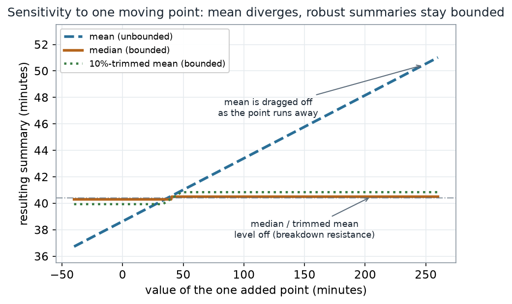
What to notice. The flat tails are breakdown resistance made visible. A summary’s breakdown point is the smallest fraction of the sample you must corrupt to send it to \(\pm\infty\). For the mean that fraction is one point in 21, about 5% — effectively 0 in large samples. The median tolerates up to 50% corruption; the 10%-trimmed mean, about 10%. Higher breakdown = harder to break.
Breakdown points (nonvisual equivalent).
| Summary | Breakdown point | Reading |
|---|---|---|
| Mean | ≈ 5% (1 of 21); → 0% for large n | one bad point is enough |
| 10%-trimmed mean | ≈ 10% | tolerates the trimmed fraction |
| Median | 50% | tolerates up to half the data |
Spread is fragile too
Robustness is not only about the center. The standard deviation squares every deviation, so a single far point dominates it. A resistant alternative is the median absolute deviation, \(\text{MAD} = \text{median}(|x_i - \text{median}(x)|)\), scaled by 1.4826 so that it estimates the same \(\sigma\) as the SD when the data really are Normal.
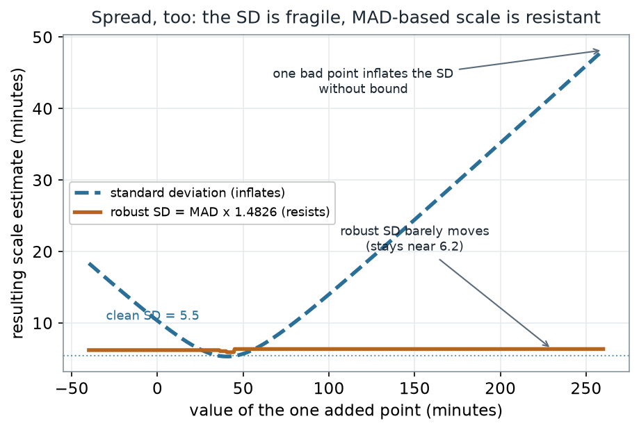
What to notice. On the clean sample the two agree closely (SD 5.5, robust SD 6.2 — both estimating a true spread near 6). Add the stuck timer and the SD explodes to 32.0 while the robust SD only creeps to 6.4. A spread of “32 minutes” would badly misdescribe a crowd that actually sits within a few minutes of 40.
Scale summaries, clean vs contaminated (nonvisual equivalent).
| Scale summary | Clean (n = 20) | Contaminated (n = 21) | Shift |
|---|---|---|---|
| Standard deviation | 5.5 | 32.0 | +26.5 |
| Robust SD (MAD × 1.4826) | 6.2 | 6.4 | +0.2 |
Worked example — recomputing the summaries
Take the clean sample, compute its five headline numbers, then drop in the one bad value and recompute. The arithmetic is ordinary; the lesson is in which numbers change.
The median is the average of the 10th and 11th sorted values, \((40.3 + 40.5)/2 = 40.4\). The 10%-trimmed mean on the contaminated sample of 21 drops \(\lfloor 0.10 \times 21 \rfloor = 2\) values from each end before averaging the middle 17 — so the 185 is discarded along with the smallest two, and the result (40.8) never sees the outlier. The MAD measures typical distance from the median: because the median itself barely moved, most \(|x_i - \text{median}|\) distances are unchanged and the MAD stays near 4.
Here is the R you would run — notice there is no plotting in it; the picture is downstream, and R’s mad() already applies the 1.4826 scaling for you:
# Schematic: the named data objects are the sample(s) described in the text above; this illustrates the analysis, not a self-contained runnable block.
# x is the vector of task-completion times (contaminated: 21 values incl. the 185)
mean(x)               # fragile mean
median(x)             # 50% breakdown
mean(x, trim = 0.10)  # 10%-trimmed mean: drops 2 from each end here

sd(x)                 # fragile spread
mad(x)                # MAD, already scaled by 1.4826 in R -> a robust SD
IQR(x)                # another resistant spread

# a quick sensitivity check: report each summary WITH and WITHOUT the suspect point
sapply(list(all = x, dropped = x[x < 100]),
       function(v) c(mean = mean(v), median = median(v), sd = sd(v), mad = mad(v)))
The last line is the honest move: don’t silently pick one number — show the reader how much the conclusion depends on the single suspect value.
“An outlier is an error, so delete it and move on.” Sometimes a far point is a recording mistake — but sometimes it is the most important observation in the dataset (the fraud, the failure, the rare responder). Robust does not mean “throw data away.” Robust summaries let you describe the crowd without first deciding the outlier’s fate; you then investigate the point on its own merits and report transparently. Deleting-until-tidy launders a real signal into a clean-looking lie.
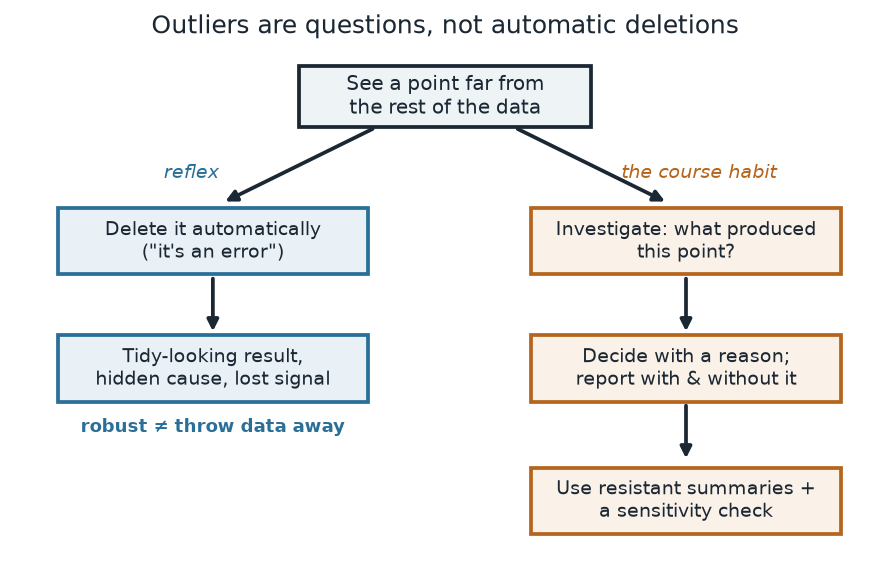
What to notice. The two paths share the same trigger and diverge on one choice. Auto-deleting optimizes for a neat table; investigating optimizes for a true description. The resistant summaries above are what let you walk the right-hand path — you can report a stable center and spread while the outlier’s cause is still an open question.
The two paths (nonvisual equivalent).
| Step | Reflex (avoid) | Course habit |
|---|---|---|
| On seeing a far point | delete it as “an error” | investigate what produced it |
| Result | tidy table, hidden cause | decision with a stated reason |
| Reporting | single number, lost signal | resistant summary + sensitivity (with/without) |
Check your understanding (ungraded)
- In your own words, what is a breakdown point, and why is the mean’s essentially 0 while the median’s is 50%?
- The contaminated mean rose to 47.4 but the trimmed mean stayed at 40.8. Explain what the trimming did to the 185-minute value, and why the median moved even less than the trimmed mean.
- The clean SD (5.5) and robust SD (6.2) nearly agree, but after contamination the SD is 32.0 and the robust SD is 6.4. Which one better describes the typical spread of the task times, and why?
- Give one situation where the far-out point is the most important observation, not an error — and say what your report should show instead of quietly deleting it.
Reading guide
- OpenIntro Statistics 4e — Examining numerical data — a conceptual companion on the mean vs the median and the effect of outliers; read for the intuition, then check it against the figures above.
- IMS — Exploring numerical data — reinforces resistant description (median, IQR) as the default for skewed or contaminated samples.
- Learning Statistics with R (Navarro) — Descriptive statistics — the section that introduces the trimmed mean and the median absolute deviation; a companion for the definitions we compute here (cited, not reproduced).
- NIST/SEMATECH e-Handbook of Statistical Methods — Detection of outliers / measures of scale — an instructor reference on robust scale estimates and the caution against reflexive deletion.
Accessibility notes
Mathematics is live text (\(\text{MAD} = \text{median}(|x_i - \text{median}(x)|)\) renders as MathML, not an image). Every figure carries an alt line stating its message, an adjacent “what to notice” reading, and a data-summary table, so each point survives without the picture. Series are distinguished by linestyle and marker (mean = dashed, median = solid, trimmed mean = dotted; the fragile mean and standard deviation are teal, the resistant median and robust SD are ochre, and the resistant 10%-trimmed mean is green) and by value-bearing labels, never color alone. A clean lint and a clean render are evidence; the rendered assistive-technology review is a human step.
Assessment (descriptive only)
This week contributes learning evidence toward choosing and defending a resistant summary and handling an outlier without deleting the signal. That is the shape only; the actual graded prompts, points, and due dates live in Blackboard.
Public vs. graded. These are public, ungraded notes and practice. Graded prompts, keys, rubrics, point values, and due dates live in Blackboard Ultra, which governs.
Looking ahead
Next week we push robustness from summaries into models: what happens to a fitted line when one high-leverage point pulls the slope, and how a resistant regression tracks the bulk of the data instead of chasing the outlier.