Week 1 — Why assumption-light?
What is fragile in a summary, and choosing a method for a purpose
Source basis. Original instructor-authored notes; data is synthetic (25 “self-checkout times” drawn from a fixed generator, seed 45201). Open texts are conceptual companions cited by section title only (map-don’t-mine); no prose, figures, examples, or exercises are reproduced. See Open readings & attribution. Ungraded — Blackboard is authoritative for graded work.
This week. This course is not a catalogue of “tests for when the Normal one fails.” It is a habit of mind: before you compute anything, ask what is fragile here — which numbers would move a lot if one observation, or one assumption, were different — and then choose a method on purpose. We start with the smallest possible case: one little sample, one stubborn outlier, and two ways to summarize it.
Learning goals
By the end of this week you should be able to:
- Explain what it means for a summary to be fragile, and contrast a mean/SD summary with a median/IQR summary on the same data.
- Show, with numbers, how a single observation drags the mean and SD while the median and IQR barely move.
- Recognise when a Normal-model assumption is questionable by eye, and say why that matters.
- State the course’s core reframe: nonparametric and robust methods are deliberate choices for a purpose — not an emergency “backup” you grab after a normality test fails.
Where we are
Every method in this course is an answer to one question: what is fragile here, and what can we still say responsibly? “Fragile” is not vague — it is measurable. A summary is fragile if a small change in the data (one mistyped value, one unusual customer, one broken sensor) produces a large change in the summary. So the first skill is not a test; it is the habit of asking which of your numbers are load-bearing and which are hostages to a single point.
One stuck checkout
Our running example is a batch of 25 self-checkout times (minutes), synthetic. Twenty-four are ordinary — a tight clump between about 1.6 and 5.2 minutes — and one transaction got stuck (a price check, a manager override) at 15.8 minutes. Nothing is wrong with that value; it really happened. The question is what it does to our two summaries.
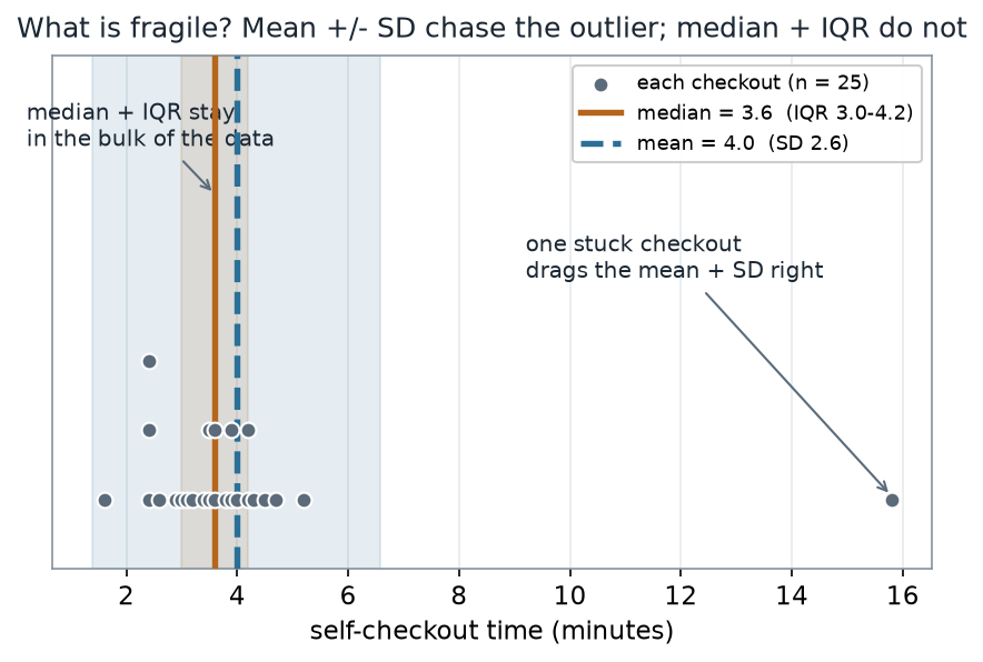
What to notice. The median line sits where most of the data actually is; the mean sits slightly to its right, and — more importantly — the mean±SD band is enormous (it reaches past 6 minutes) even though almost every checkout took under 5. A single point has made the SD describe a spread the data does not really have. That is fragility you can see.
The sample, as numbers (nonvisual equivalent).
| Summary | Value (minutes) |
|---|---|
| n | 25 |
| Min · Q1 · Median · Q3 · Max | 1.6 · 3.0 · 3.6 · 4.2 · 15.8 |
| Mean · SD | 4.0 · 2.6 |
| IQR (Q3 − Q1) | 1.2 |
The median (3.6) and the mean (4.0) are close, but the SD (2.6) is more than twice the IQR (1.2) — the first hint that the mean/SD summary is being driven by the tail, not the bulk.
Is the Normal model even right?
A mean-and-SD summary is really shorthand for a model: it describes the data as if it came from a Normal (bell-shaped) distribution with that centre and spread. So a fair question is whether that model fits at all. Because our data is synthetic and small, we can just look.
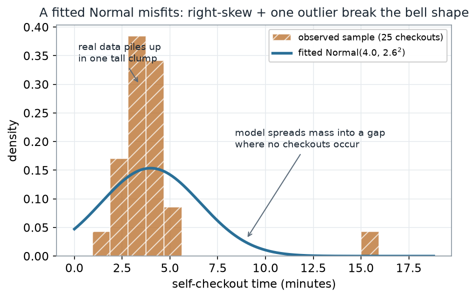
What to notice. The fitted Normal is not a subtle miss — it is describing a different dataset. It predicts plenty of checkouts around 8–12 minutes (there are none) and under-represents the tall pile near 3–4 minutes. When a model this size misfits this badly, any procedure that assumes Normality (a t-interval, an SD-based rule) inherits the misfit. The point is not “the test failed”; it is that the assumption was never appropriate here.
Model vs data (nonvisual equivalent).
| Where the fitted Normal is wrong | Consequence |
|---|---|
| Spreads density into the empty 7–13 min gap | Overstates how variable checkouts are |
| Too short to match the tall 3–4 min clump | Understates how typical the bulk is |
| Cannot produce a value as extreme as 15.8 without a huge SD | The SD (2.6) is inflated to “explain” one point |
Worked example — drop the one point and watch each summary
The cleanest way to measure fragility is a sensitivity check: recompute each summary with and without the single stuck checkout, and see which numbers move.
| Summary | With the 15.8-min outlier | Without it (24 checkouts) | Change |
|---|---|---|---|
| Mean | 4.0 | 3.5 | −0.5 |
| SD | 2.6 | 0.8 | −1.7 |
| Median | 3.6 | 3.5 | −0.1 |
| IQR | 1.2 | 1.1 | −0.1 |
The Change column is computed from the unrounded statistics, so it can differ by 0.1 from subtracting the rounded endpoints shown. Only the SD row is affected here: the true SD drop is about 1.75 minutes (2.60 → 0.85), which rounds to −1.7, whereas subtracting the rounded 2.6 − 0.8 would read 1.8.
Removing one observation out of 25 more than triples the SD going the other way (0.8 → 2.6) and moves the mean by half a minute, while the median and IQR each shift by one-tenth of a minute. The mean/SD summary is a hostage to that single point; the median/IQR summary barely notices it.
Here is the R you would run — notice there is no plotting in it; the picture is downstream, and the numbers above are what the code returns:
# one small sample of self-checkout times (minutes); one value is a stuck transaction
x <- c(1.6, 2.4, 2.4, 2.4, 2.6, 2.9, 3.0, 3.1, 3.2, 3.4, 3.5, 3.5,
       3.6, 3.6, 3.8, 3.9, 3.9, 4.0, 4.2, 4.2, 4.3, 4.5, 4.7, 5.2, 15.8)

# two summaries of the SAME data
c(mean = mean(x),     sd  = sd(x))        # parametric summary: pulled + inflated by the outlier
c(median = median(x), iqr = IQR(x))       # robust summary: sits in the bulk

# a sensitivity check: drop the single stuck checkout and recompute
x_core <- x[x < 10]                        # the 24 ordinary checkouts
c(mean = mean(x_core), sd = sd(x_core))    # SD collapses ~2.6 -> ~0.8; mean moves ~0.5
c(median = median(x_core), iqr = IQR(x_core))  # median + IQR barely move
We can push the sensitivity check further: instead of just deleting the point, slide its value along the number line and watch each statistic respond.
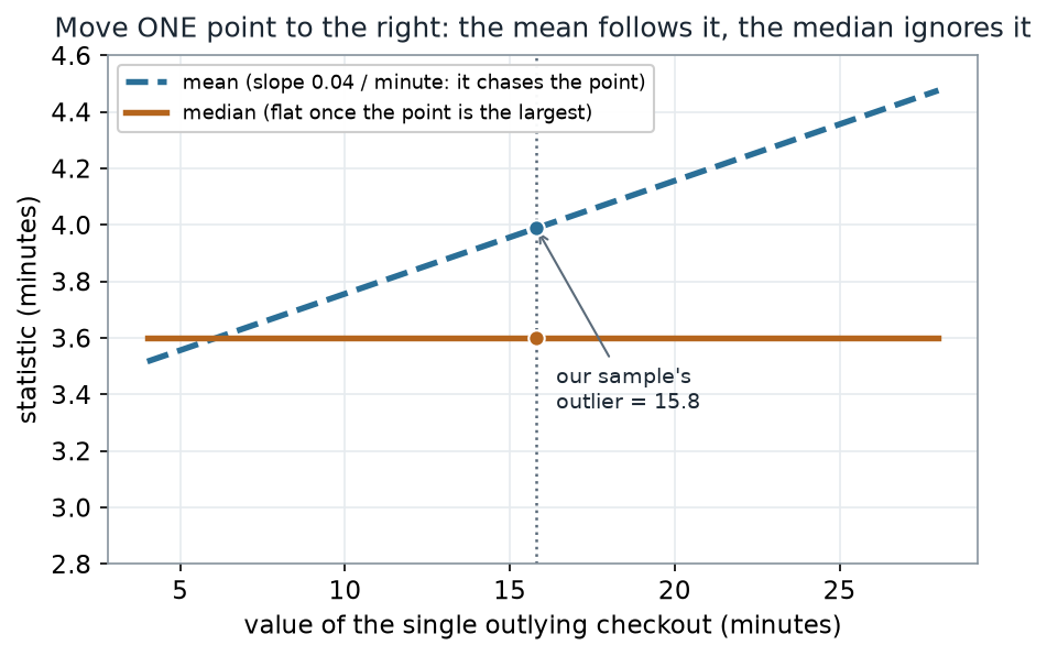
What to notice. The mean has no ceiling: push the outlier to 100 minutes and the mean follows it to the right, one twenty-fifth of a minute for every minute you move the point. The median simply does not care where the largest value goes, only that it is the largest. This bounded-versus-unbounded response is the first quantitative face of robustness — the idea the whole course keeps returning to.
Sensitivity read-out (nonvisual equivalent).
| Quantity | Value |
|---|---|
| Mean’s response to the moving point (slope) | 0.04 min per min (= 1/25) |
| Median’s response to the moving point | 0.0 (flat) while the point is the maximum |
| Mean · median at our observed outlier (15.8) | 4.0 · 3.6 |
A common mistake
“Nonparametric methods are the backup — you run a normality test, and if it fails you reach for the rank version.” This is the habit the course is built to replace. A normality test answers a narrow question (“is there evidence against Normality?”) that is not the question you care about, and its verdict depends heavily on sample size — tiny samples pass almost anything, huge samples reject almost everything. Choosing your method by that verdict lets an incidental test drive your analysis. Instead, decide what is fragile and what your purpose is before you compute: if you want a centre that resists outliers, the median is a first choice on its own merits, not a consolation prize.
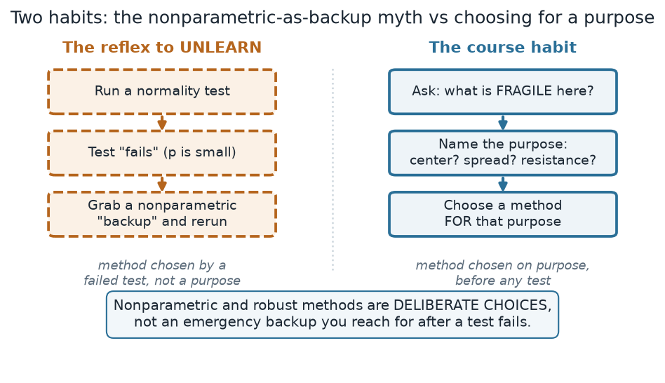
What to notice. The two paths can even select the same tool — but for opposite reasons. On the left, the median gets used only because a test failed; on the right, the median gets used because you decided a resistant centre was the point. Same computation, completely different reasoning — and only the right-hand reasoning survives when someone asks you why you chose it.
The two habits (nonvisual equivalent).
| Reflex to unlearn | Course habit |
|---|---|
| Run a normality test | Ask: what is fragile here? |
| Test “fails” (p is small) | Name the purpose (centre / spread / resistance) |
| Grab a nonparametric “backup” | Choose a method for that purpose |
| Method chosen by a failed test | Method chosen on purpose, before any test |
Check your understanding (ungraded)
- In your own words, what does it mean for a summary to be fragile? Give the two numbers from this week that show the mean/SD summary is more fragile than the median/IQR summary.
- Dropping one checkout out of 25 changed the SD from 2.6 to 0.8 but the median from 3.6 to 3.5. Explain why the SD is so much more sensitive to that one point than the median is.
- The fitted Normal predicted checkouts around 8–12 minutes, where the data has none. Name one procedure from your past courses that would be misled by that misfit, and say how.
- A classmate says, “I always run a Shapiro–Wilk test first, and use the rank test only if it fails.” Rewrite their workflow in the course’s fragility → purpose → method form, and say what changes.
Reading guide
- OpenIntro Statistics 4e — Exploring numerical data — a companion for the mean/median and IQR/SD contrast and for how outliers act on each; read it, then re-derive the with/without table above from the numbers.
- IMS — Exploring numerical data — reinforces reading a distribution’s shape (skew, clumps, gaps) before summarising it.
- Learning Statistics with R — Descriptive statistics — a readable companion on measures of centre and spread and their differing sensitivity.
- NIST/SEMATECH e-Handbook — Measures of location and scale — a reference for the formal definitions of the summaries we compared (cited, not reproduced).
Accessibility notes
Mathematics is live text (for example \(1/25\) and \(\text{IQR} = Q_3 - Q_1\) render as MathML, not images). Every figure carries an alt line stating its message, an adjacent “what to notice” reading, and a data-summary table carrying its key numbers, so each point survives without the picture. Series are distinguished by linestyle and hatch (mean = dashed teal, median = solid ochre; the sample histogram is hatched) plus value-bearing labels, never colour alone. A clean lint and a clean render are evidence, not proof; the rendered assistive-technology review is a human step.
Assessment (descriptive only)
This week contributes learning evidence toward naming what is fragile in a summary and justifying a method by purpose rather than by a failed test. That is the shape only; the actual graded prompts, weightings, and due dates live in Blackboard.
Public vs. graded. These are public, ungraded notes and practice. Graded prompts, keys, rubrics, point values, and due dates live in Blackboard Ultra, which governs.
Looking ahead
Next week we replace the mean and SD with the machinery that makes the median and IQR possible in the first place: order statistics, ranks, and the empirical CDF. Once we can read a sample through its ranks, we have the raw material for the distribution-free comparisons that carry the rest of the course.