Advanced showcases
How the course’s basic habits scale into polished, reproducible real-world work
This page collects a few advanced showcases — examples of finished, real reproducible work that grew out of exactly the habits you practice all term: write in source, render to output, keep things organized, and let configuration (not hand-editing) build the result.
- The figures and the website below are finished, real projects, shown to illustrate where the course’s habits lead — not templates to copy for an assignment.
- The exact requirements for any assignment live in the course LMS.
- The research figures come from a separate research project by the course instructor (its open-source workflow is linked below). You are not expected to reproduce them; they are here so you can see professional reproducible output and recognize the same source → render → output ideas at a larger scale.
Why advanced showcases?
In the weekly work you build small things: a short math note, a first ggplot, a tiny simulation, a tidy portfolio folder. It is easy to think those habits stop being useful once the documents get bigger. They do not. The same handful of habits — plain-text source, render-to-output, relative paths, organized folders, configuration over hand-editing — are what make large, trustworthy, reproducible projects possible. The showcases below are real examples of that.
Showcase 1 — Comparing baseline and bias-aware estimates
The same study can give a different answer depending on how carefully you model it. The figure below compares each outcome’s effect under a plain baseline model with the same outcome under a bias-aware model; each line connects the two estimates for one outcome. Many lines slope toward zero — the bias-aware model attenuates (shrinks) effects that the simpler model reported.
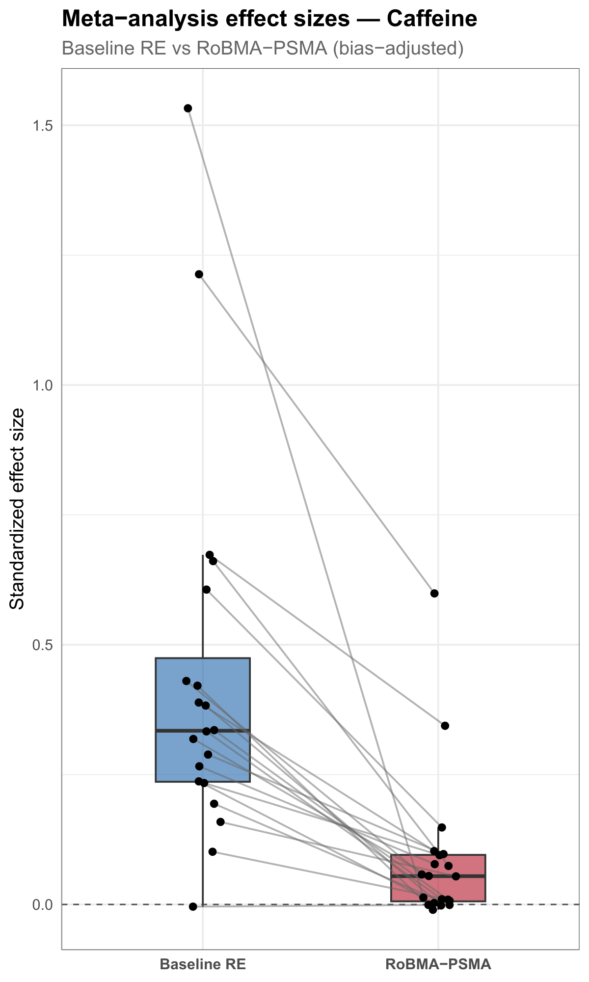
The point for this course is not the statistics — it is that a single reproducible figure can carry a real comparison, built from data by code. A simplified sketch of the pattern:
# Simplified from scripts/50_stratum_visuals.R (evidential-audit-workflow).
ggplot(estimates, aes(x = method, y = effect)) +
  geom_boxplot(aes(fill = method)) +
  geom_line(aes(group = outcome), color = "gray60") +   # one line per outcome
  geom_point() +
  geom_hline(yintercept = 0, linetype = "dashed") +
  labs(title = "Meta-analysis effect sizes — Caffeine",
       subtitle = "Baseline vs. bias-aware estimates",
       x = NULL, y = "Standardized effect size") +
  theme_minimal()
Source: evidential-audit-workflow (output/caffeine/plots/caffeine_effect_estimate_comparison.pdf), © Matt Hester, CC BY 4.0.
Showcase 2 — A multi-panel research figure
A single plot answers one question; a multi-panel figure puts several related views side by side under one title so they can be read together. The figure below stacks three panels — effect evidence, heterogeneity evidence, and modeled-bias evidence — each a violin showing a distribution of values across the same set of outcomes.
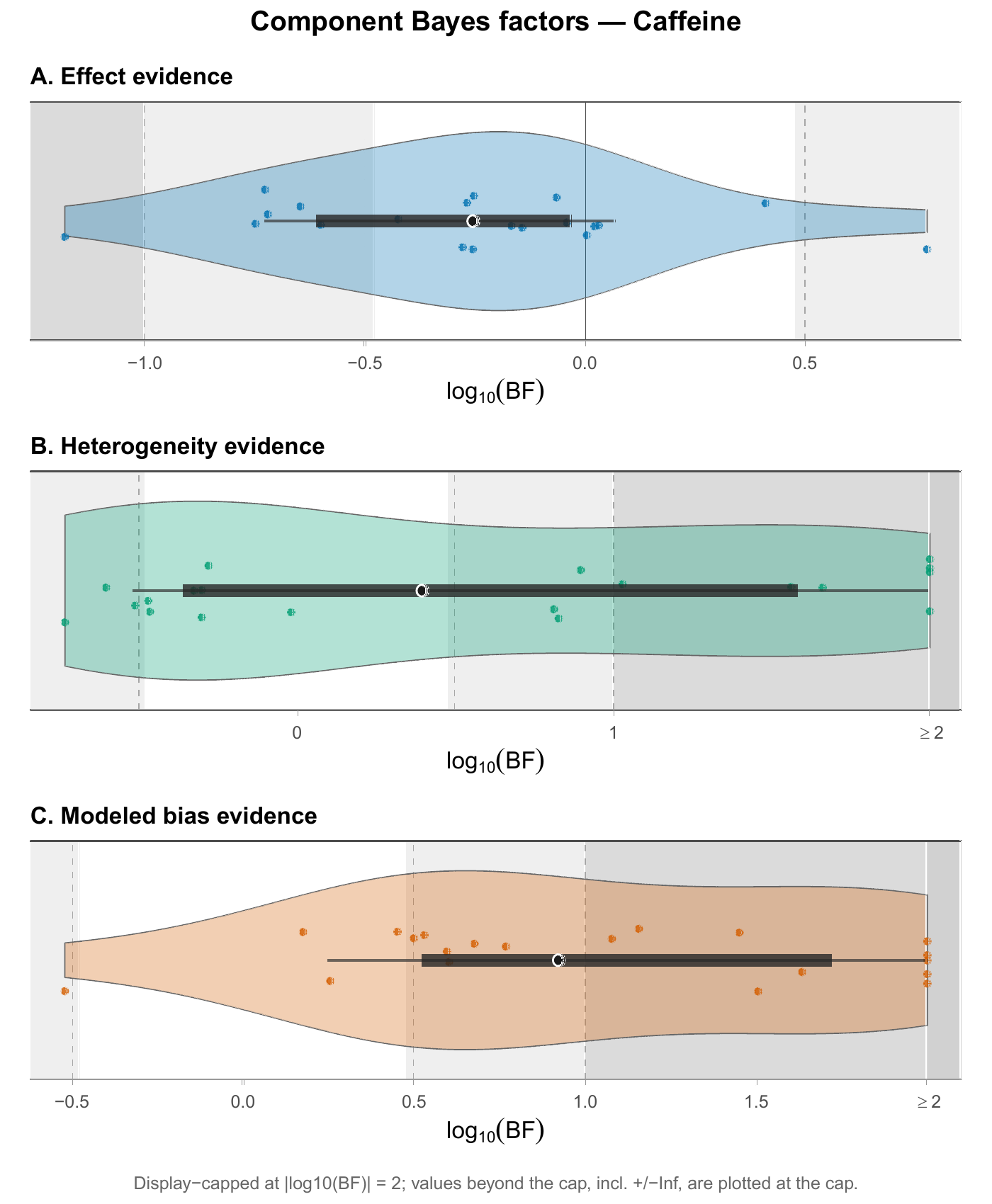
Each panel is an ordinary ggplot; the three are combined into one figure. That composition is itself reproducible — change the data and all three panels update at once. A simplified sketch of one panel:
# Simplified from scripts/50_stratum_visuals.R (evidential-audit-workflow).
# One component panel; the real figure stacks three (effect / het / bias).
ggplot(component, aes(x = log10BF, y = "")) +
  geom_violin(fill = "#4F9DCB", color = "gray40") +
  geom_jitter(height = 0.15, alpha = 0.8) +
  labs(title = "A. Effect evidence",
       x = expression(log[10](BF)), y = NULL) +
  theme_minimal()

# The panels A / B / C are then combined into one figure, e.g. with
# the patchwork package:   pA / pB / pC
Source: evidential-audit-workflow (output/caffeine/plots/caffeine_component_violin_stack.pdf), © Matt Hester, CC BY 4.0.
Showcase 3 — This website is a Quarto project
You do not have to leave the course to see a larger reproducible project — this website is one. Every page you read here is a plain-text source file that Quarto renders to HTML, organized into folders by purpose and assembled by a configuration file. It is the same idea as a single rendered document, scaled up to a whole site.
The folder structure
math-software/
├── _quarto.yml          # site configuration: navbar, sidebar, format
├── index.qmd            # the landing page
├── syllabus.qmd  schedule.qmd
├── notes/               # one .qmd per conceptual note (weeks 1–15)
├── labs/                # one .qmd per hands-on lab (1–9)
├── examples/            # this page lives here
├── resources/           # setup, data, AI, and CAS references
├── assets/              # images and figures
└── styles.css           # a little styling
#  _site/  .quarto/      # generated output + cache — never committed
Source files are organized by purpose, not dumped in one place — the same habit you practice in your portfolio folder.
Pages are just source files
Each page is a .qmd with a small YAML header and ordinary prose — exactly like the documents you write:
---
title: "Your first render"
subtitle: "Week 1 — source files, rendered output, and the course container"
---

Every document in this course starts as a plain-text source file that you
render into a finished output …
From source to a live site
The whole site is built the same way you render a single document:
quarto render # turns every .qmd into HTML under _site/Rendering produces a _site/ folder of HTML. That generated output — and the local .quarto/ cache — are deliberately not committed to the repository; only the source is tracked. A separate publishing step takes the committed source, renders it, and deploys the result to the live web address through a GitHub Pages workflow. Source in, website out.
What makes this reproducible
- The site is generated from source, not hand-built page by page in a visual editor.
- Navigation is configuration in one file, not repeated on every page.
- Generated and local files are ignored — they are rebuilt from source, so they never clutter or bloat the repository.
- Anyone with the source can rebuild the entire site exactly.
Culmination — Corpus-scale effect attenuation
The first two showcases looked at a single research area (caffeine). The real payoff of a reproducible workflow is that the same code scales to the whole project. This figure runs the baseline-vs-bias-aware comparison across every nutrition stratum at once — eight areas in one view — ordered so the patterns line up.
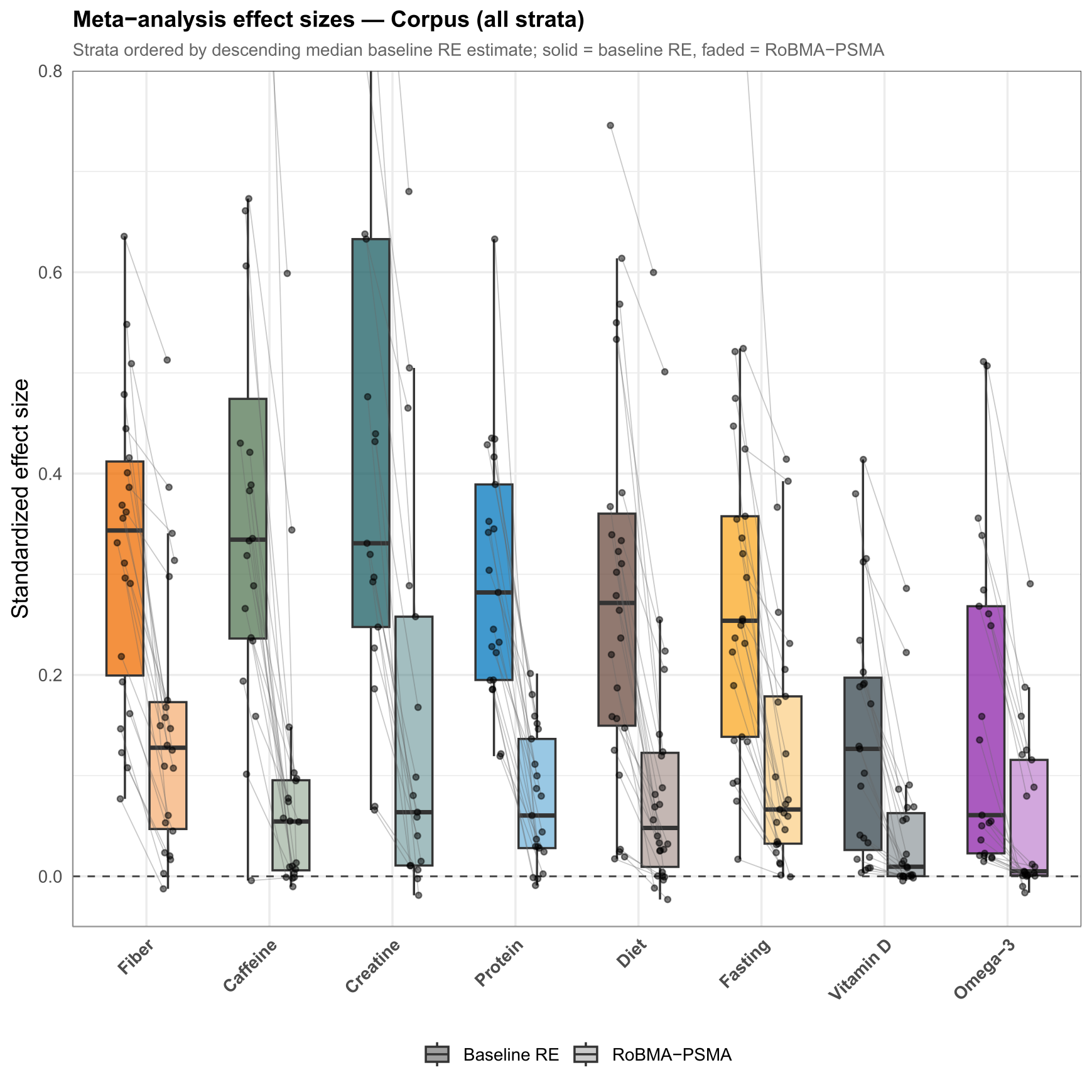
Nobody arranged eight strata by hand. The figure is built from one tidy table by code, so adding a stratum or revising the data redraws the whole thing. A simplified sketch:
# Simplified from scripts/70_corpus_visuals.R (evidential-audit-workflow).
ggplot(corpus, aes(x = stratum, y = effect, alpha = method)) +
  geom_boxplot(aes(fill = stratum), position = position_dodge(width = 0.7)) +
  geom_segment(aes(x = x_baseline, xend = x_bias,
                   y = mu_baseline, yend = mu_bias),
               color = "gray70") +                       # one line per outcome
  geom_hline(yintercept = 0, linetype = "dashed") +
  labs(title = "Meta-analysis effect sizes — Corpus (all strata)",
       x = NULL, y = "Standardized effect size") +
  theme_minimal()
Source: evidential-audit-workflow (output/overview/corpus_effect_attenuation_strip.pdf), © Matt Hester, CC BY 4.0.
Culmination — Corpus-scale evidence components
The multi-panel idea also scales to the whole corpus. This three-panel figure shows three evidence components — selected rigor, effect evidence, and modeled-bias evidence — for every stratum, so the three views can be read together across the entire project.
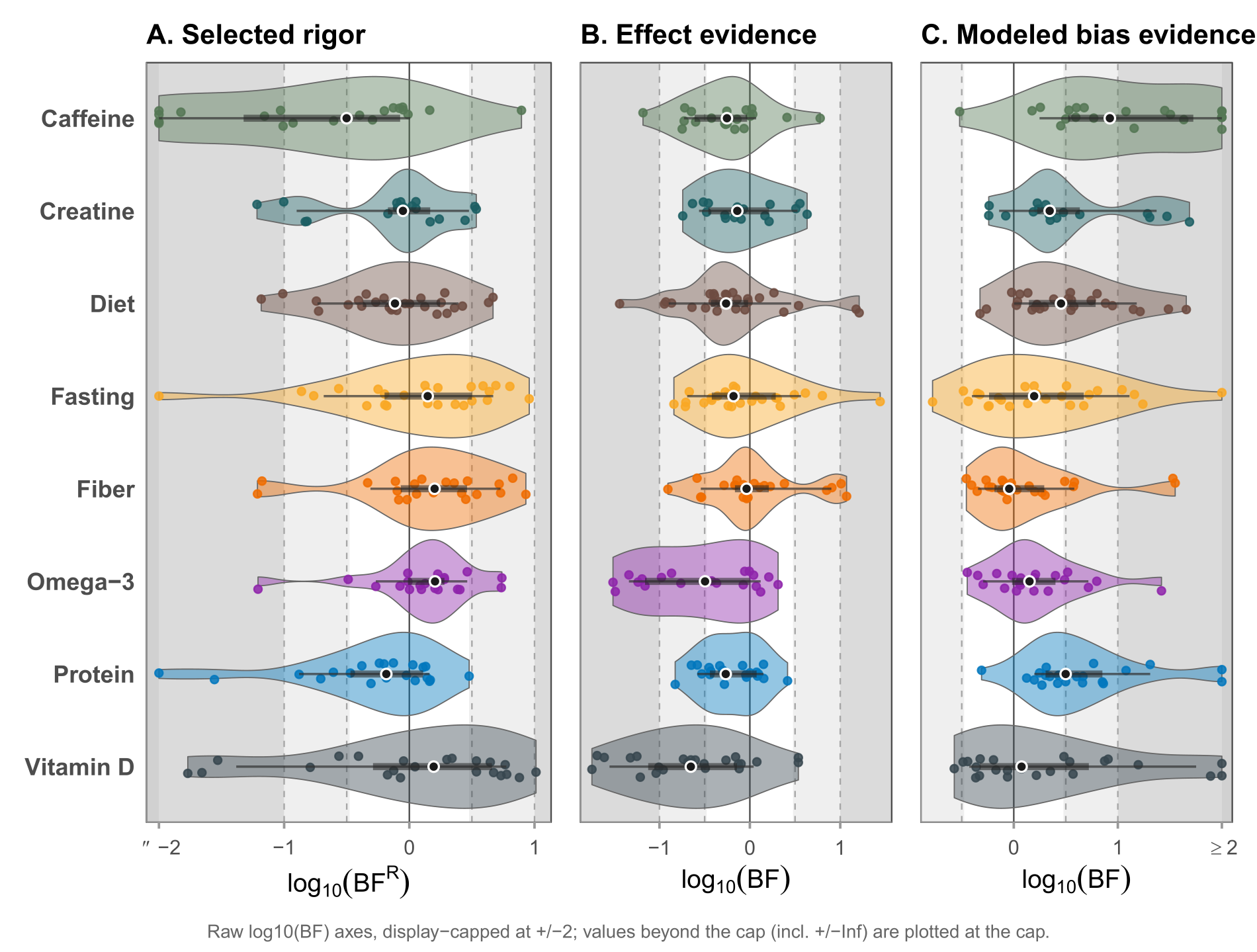
It is the same composition habit as Showcase 2 — several ordinary plots combined into one coherent figure — applied at corpus scale. A simplified sketch of one panel:
# Simplified from scripts/70_corpus_visuals.R.
# One component panel; the real figure places three side by side.
ggplot(corpus, aes(x = log10BF, y = stratum, fill = stratum)) +
  geom_violin(color = "gray40") +
  geom_jitter(height = 0.15, alpha = 0.8) +
  labs(title = "A. Selected rigor",
       x = expression(log[10](BF)), y = NULL) +
  theme_minimal()

# Panels A (selected rigor) / B (effect) / C (modeled bias) are combined
# side by side, e.g. with patchwork:  pA | pB | pC
Source: a corpus-level figure from the instructor’s evidential-rigor research project, © Matt Hester. This selected-rigor / effect / modeled-bias version is included here by the author as a teaching showcase, and is not part of the public v1.0.0 / Zenodo release. The related open-source workflow is public at evidential-audit-workflow.
What students should take from these examples
- The habits scale. Source → render → output is the same whether the output is a one-page note or an entire website or a publication figure.
- Code-built figures are reproducible figures. Because the research figures above are produced from data by code, they can be regenerated exactly — which is what makes them trustworthy.
- Organization and configuration are not busywork; they are what let a project stay legible and rebuildable as it grows.
- You are already practicing all of this at small scale. These showcases are just the same ideas, grown up.
Reminder
These are advanced showcases, not assignment models. Do not copy them as submissions. The research figures come from the instructor’s separate research project — most from its public open-source release (CC BY 4.0), and one from the associated manuscript, used with permission; the website is this course site itself. The exact requirements for your own assignments are in the course LMS.