Week 8 — Simple regression
MATH 21003 · Introduction to Statistical Methods · Fall 2026 · Week 8 (Oct 12–16, 2026)
Why this week matters
In Week 5 we learned to describe a scatterplot — direction, form, strength, the cautious correlation r. This week we do something slightly more ambitious: we fit a line through the cloud of points, and we learn to read the line. A scatterplot says “two things move together”; a fitted line says “for every one-unit change in x, y changes by about this much on average.”
That promise sounds bigger than it is. The line is a summary, not a perfect description. It is fit to the data we have and is honest only over the range of x values we observed. And — the Wk 5 / Wk 6 caveat carries — fitting a line to observational data does not by itself license a causal claim. What this week buys us is the ability to report a slope and an intercept in real units, to use the line for a careful prediction, and to look at how off-the-line each observation is in a structured way.
From a scatterplot to a fitted line
Week 5’s scatter described countries’ meat consumption and life expectancy as an upward cloud. The natural next move is to draw a straight line through the cloud — not by eye, but by a rule — and use it as a compact summary. The line has a shape:
\[\hat{y} = b_0 + b_1 \, x\]
The variable \(x\) is the predictor (sometimes called the explanatory variable, vocabulary from Week 1); \(y\) is the outcome (the response variable). The “hat” on \(\hat{y}\) signals that this is the line’s predicted value, not an observed value. The number \(b_1\) is the slope of the line; \(b_0\) is the intercept, the line’s height when \(x = 0\). We will pin down what those numbers mean in the next two sections.
The fitted line in plain English
Researchers captured 104 brushtail possums in Australia, recorded each possum’s total length (head-to-tail, in centimeters) and head length (in millimeters), and released them. The scatter of head length against total length is the moderately strong upward cloud you would expect; longer possums tend to have longer heads. The line that summarizes that cloud is
\[\hat{y} = 41 + 0.59 \, x,\]
where \(x\) is total length in centimeters and \(\hat{y}\) is the predicted head length in millimeters.
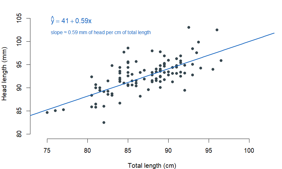
openintro::possum; equation values are from the published source.That equation is the line we have just fit. The rest of this week is about reading it.
Reading the slope
The slope \(b_1\) answers a one-sentence question: how much does \(y\) change on average for every one-unit change in \(x\)? For the possum line, \(b_1 = 0.59\) — for each additional centimeter of total length, a possum’s predicted head length goes up by about \(0.59\) millimeters, on average.
Two things matter in that sentence. The units carry meaning. A slope of \(0.59\) is not meaningful in the abstract; it is \(0.59\) mm of head per cm of total length. Always report a slope in the units of the data. And the qualifier matters. On average is real. No single possum’s head is predicted exactly by the line; the slope describes the average direction of the cloud, not a guarantee for any individual case.
The same idea, on clinical data. The ISLBS textbook fits a line to data from the PREVEND study — 500 adults aged 36–81 in the Netherlands whose cognitive function was scored on the Ruff Figural Fluency Test (RFFT, 0–175 points). Fitting RFFT against age gives
\[\widehat{\mathrm{RFFT}} = 137.55 - 1.26 \times \mathrm{age}.\]
The slope of \(-1.26\) says: on average, RFFT score tends to decline by about \(1.26\) points per additional year of age. The negative sign matches the direction we would expect — older participants tend to score lower on this cognitive test. But we are reading observational data; we cannot conclude that aging causes cognitive decline from this fit alone. The fitted line is a description.
Reading the intercept
The intercept \(b_0\) is the line’s predicted \(y\) when \(x = 0\). For the possum line, \(b_0 = 41\) — a possum of zero total length is predicted to have a head length of \(41\) mm. That is not a meaningful sentence; possums don’t have zero total length. The intercept is mathematical scaffolding here.
This is the usual situation. In many real datasets the intercept is mathematically the line’s value at \(x = 0\), but \(x = 0\) is outside the data we have or outside what is biologically or physically meaningful. Always check whether \(x = 0\) is in the data range and whether it makes sense in context. If it does, report the intercept the same way as a slope — in real units, on average. If it does not, name that explicitly: the intercept is not a meaningful prediction here.
The PREVEND line illustrates the same point — at \(\mathrm{age} = 0\) the equation predicts an RFFT score of \(137.55\), but PREVEND only included adults ages 36 through 81. Predicting a newborn’s RFFT from this line is exactly the kind of thing the line does not earn.
Prediction with the line
Once you have a fitted line, plugging in a new \(x\) gives a predicted \(\hat{y}\). For a possum with total length 80 cm,
\[\hat{y} = 41 + 0.59 \times 80 = 88.2 \text{ mm}.\]
The prediction reads as: on average, possums of about 80 cm total length have head lengths around 88 mm. Two caveats travel with that prediction. First, no individual 80-cm possum will have a head length exactly equal to 88.2 mm — there is scatter around the line. Second, the prediction is honest only inside the range of \(x\) values we observed. The possum data span roughly \(75\) to \(100\) cm total length; predicting head length for a 60-cm possum or a 130-cm possum is not what the line was built for. We will return to that caveat under Extrapolation, below.
Residuals: what the line missed
For each observed point \((x_i, y_i)\) in the data, the line predicts \(\hat{y}_i\) and the data shows \(y_i\). The vertical distance between them — observed minus predicted — is called the residual:
\[e_i = y_i - \hat{y}_i.\]
A positive residual means the point sits above the line; the line under-predicted that point. A negative residual means the point sits below the line; the line over-predicted that point.
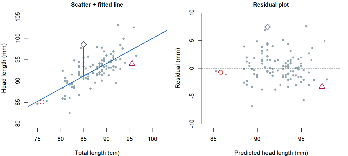
Working through one observation: take the possum with \(x = 76\) cm of total length and \(y = 85.1\) mm of head length. The line predicts \(\hat{y} = 41 + 0.59 \times 76 = 85.84\) mm, so the residual is \(e = 85.1 - 85.84 = -0.74\) mm — a small negative residual; the line over-predicted by a hair.
Residuals matter for two reasons. They tell you how off the line was for individual cases, in real units. And — when you plot all of them — they tell you whether a line is the right shape for the data at all. A residual plot puts the predicted \(\hat{y}\) on the x-axis and the residual \(e\) on the y-axis, with a dashed horizontal line at zero. If the residuals scatter randomly around zero with no obvious pattern, a straight line is a reasonable summary. If the residuals curve, a straight line is not the right shape and the relationship is curved. If the residuals fan out (small near one end, large near the other), the line is a less reliable summary at one end than the other. Reading those patterns is enough for this week; we are not going to formalize them into tests.
Least squares: how the line is chosen
Different straight lines through the same cloud will give different sets of residuals. To pick one line as the fit, we need a rule. The standard rule is least squares: pick the line that makes the sum of squared residuals \(e_1^2 + e_2^2 + \cdots + e_n^2\) as small as possible.
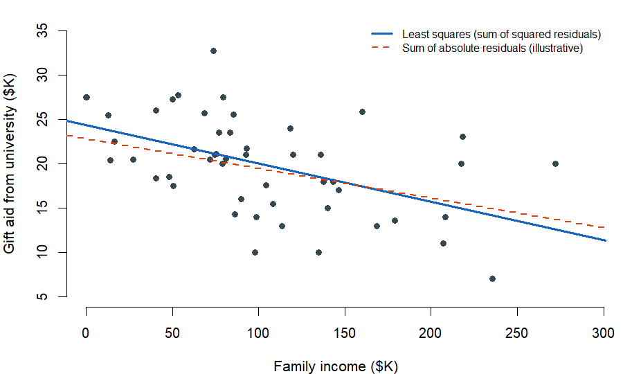
openintro::elmhurst data; published correlation r ≈ −0.499.Why squared residuals rather than, say, absolute residuals? Two reasons worth keeping. First, a residual twice as large as another is more than twice as bad in many real applications — squaring penalizes large misses more aggressively, which matches how badly a far-off prediction tends to hurt. Second, the least-squares rule is the standard tool in nearly every software package, so the line you fit in this course is the same line a colleague at a different institution would fit on the same data.
We will not derive the least-squares formulas by hand in this course. The slope and intercept are computed by software in practice, and we will read them off output. The point is that there is a clear rule for picking the line — not “by eye” — and that rule is minimize the sum of squared residuals.
\(R^2\): strength of the linear fit
Once we have a fitted line, it is natural to ask how strong is the fit? The summary number is \(R^2\), called the coefficient of determination. It is the proportion of the variation in \(y\) that the line captures.
In simple linear regression, \(R^2 = r^2\) — it is the square of the correlation coefficient you learned in Week 5. So if a scatter has \(r = -0.499\), then \(R^2 = (-0.499)^2 \approx 0.25\), meaning the fitted line captures about \(25\%\) of the variation in \(y\) across the data we have. If a scatter has \(r = -0.534\), then \(R^2 \approx 0.285\), about \(29\%\).
The Elmhurst gift-aid scatter is the classic worked example. The fitted line is
\[\widehat{\mathrm{aid}} = 24.3 - 0.0431 \times \mathrm{family\_income}\]
(both in thousands of dollars). The slope says: for each additional \(\$1{,}000\) of family income, predicted gift aid drops by about \(\$43.10\), on average. The correlation across the 50 students in the sample is \(r = -0.499\), so \(R^2 \approx 0.25\) — family income captures about a quarter of the variation in gift aid across this sample.
Two readings of \(R^2\) that are worth carrying forward. A higher \(R^2\) means the cloud is tighter around the line; the line is a more reliable summary. A lower \(R^2\) does not by itself mean “no relationship” — it can mean the cloud is loose but linear, or it can mean (as in Week 5’s U-shape example) that the cloud is tight but not linear. Always look at the picture next to the number.
Extrapolation: where the line stops being trustworthy
The Elmhurst line is honest inside the range of family incomes the data covers — roughly \(\$0\) to about \(\$275{,}000\) in the sample. If you push the line outside that range, it does what straight lines do: it keeps going.
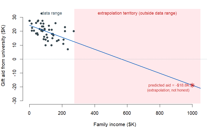
If we plug a family income of \(\$1{,}000{,}000\) into the equation (which is \(1{,}000\) in the data’s units of \(\$1{,}000\)s), we get
\[\widehat{\mathrm{aid}} = 24.3 - 0.0431 \times 1000 = -18.8.\]
The line says: a student from a family with a million dollars of income is predicted to receive negative \(\$18{,}800\) in aid. Elmhurst College does not collect \(\$18{,}800\) in extra tuition from a millionaire’s child. The line is extrapolating — applying a model estimate to values outside the data it was built on — and the result is mechanical nonsense. The honest reading is: this line is a description of the relationship between family income and gift aid inside the range of incomes the sample covered. Outside that range, the linear shape does not earn the benefit of the doubt.
The same caveat travels with PREVEND. The line was fit on adults ages 36 to 81. Predicting RFFT for a 20-year-old college student, or a 95-year-old in long-term care, is not what the line was built for; the cognitive arc may bend in places the data did not see.
Outliers and leverage, lightly
Most scatterplots have one or two points that sit far from the rest. There is a small vocabulary for what those points are doing to the line.
A point can sit far from the line in the y direction, with an \(x\) value inside the rest of the cloud. That’s a residual outlier — its residual is large in absolute value, but it does not pull the line very much, because the rest of the cloud anchors the line. A point can sit far from the rest in the x direction, away from the bulk of the data on the horizontal axis. That’s a leverage point — points like this can pull the line, the way a small weight far out on a seesaw moves the seesaw more than the same weight near the fulcrum. A leverage point that actually changes the line we would have drawn without it is called influential.
A clean clinical example. ISLBS plots US state-level infant mortality (per 1,000 live births) against the number of doctors per 100,000 population, with the District of Columbia included as one row. DC has roughly \(807\) doctors per 100,000 — far above any state’s rate — paired with an unusual infant mortality figure. With DC included, the regression line slopes upward (more doctors paired with more infant deaths, the opposite of what you would expect). Without DC, the regression line slopes downward, with the public-health-typical pattern. DC is influential because removing it does not just nudge the line — it flips the slope.
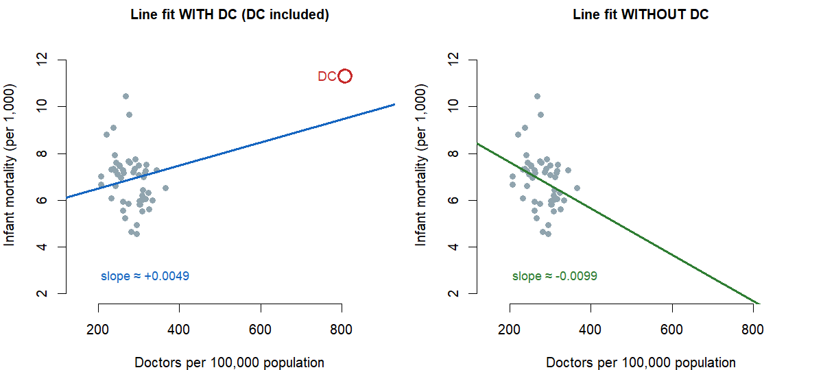
The reading-rule for this week is: don’t drop outliers silently. Investigate them. An outlier may be a data-entry mistake, in which case removing it is the right move and you say so. It may also be a real and informative case, like DC in the example above — a place where the data tell you something about who is in the dataset, not just about the line. Producing two readings — one with the suspect point and one without — and reporting both is the honest move when the point is clearly influential.
Common mistakes
These come up every Week 8 and are worth heading off now.
- “Residual equals error.” A residual is a descriptive vertical distance from the fitted line. “Error” implies a random-noise claim about a population that we have not made.
- “High \(R^2\) means causation.” It does not. The Wk 5 / Wk 6 caveat carries: a tight, linear-looking fit on observational data is still a description of how two variables move together.
- “The slope is the exact change in \(y\) when \(x\) goes up by one.” Close but careful. The slope is the average change in \(\hat{y}\) along the fitted line for a one-unit change in \(x\), for the data we have. No individual case is guaranteed to follow the line.
- “Extrapolation is fine if the line looks straight.” It is not. Outside the data’s range the line is doing arithmetic, not summarizing data.
- “If you see an outlier, drop it.” No — investigate it first. An outlier may be a real and informative case; dropping it silently is a research-integrity problem.
- “The intercept is always meaningful.” Only if \(x = 0\) is in the data range and makes sense in context. Otherwise the intercept is mathematical scaffolding, not a prediction.
What you should be able to do by Friday
By the end of Week 8 you should be able to:
- write a fitted line \(\hat{y} = b_0 + b_1 x\) for a real dataset, with \(x\) and \(y\) named in real units;
- interpret the slope in context — including the on average qualifier and the units — and decide whether the intercept is meaningful in this context;
- compute a residual \(e = y - \hat{y}\) for a specific observation, and explain what its sign means;
- describe what the line is doing using least squares in one sentence (it minimizes the sum of squared residuals);
- interpret \(R^2\) as the proportion of variation in \(y\) captured by the line, and connect it to the Week 5 correlation through \(R^2 = r^2\) in simple regression;
- use the line for a prediction inside the data range, and refuse to use it outside that range (extrapolation);
- recognize a residual outlier, a leverage point, and an influential point on a scatterplot, and decide whether the line you fit deserves a second reading without that point.
Assignments this week
- Monday check. A short concept check on writing a fitted line and reading slope and intercept in context. Aim for about 3–5 minutes in class. Sheet: Week 8 Monday exit ticket.
- Wednesday check. A short application on reading a regression output table and interpreting slope, intercept, \(R^2\), and a residual. Aim for about 8–12 minutes in class. Sheet: Week 8 Wednesday exit ticket.
- 🔒 Friday quiz — handled through Blackboard or in class as directed. The quiz prompt is not posted here. Exact timing and submission details live in Blackboard.
- 🔒 Homework 4 (biweekly, Weeks 7–8) — posted and submitted through Blackboard. Due near the start of Week 9.
Read more in IMS / ISLBS
The course page above is the main explanation for this week. If you want a second voice on the same material, these readings cover the same concepts at similar depth:
- IMS — Chapter 7 (“Linear regression with a single predictor”), §7.1.2 Using linear regression to predict possum head lengths through §7.3 Outliers in linear regression. Stop before the chapter’s inference material — that arrives later in this course.
Hosted IMS book: https://openintro-ims.netlify.app/ - ISLBS — Introductory Statistics for the Life and Biomedical Sciences, Chapter 6 Simple linear regression, §6.2 through §6.3. §6.4 and §6.5 (inference and intervals) are later-course material in this sequence.
OpenIntro book page: https://www.openintro.org/book/biostat/
Sources adapted in this lesson: OpenIntro Introduction to Modern Statistics (2e), Çetinkaya-Rundel & Hardin, Chapter 7 §7.1.2 (possum example), §7.2 (Elmhurst least squares and \(R^2\)), §7.3 (outliers and leverage), CC BY-SA 3.0; and OpenIntro Introductory Statistics for the Life and Biomedical Sciences, Vu & Harrington, Chapter 6 §6.2 (PREVEND least-squares estimation) and §6.3 (interpreting a linear model, residuals, \(R^2\), light outliers), CC BY-SA 3.0. Source files at github.com/openintrostat/ims and github.com/OI-Biostat/oi_biostat_text. The Elmhurst gift-aid data are real and come from a random sample of fifty first-year students in the 2011–2012 academic year. The PREVEND data are real and come from the Prevention of REnal and Vascular END-stage Disease study (Netherlands), packaged as prevend.samp in the oibiostat R package. The DC infant-mortality and doctors data are from US census records, packaged as census.2010 in oibiostat.