Week 7 — First-half synthesis and midterm
MATH 21003 · Introduction to Statistical Methods · Fall 2026 · Week 7 (Oct 5–9, 2026)
Why this week matters
The first six weeks have given us a way to read data honestly. Week 1 named what counts as data — cases, variables, the difference between what we’re studying and what we’re explaining it with. Week 2 asked where the data came from, and what we can and can’t responsibly say with it. Weeks 3 and 4 walked through how to describe one variable and how to compare two or more groups. Week 5 introduced association between two numerical variables — the scatterplot, the correlation, the cautious “they move together.” Week 6 introduced the one big complication: a third variable may be doing the work.
This week we pause and bring those six habits together. The Friday class meeting is the midterm exam (Friday, October 9, in class). This page is the assigned reading for the week — not a review checklist, but a single coherent walkthrough of how the six units fit together on one connecting study, with a couple of side scenarios where one unit needs a fresher example. Read it the way you would read a long worked example.
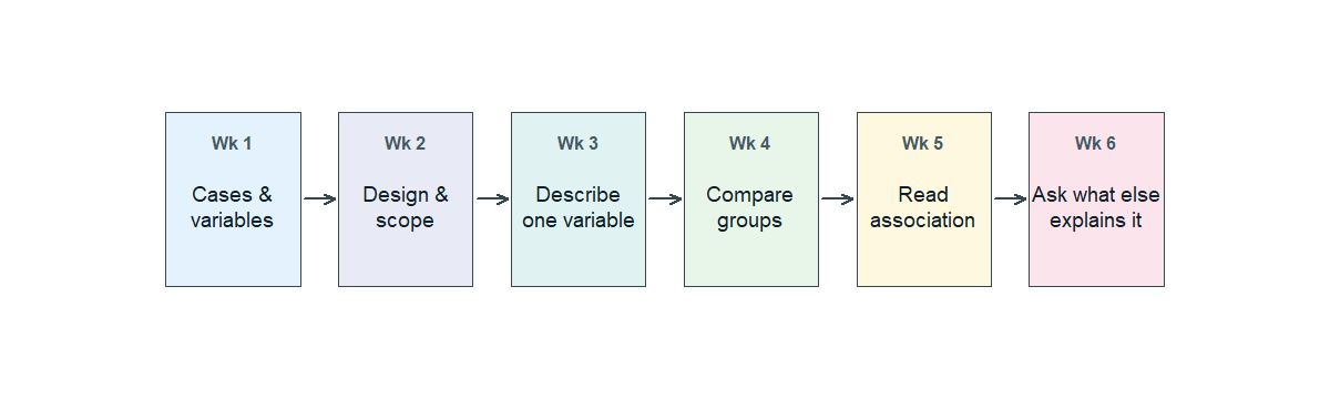
The first-half arc in one sentence
Week 1 asks what is this data? Week 2 asks where did it come from? Weeks 3 and 4 ask what does one variable look like, and how do the groups compare? Week 5 asks are two variables related? Week 6 asks what else could explain that? The midterm asks you to do all of those in order on one new study.
Cases, variables, and study design
Our running case for this page is the country-level meat × life-expectancy dataset from Week 5. Researchers compiled per-capita meat consumption (in kg per person per year, averaged across 2011–2013) and life expectancy at birth for 175 countries. We saw the aggregate scatter in Week 5, then revisited it stratified by income bracket in Week 6.
To read this study the Week 1 way, name the cases and the variables. The cases are countries, one country per row. The variables are per-capita meat consumption (numerical, in kg per person per year), life expectancy at birth (numerical, in years), and a third variable we used in Week 6 — per-capita GDP, which split countries into low-, middle-, and high-income brackets (categorical when used as a tercile; numerical underneath). Meat consumption plays the role of the explanatory variable; life expectancy is the response.
To read it the Week 2 way, identify the design. These are observational country-level data, not an experiment — no one randomized countries to high or low meat consumption. The scope of inference is country-level associations as they were in roughly 2011–2013, with the standard caution that observational data does not by itself license causal language.
Describing one variable
Before comparing or relating two variables, it helps to read each of them alone. Life expectancy at birth across these 175 countries ranges from roughly the mid-50s to the low 80s, with a center around the upper 70s and a clear left skew — there is a long tail of countries with low life expectancy and a tight cluster of countries at the high end. Per-capita meat consumption ranges from near zero to over 100 kg per person per year, with a right skew — most countries fall under 60 kg, and a small group of high-meat countries pulls the upper tail.
The Week 3 habit is: name the center, the spread, the shape, and any unusual points. A short paragraph in that pattern is a good description; “the median is about X, the spread is about Y, the shape is roughly Z, with a few unusual countries at W” is the kind of honest sentence the midterm rewards.
Comparing groups
The meat case is not a clean group-comparison example on its own, so use this short scenario instead. Imagine a small clinical trial: 200 adults with high blood pressure are randomly assigned, half to a new medication and half to a placebo. After eight weeks, the medication group’s average systolic blood pressure is about 138 mm Hg; the placebo group’s average is about 145 mm Hg. The difference in average systolic blood pressure is about 7 mm Hg, in favor of the medication.
That’s the Week 4 read: a difference in means of about 7 mm Hg between the two groups. Because participants were randomly assigned, the comparison is also a fair causal one in the Week 2 sense — random assignment is what makes us comfortable saying “the medication appears to reduce blood pressure” rather than only “the medication group had lower blood pressure on average.” A numerical difference and a causal license are two separate questions; the midterm will want you to keep them separate.
Reading association
Back to the meat case for the Week 5 read. The aggregate scatterplot of life expectancy against per-capita meat consumption trends upward — countries with higher meat consumption tend to have higher life expectancies. The cloud is moderately tight and roughly linear once you get above the lowest meat-consumption levels; the correlation across the 171 countries with non-missing values is approximately r ≈ 0.72.
The Week 5 honesty habit is the verdict here. There is a real, positive, moderately strong association between meat consumption and life expectancy across countries. The correlation summarizes the linear part of that association — not its causal direction. A high r tells us the cloud is tight around an upward line. It does not tell us why.
Asking what else could explain the relationship
The Week 6 move is to ask, what else could explain that? For the meat case the obvious candidate is the wealth of the country. Wealthier countries tend to consume more meat and tend to have better healthcare, cleaner water, better sanitation, and longer life expectancies. Wealth is plausibly associated with both the explanatory variable and the response — the textbook shape of a confounder.
Splitting the 171 countries into low-, middle-, and high-income terciles by per-capita GDP and reading the scatter inside each bracket showed within-bracket correlations of about 0.64, 0.33, and 0.48 — all smaller than the aggregate 0.72. Most of what looked like a country-level “meat → longer life” association was income doing the work. The Week 6 verdict, in the alone / after accounting for phrasing: looking at the meat–life-expectancy association alone, the data suggest a moderately strong positive association; after accounting for per-capita income, the within-bracket association is real but much weaker. Stratification did not erase the relationship, but it shrank it, and shifted what we can responsibly claim.
Pulling the ideas together on one scenario
Here is one more, fresh, case to read in the same order. A 2024 report compares hospitals in a metropolitan area on 30-day mortality after admission for heart failure. Across all hospitals, large urban academic medical centers have higher 30-day mortality than small community hospitals. A blog post turns this into a headline: “Big hospitals are worse for heart-failure patients.”
Read this the Week 1 way: the cases are hospitals; the response is 30-day mortality (a rate); the explanatory variable is hospital type (urban academic vs small community — categorical). Read it the Week 2 way: this is observational. Patients were not randomly assigned to hospital type; they ended up at one or the other through referral, geography, or severity at admission. Read it the Week 4 way: there is a real numerical difference in mortality rates between the two groups, so the comparison is not nothing. Read it the Week 5 way: there is an association between hospital type and mortality. And read it the Week 6 way: what else could explain it? Large urban academic centers tend to receive sicker patients — they have specialists, equipment, and capacity, so referrals concentrate the hardest cases there. If we stratify by severity at admission (mild, moderate, severe), the urban-academic-versus- community gap likely shrinks or reverses inside each stratum, because we are then comparing comparable patients.
The honest one-sentence summary uses the Week 6 phrasing: looking at hospital type alone, urban academic centers have higher 30-day mortality; after accounting for severity at admission, the picture changes — the data do not by themselves support the headline.
A small preview of next week
Next week we will fit a line to a scatterplot and learn to read its slope. This week we are still in description.
Common mistakes
These are the most common Units 1–6 mistakes worth retiring before the midterm.
- Calling an observational association causal. An association between two variables in observational data is real, but it is not by itself a causal story (Wk 2 and Wk 5).
- Reading a low correlation as “no relationship.” A near-zero r means no apparent linear trend. A curved relationship can be strong and still produce r near zero (Wk 5).
- Forgetting to name the scope of inference. “These data show…” should be followed by a clear sense of who and when — the population the sample represents, and the time the data describe (Wk 2).
- Comparing groups without checking the comparison’s basis. A difference in means or proportions is the Wk 4 number, but whether it supports a causal claim depends on the Wk 2 design.
- Mistaking the size of an association for its direction. A small correlation and a small slope of the cloud are not exactly the same as no relationship, and a large correlation does not by itself mean a large practical effect (Wk 5).
- Stopping at the aggregate. When two variables move together, ask what else could explain that? before describing the relationship as the bottom line (Wk 6).
What you should be able to do by Friday
By Friday you should be able to, on a new short scenario you have not seen:
- name the cases, the variables (numerical vs categorical; response vs explanatory), and the scope of inference;
- classify the study as observational or experimental, and say what each design can support;
- describe one variable in a short table or graph using center, spread, shape, and any unusual values;
- compute and read a difference in means or a difference in proportions between two or more groups;
- read direction, form, strength, and unusual points from a scatterplot, and report a correlation r as a descriptive summary;
- name a plausible confounder for an observational association, and write a one-sentence alone / after accounting for description of what changes when you stratify on it;
- write a short, honest conclusion from a graph and a table together — without overclaiming what the design supports.
The midterm exam is Friday, October 9, in class, and exercises this list directly.
Assignments this week
- Monday check. A short concept check across Units 1–6. Aim for about 3–5 minutes in class. Sheet: Week 7 Monday exit ticket.
- Wednesday check. A short mixed-scenario review with one small early-modeling question for next week. Aim for about 8–12 minutes in class. Sheet: Week 7 Wednesday exit ticket.
- 🔒 Friday — midterm exam (in class). Case-based and interpretive, covering Units 1–6 and a small amount of early-modeling vocabulary. Bring a calculator. No external sources. Exact section details live in Blackboard.
- 🔒 Homework 4 (biweekly, covers Weeks 7–8) — posted and submitted through Blackboard. The Week 7 share is review; the Week 8 share uses next week’s regression vocabulary. Due near the start of Week 9.
Read more in IMS / ISLBS
This week opens no new chapters. To review a specific Wk 1–6 idea before the midterm, the assigned readings remain the IMS and ISLBS chapters we have been using:
- IMS — Chapters 1–3 (data basics, study design, applications) and Chapter 7 §7.1.4 (correlation). The same chapter §7.2 begins next week’s material; do not start it yet.
Hosted IMS book: https://openintro-ims.netlify.app/ - ISLBS — Chapter 1 (data basics, study design, summarizing one variable, relationships between two variables) and the DDS case in §1.7.1 as the Wk 6 confounding anchor.
OpenIntro book page: https://www.openintro.org/book/biostat/
Sources adapted in this lesson: OpenIntro Introduction to Modern Statistics (2e), Çetinkaya-Rundel & Hardin, Chapters 1–3 and Chapter 7 §7.1.4, CC BY-SA 3.0; and OpenIntro Introductory Statistics for the Life and Biomedical Sciences, Vu & Harrington, Chapter 1, CC BY-SA 3.0. Source files at github.com/openintrostat/ims and github.com/OI-Biostat/oi_biostat_text. The meat-and-life-expectancy data are real and come from You W. et al., Meat consumption providing a surplus energy in modern diet contributes to obesity and related metabolic disorders, BMC Nutrition 8 (2022).