Week 5 — Association
MATH 21003 · Introduction to Statistical Methods · Fall 2026 · Week 5 (Sep 21–25, 2026)
Why this week matters
So far this term we have been reading one variable at a time. Week 3 asked how a single column of a dataset is distributed; Week 4 asked how a single outcome differs across groups. Both habits read the data one dimension at a time.
This week we add the natural next question: are two variables related to each other? Does longer hospital stay tend to go with higher costs? Does higher meat consumption per person in a country tend to go with longer life expectancy? Does a higher score on midterm one tend to go with a higher course grade overall?
There are two main tools for this kind of question when both variables are numerical: a picture called a scatterplot and a single number called the correlation coefficient. By Friday you should be able to read a scatterplot honestly, report a correlation without overstating it, and recognize the most common reading errors — in particular, the move from X and Y are associated to X causes Y, which the data almost never actually license.
Two big cautions sit on top of everything this week:
- A correlation summarizes the linear part of a relationship. Two variables can be strongly related and still have a correlation near zero, if the pattern is curved.
- An association does not, by itself, mean a causal story. Week 6 will spend the whole week on the most common reason this trips people up.
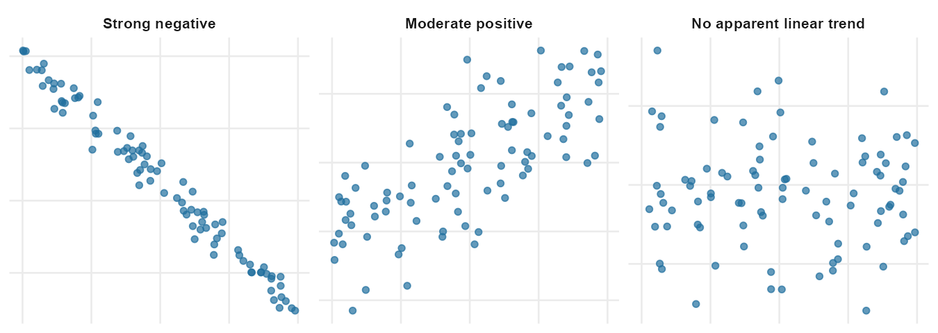
A scatterplot reads two columns at once
A scatterplot displays one numerical variable on the x-axis and another numerical variable on the y-axis. Each case in the dataset is one point. The position of the point shows that case’s values for both variables.
If the cases form a cloud that trends upward (low x with low y, high x with high y), we call that a positive association. If the cloud trends downward (low x with high y, high x with low y), it’s a negative association. If the cloud has no clear up-or-down direction, the two variables show no apparent linear relationship.
There are four things to read off a scatterplot, in roughly this order:
- Direction. Does the cloud trend up, down, or have no obvious direction?
- Form. Is the cloud roughly straight, or is it curved? A curved trend is still a relationship — it just isn’t a linear one.
- Strength. Is the cloud a tight pencil-thin line, or a diffuse cloud? Tight is strong, diffuse is weak.
- Unusual points. Does any single point sit far from the rest of the cloud? Those points can pull summary numbers around and deserve a look.
When you describe a scatterplot in writing, you should be able to hit all four points in two or three sentences. For example:
In this scatterplot of weight (kg) against height (cm) for 507 physically active adults, taller individuals tend to be heavier (positive direction). The relationship looks roughly linear, with moderate-to-strong strength: the cloud is fairly tight around an upward trend. A few points sit at the upper-right corner with noticeably higher weights than the rest of the cloud at the same height; they are unusual but not implausible.
That’s the kind of sentence we want by the end of the week.
Correlation: a single number for a single idea
Reading a scatterplot is the first step. A single number, the correlation coefficient, summarizes the strength and direction of the linear part of the relationship.
The correlation is written as r. It always sits between -1 and +1. The sign matches the direction of the linear trend, and the size of the number matches the strength:
- \(r = +1\) means the points lie exactly on an upward-sloping line.
- \(r = -1\) means the points lie exactly on a downward-sloping line.
- \(r\) near 0 means there is no apparent linear relationship.
- A value like \(r = 0.85\) is a strong positive linear association; \(r = -0.30\) is a weak negative one.
A handful of facts about \(r\) that the lesson page will keep coming back to:
- \(r\) has no units. It does not change when you switch the x-axis from inches to centimeters, or the y-axis from kilograms to pounds. The picture would look the same; the number is the same.
- \(r\) only sees the linear part of the relationship. Two variables can have a strong, clean, U-shaped relationship and still produce a correlation near zero, because the upward half and the downward half of the U cancel each other.
- \(r\) is a descriptive number, not a verdict. A correlation of 0.7 does not mean “70% of the relationship is explained” and certainly does not mean “X causes 70% of Y.” It is a single summary of the linear trend, no more.
You will not compute \(r\) by hand in this course. The formula exists and is in the IMS and ISLBS chapters at the end of this page if you want to see it; we will read \(r\) from displays and from output, but we will not crank it out.
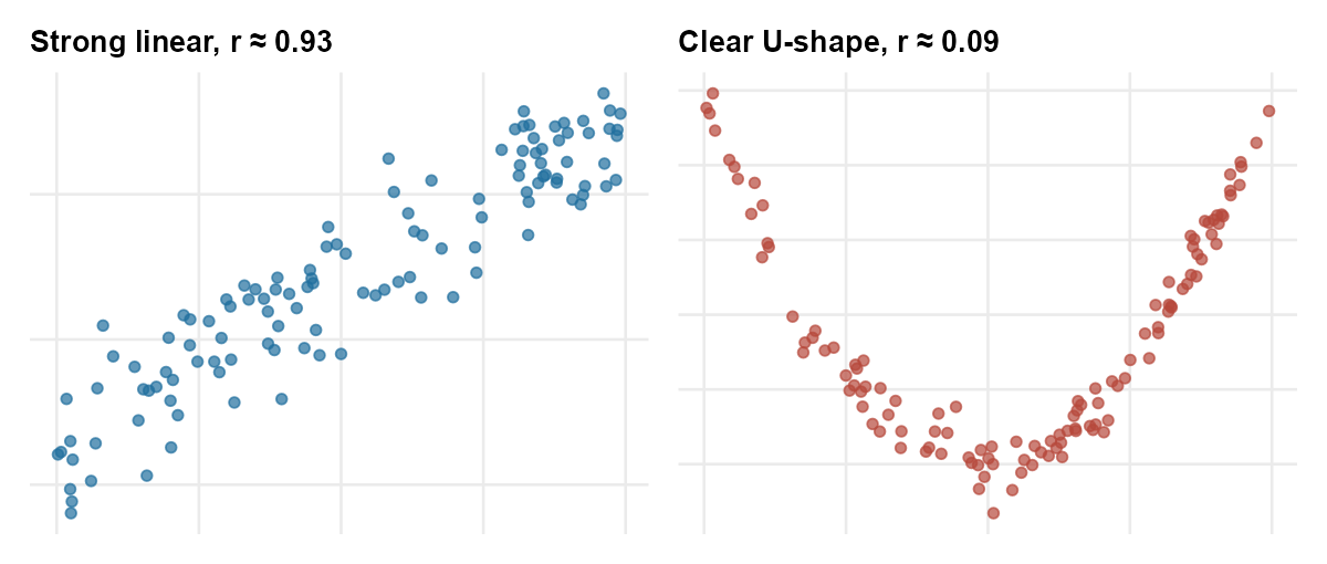
The single most common reading mistake at this stage is to look at a reported \(r\) near zero and conclude that the two variables are unrelated. Always look at the picture too: a curved relationship is still a relationship, and the linear summary will miss it.
Two-way tables — a one-paragraph callback
If both variables are categorical (not numerical), the natural tool is the two-way table you met in Week 4. Conditional proportions inside that table — the percent of each outcome within each group — play the same role for two categorical variables that scatter and correlation play for two numerical variables. We will not re-teach the table here. The point is just that association between two variables is the same broad question regardless of type; the display and summary number change with the variable types, but the underlying habit (read the cloud / table, describe direction and strength, do not overclaim) does not.
A worked example: meat consumption and life expectancy
A 2022 study collected per-capita meat intake (in kilograms per person per year, averaged across 2011–2013) for 175 countries together with life expectancy at birth. Plotted as a scatterplot, the relationship looks like this.
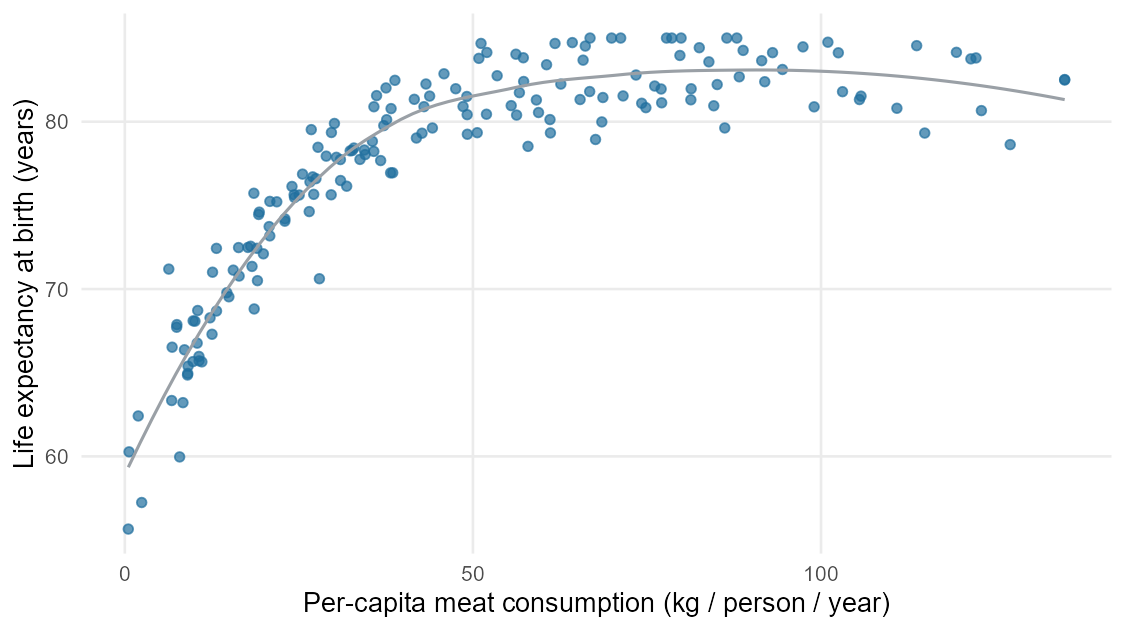
Read this scatterplot the way the section above described.
- Direction. Positive. Countries with higher per-capita meat consumption tend to have higher life expectancies.
- Form. Roughly linear once you get above the lowest meat consumption levels. At the very low end of the x-axis the cloud fans out — many of those low-meat-consumption countries have a wide range of life expectancies.
- Strength. Moderately strong. The correlation here is around \(r \approx 0.7\). That is a real signal in the picture: you can see the upward trend without squinting.
- Unusual points. A handful of countries do not fit the cloud — some have very low meat consumption but quite high life expectancy, and a few have moderate meat consumption with unusually low life expectancy. They are worth looking at individually rather than ignoring.
So far, so descriptive. The hard question is the next one:
Does eating more meat cause longer life expectancy?
Almost certainly not, at least not in the simple way the headline would suggest. There is a much more obvious explanation that the data have not ruled out: the wealth of the country. Wealthier countries tend to consume more meat and tend to have better healthcare, cleaner water, better sanitation, and longer life expectancies. Wealth is associated with both variables; it is plausibly the real driver. This is the confounding idea from Week 2, and it is the focus of Week 6, where we revisit this exact same dataset and look at the same relationship within income brackets.
The Week 5 honesty habit is to stop at: we have a real, positive, moderately strong association between meat consumption and life expectancy across countries. We have not shown causation.
Association versus causation in headlines
Headlines almost always overstate what the data actually show. The clearest tell is when a headline uses causes, cuts, protects against, or raises the risk of, but the underlying study only showed an association. A short habit that catches most of these:
- Find the study. Read the abstract, not the headline. Was this an observational study or an experiment? (Week 2.)
- Find the design. If it is observational, the language should be “associated with,” “linked to,” or “correlated with.” If the article says “causes,” ask why.
- Find a plausible third variable. Could something else be driving both X and Y? In the meat-and-life-expectancy example, wealth is the obvious candidate. (Week 6.)
- Find the size and the form. A reported \(r\) of 0.2 is a weak linear trend. A reported \(r\) of 0.9 between two variables that are essentially the same thing (e.g., height in inches and height in centimeters) is a measurement-redundancy, not a discovery.
This is the Friday quiz: read a short health-or-science headline, identify the study type and the reported summary, and decide whether the headline’s language is honest with the data.
Common mistakes
These come up every Week 5 and are worth heading off now.
- “\(r\) near 0 means no relationship.” No. It means no linear relationship. The U-shaped picture above has a strong relationship and \(r\) near 0.
- “Big \(r\) means causation.” It does not. A large positive correlation between two numerical variables in observational data tells you they move together — nothing about why.
- “\(r\) changes when I change units.” It does not. Switching height from inches to centimeters does not change the correlation between height and weight.
- “\(r = 0.5\) is twice as strong as \(r = 0.25\).” Strength is about how tightly the cloud hugs a line. More technical explained-variation language belongs to a later chapter; this week, use correlation only as a descriptive summary of linear direction and strength.
- “Two variables that are clearly related must have a high \(r\).” Only if the pattern is approximately linear. Curved, U-shaped, or cyclical relationships can defeat \(r\) even when the relationship is real and strong.
What you should be able to do by Friday
By the end of Week 5 you should be able to:
- Read a scatterplot of two numerical variables and describe its direction, form, strength, and any unusual points in two or three honest sentences.
- Match a reported correlation \(r\) to one of several scatterplots, and (the reverse) estimate roughly whether \(r\) is near \(+1\), \(-1\), or \(0\) from a picture.
- Explain why \(r\) alone is not enough — that a near-zero correlation can hide a strong nonlinear relationship, and that a large correlation between observational variables does not license a causal claim.
- Recognize when a headline’s language has outrun what the underlying study supports.
Assignments this week
- Monday check. A short concept check on reading a scatterplot and matching a correlation to a picture. Aim for about 3–5 minutes in class. Sheet: Week 5 Monday exit ticket.
- Wednesday check. A short application on reading direction, form, strength, and unusual points in a clinical or public-health scatterplot; classifying a reported correlation. Aim for about 8–12 minutes in class. Sheet: Week 5 Wednesday exit ticket.
- 🔒 Friday quiz — handled through Blackboard or in class as directed. The quiz prompt is not posted here. Exact timing and submission details live in Blackboard.
- 🔒 Homework 3 (biweekly, covers Weeks 5–6) — posted and submitted through Blackboard. Due near the start of Week 7; exact due date is on Blackboard.
Read more in IMS / ISLBS
The course page above is the main explanation for this week. If you want a second voice on the same material, these readings cover the same concepts at similar depth:
- IMS — Chapter 7 (“Linear regression with a single predictor”), the opening section and §7.1.4 Describing linear relationships with correlation. Stop before §7.2 (least squares fitting) — that is Week 8 material in this course.
Hosted IMS book: https://openintro-ims.netlify.app/ - ISLBS — Introductory Statistics for the Life and Biomedical Sciences, Chapter 1 §1.6 Two numerical variables (scatter and correlation).
OpenIntro book page: https://www.openintro.org/book/biostat/
Sources adapted in this lesson: OpenIntro Introduction to Modern Statistics (2e), Çetinkaya-Rundel & Hardin, Chapter 7 (Linear regression with a single predictor), §7.1 scatter framing + §7.1.4 Describing linear relationships with correlation, CC BY-SA 3.0; and OpenIntro Introductory Statistics for the Life and Biomedical Sciences, Vu & Harrington, Chapter 1 §1.6 Two numerical variables, CC BY-SA 3.0. Source files at github.com/openintrostat/ims and github.com/OI-Biostat/oi_biostat_text. The meat-and-life-expectancy data are real and come from You W. et al., Meat consumption providing a surplus energy in modern diet contributes to obesity and related metabolic disorders, BMC Nutrition 8 (2022); the figure here uses the country-level 2011–2013 averages summarized in that paper.